Brand guidelines companion
Longs Drugs Brand Revival Guidelines
A portfolio version of the Longs digital brand playbook, shaped around the revival project: recognizable retail heritage, warmer local character, and clearer digital paths for everyday pharmacy, wellness, savings, and store needs.
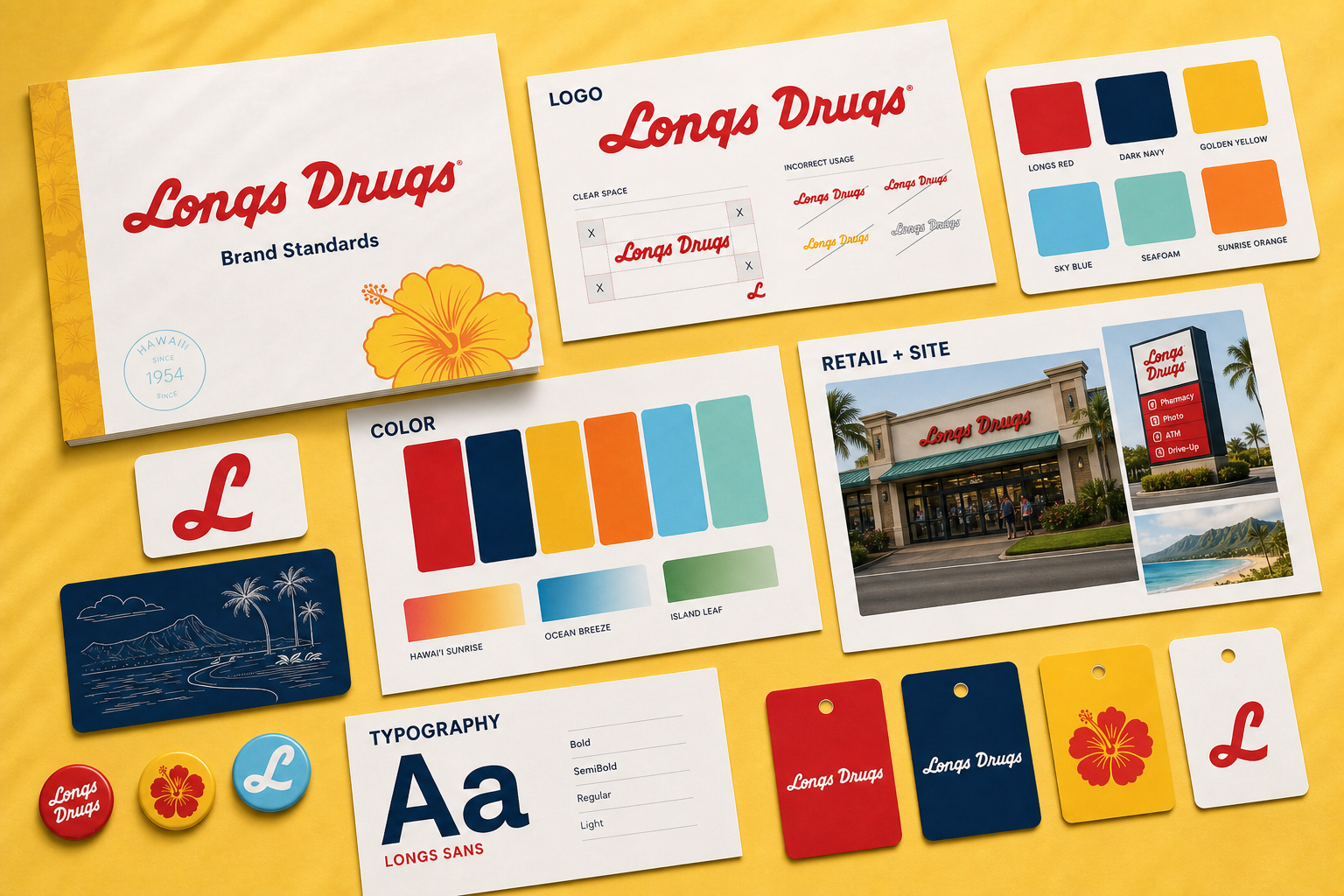
Brand foundation
A trusted neighborhood brand, sharpened for digital use.
Keep Longs instantly familiar
The revival starts with the details customers already know: red brand presence, clear shelf communication, everyday utility, and a neighborhood-store tone.
Make the system feel local
Color, photography, and copy should feel grounded in Hawaii without leaning on decorative shorthand or overly polished corporate language.
Prioritize the next action
Retail, pharmacy, savings, and community information should be quick to scan, simple to understand, and easy to act on from mobile first.
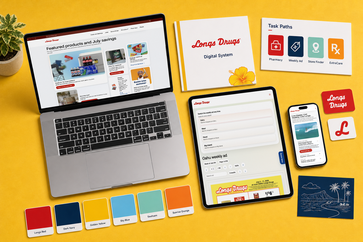
System standards
Translate the rules into real customer paths.
The guidelines should help every page make the same practical decisions: what the customer needs first, how the Longs identity appears, and how brand color supports navigation without overwhelming the task.
- Lead with the Longs mark, then make pharmacy, savings, store, and wellness actions easy to identify.
- Use color as wayfinding: red for recognition, navy for structure, yellow for emphasis, and supporting colors for category cues.
- Pair local warmth with practical interface structure so the system feels familiar without becoming decorative.
Voice and behavior
Write like the store is close by.
The revival voice should be clear and useful first. It can feel warm and local without over-explaining, over-promising, or turning every message into a campaign line.
Write like a helpful neighbor: direct, warm, and practical.
Use short headings that name the customer benefit before the operational detail.
Keep local references respectful, specific, and easy for broad audiences to understand.
Avoid unsupported health, savings, or service claims.
Color palette
Red leads. Island color supports.
The palette keeps Longs Red as the recognition signal, uses navy for trust and structure, and brings in bright supporting color where the page needs warmth, wayfinding, or campaign energy.
Digital system
Simple rules for pages, promos, and retail touchpoints.
Logo
Treat the red Longs script as the lead recognition asset. Give it clean space, avoid busy backgrounds, and protect contrast at small sizes.
Typography
Use legible sans-serif type for interface and retail copy. Let hierarchy come from size, weight, and spacing before adding decoration.
Layout
Build pages in clear editorial blocks: an immediate customer promise, direct task paths, and supporting story only where it adds confidence.
Photography
Favor real retail texture, community warmth, and product clarity. Images should help people understand the service or offer faster.
Before publishing
Use this quick check before a Longs page goes live.
- Does the first screen read as Longs before the user reaches body copy?
- Can someone find pharmacy, savings, store, or community actions without hunting?
- Do color and image choices stay warm without reducing readability?
- Does the page work as a practical mobile retail experience?
Official reference
Continue to the Longs guidelines page.
This portfolio page is a project companion. For the public reference and canonical brand-guidelines destination, use the Longs page below.