2023 / Exhibition / Case Study / Editorial / Identity
Toriyama Early Works Exhibition
A For Fun's Sake exhibition campaign for the late Akira Toriyama, focusing on his early creative path through print, merchandise, badges, and an app.
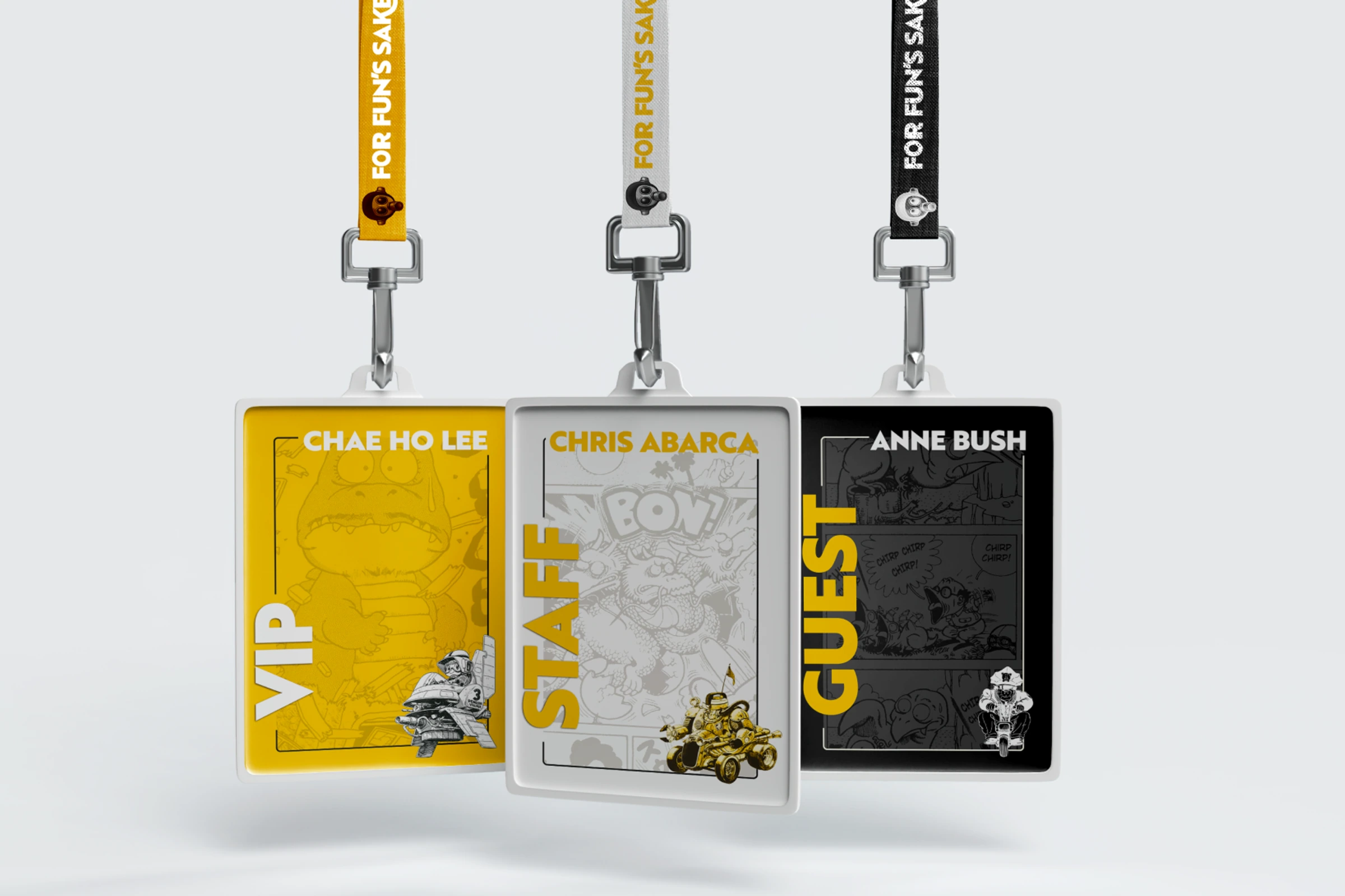
Art direction, identity, and editorial design
Self-initiated case study
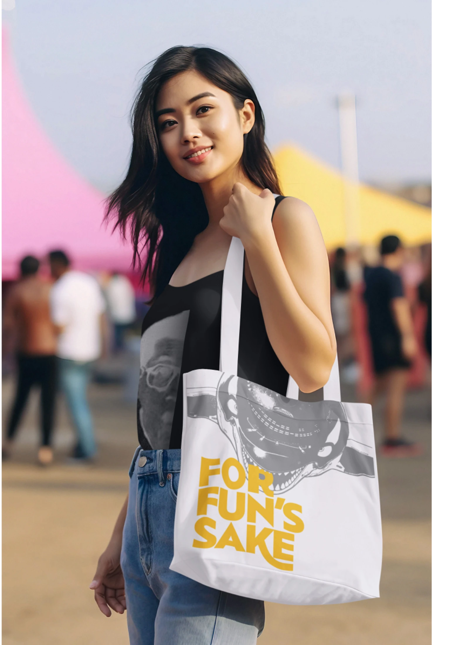
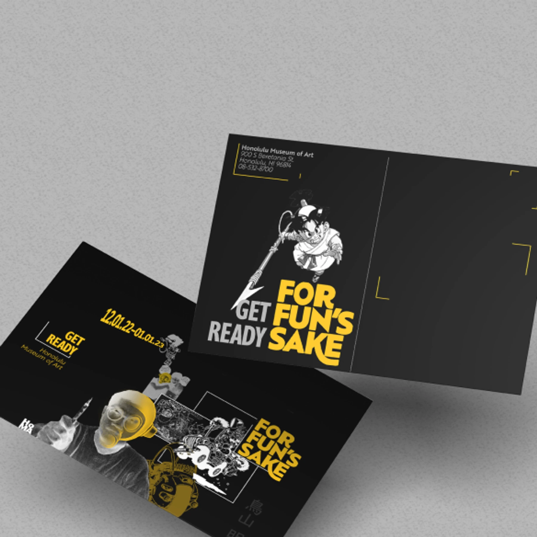
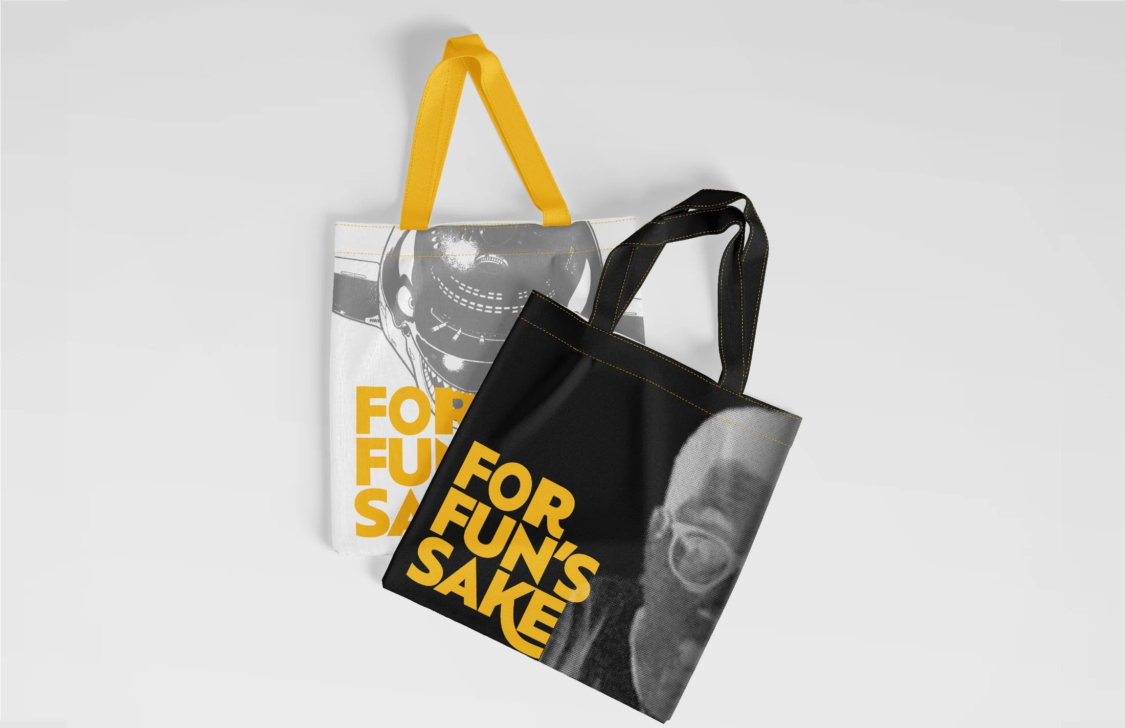
Exhibition concept, Posters, Publication system, Merchandise, Mobile app concept
Honolulu Museum of Art concept
For Fun's Sake
The exhibition looks before Dragon Ball to show how Toriyama became a legend of his field.
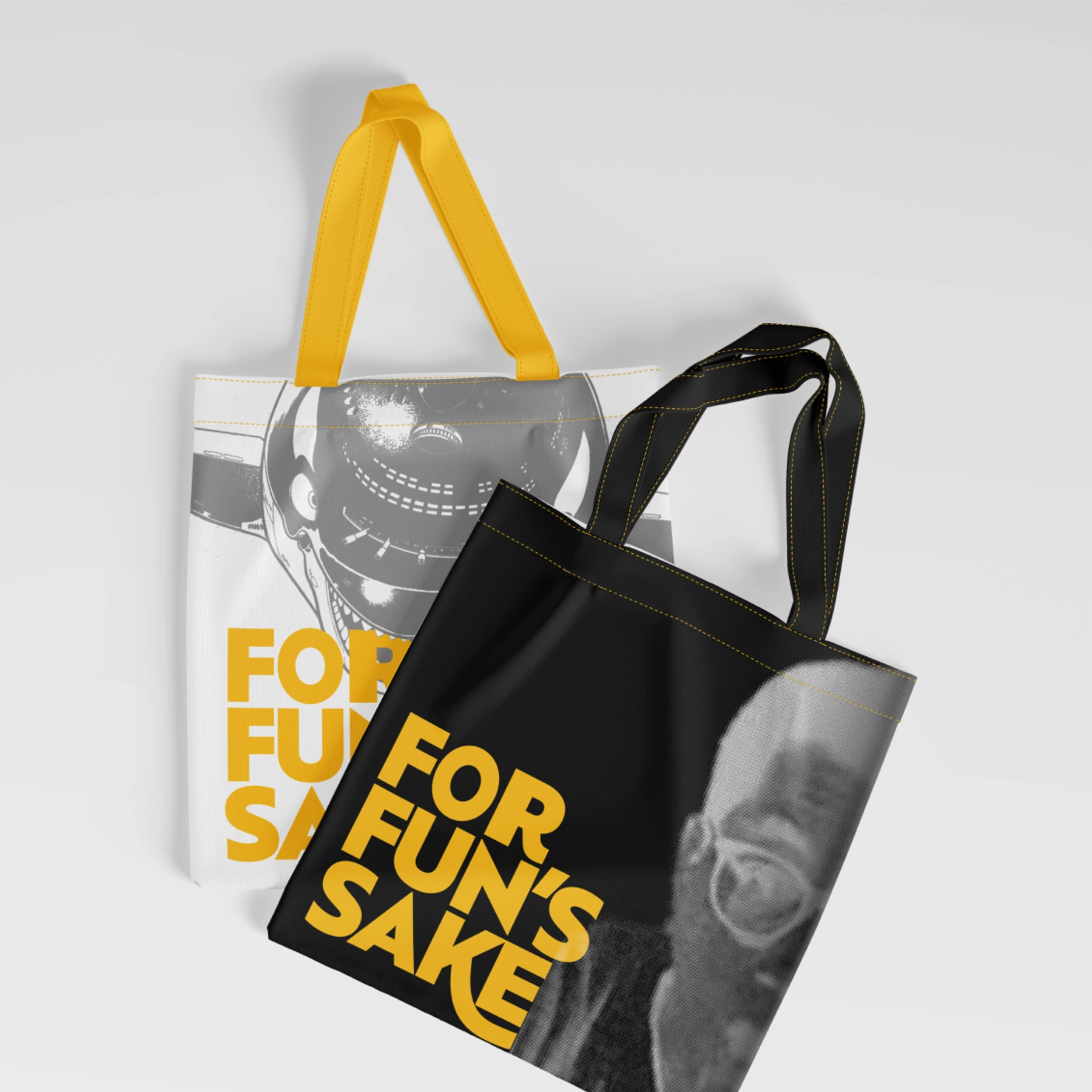
The system uses black, white, and gold to allude to inked manga panels and a warm studio yellow, turning limited early-work material into an exhibition built on form, shadow, print, and visitor objects.
Brief
This case study explores how I would develop and market an exhibition for the late Akira Toriyama. Instead of focusing on Dragon Ball, the project looks at his earlier work and the path that made him a legend in his field.
Concept
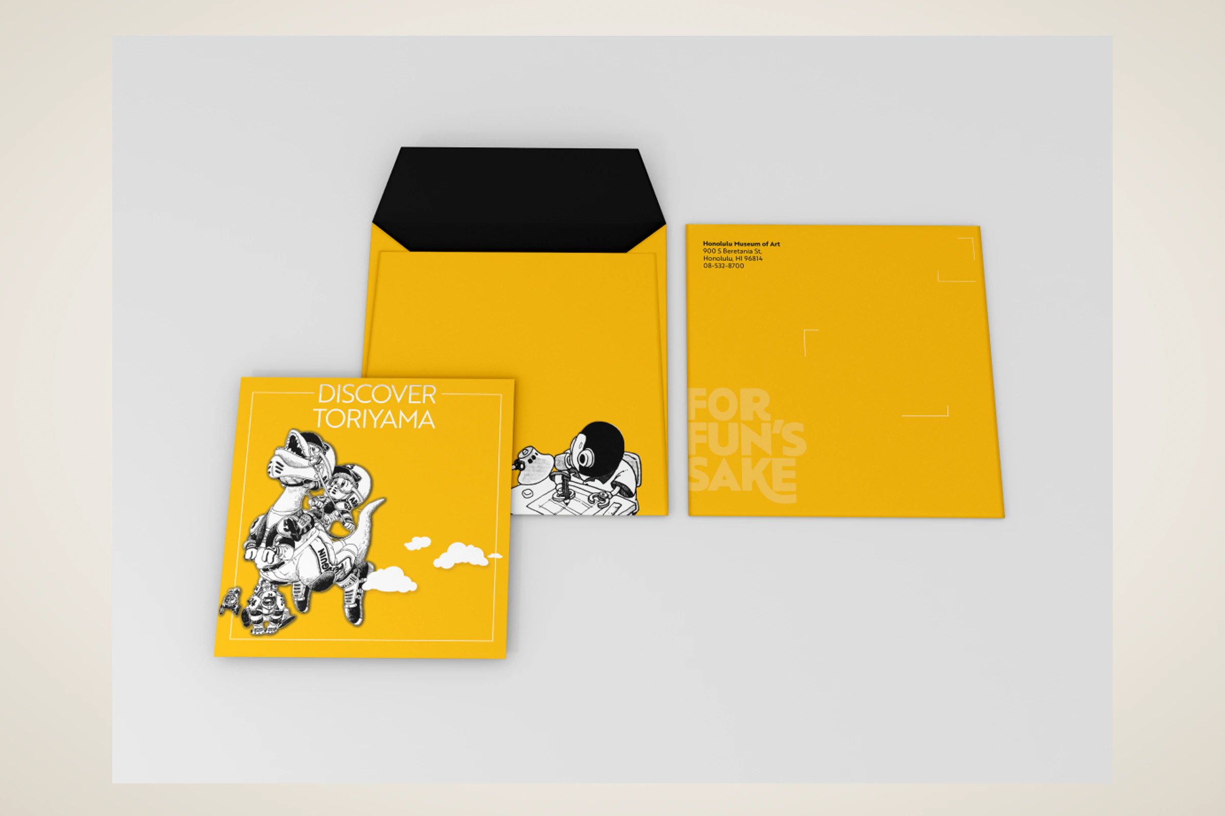
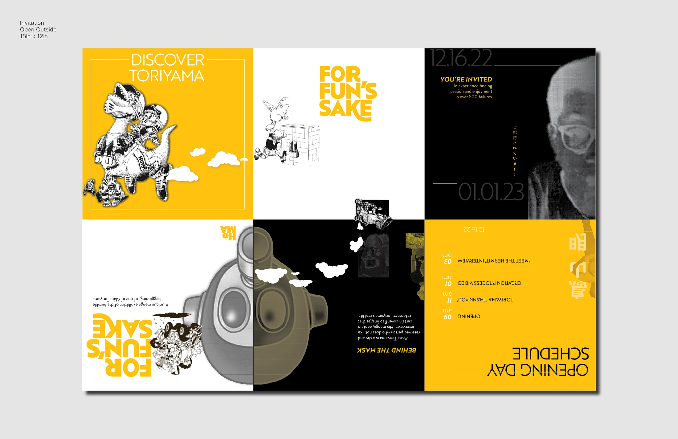
I limited the system to black, white, and gold. Black and white allude to traditional inked manga panels, while the warm yellow pays homage to the color he later used for his studio and home.
That restraint created a natural challenge because there was less public material from his early work to highlight. The exhibition materials needed to stay interesting through form, contrast, and shadow rather than depending on vibrant character-driven color palettes.
System
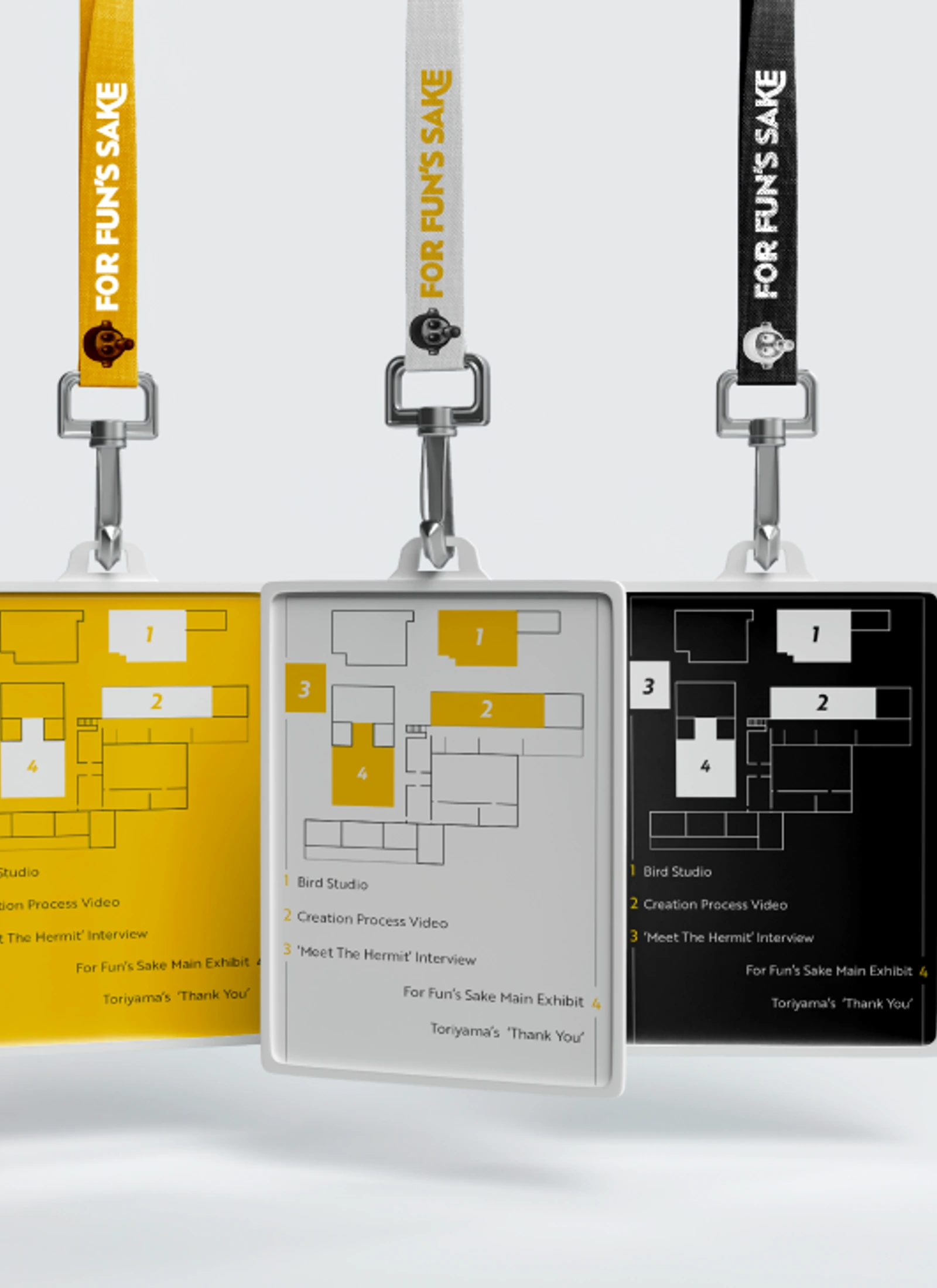
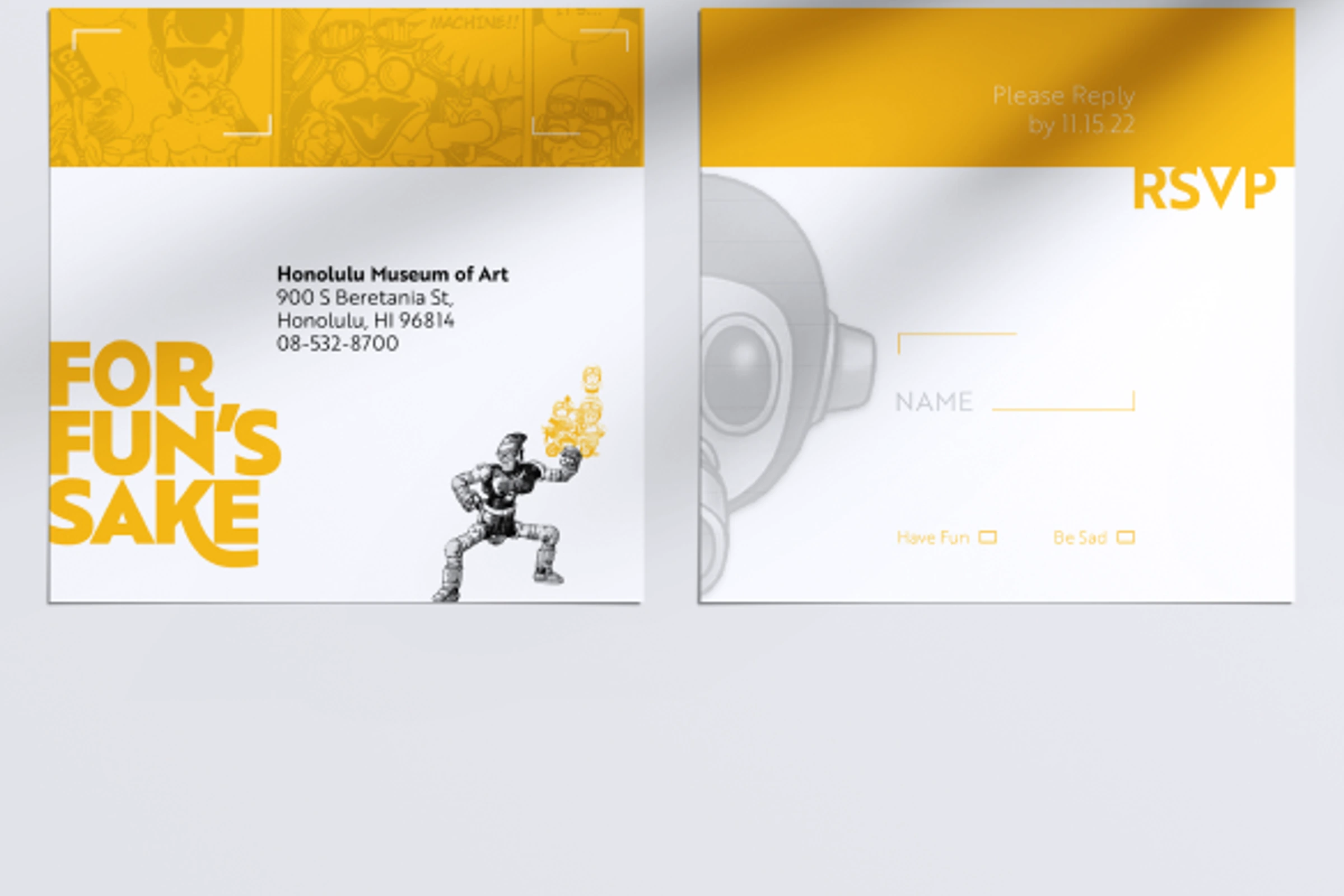
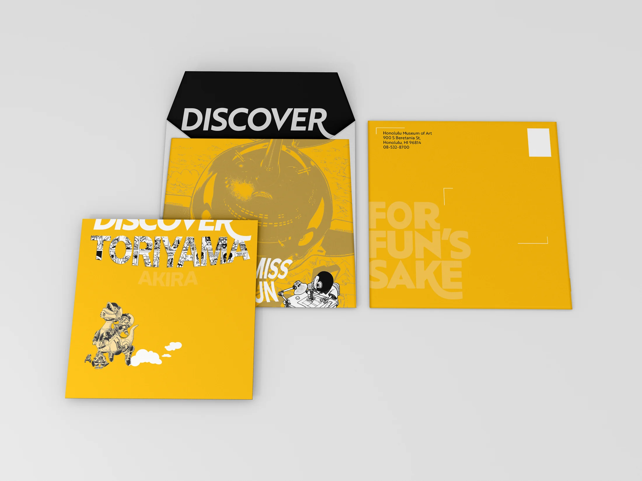
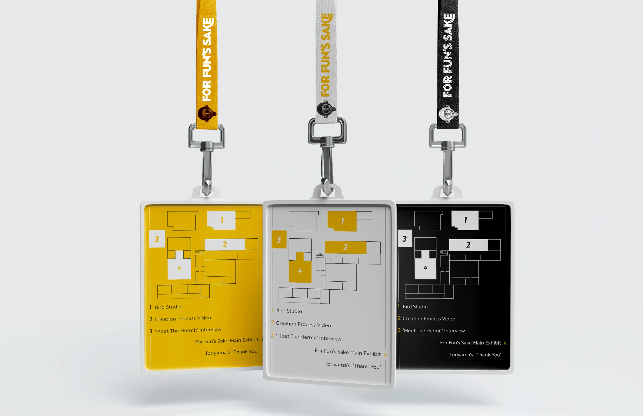
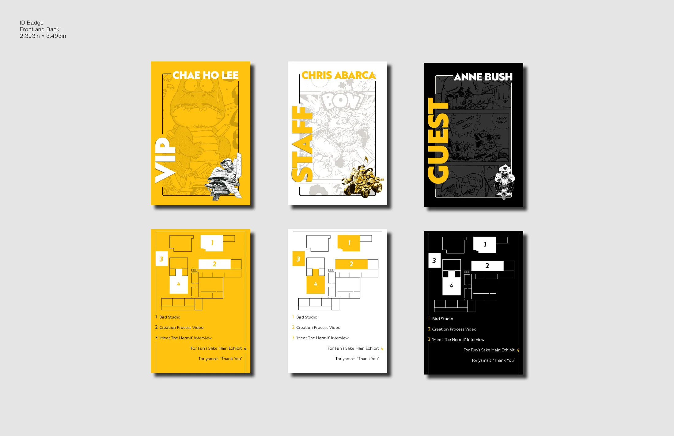
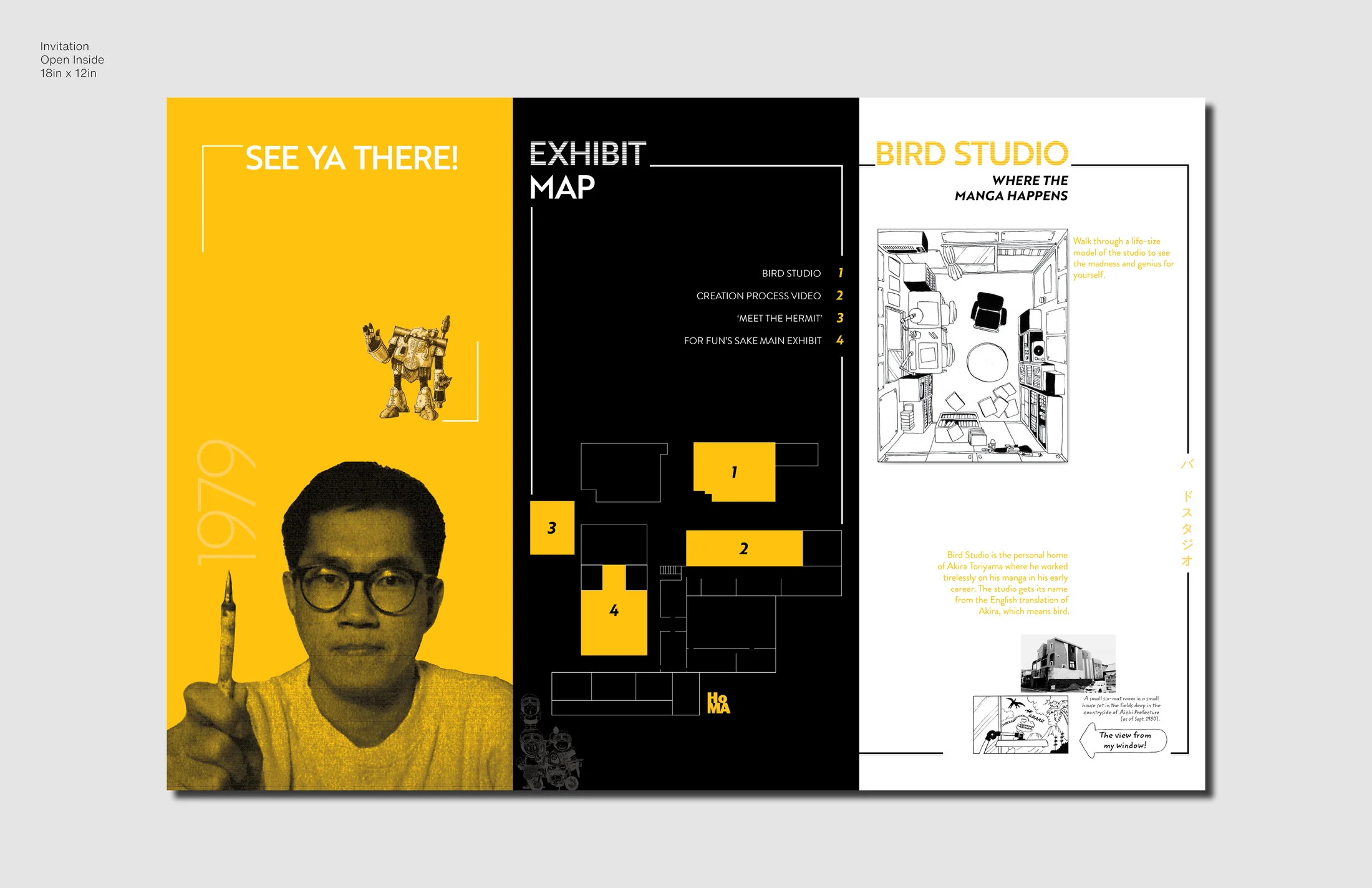
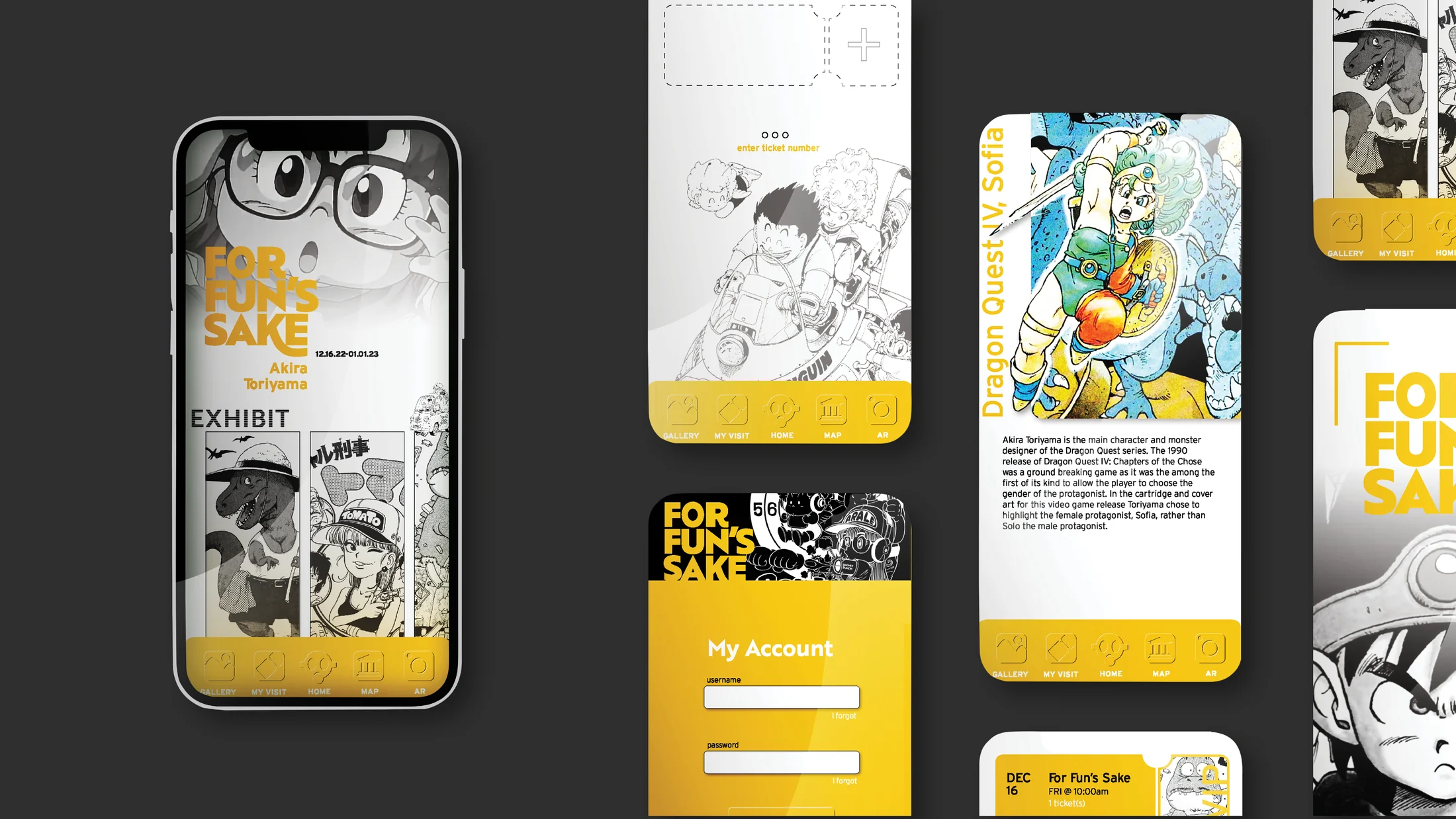
The case study plans a floor plan inside the Honolulu Museum of Art, staff, VIP, and guest badges, merchandise, invitations, and a mobile app visitors could use during the exhibition.
The app supports reservations, merchandise, artwork browsing, and interactive moments, while the printed objects make the exhibition feel collectible before, during, and after the visit.
Outcome
The result is a self-initiated exhibition identity that turns a focused archive into a complete visitor journey, using a strict palette and tactile system to make the early work feel intentional, memorable, and worth revisiting.
Image archive
14 selected visual moments

Related work
Continue through the archive
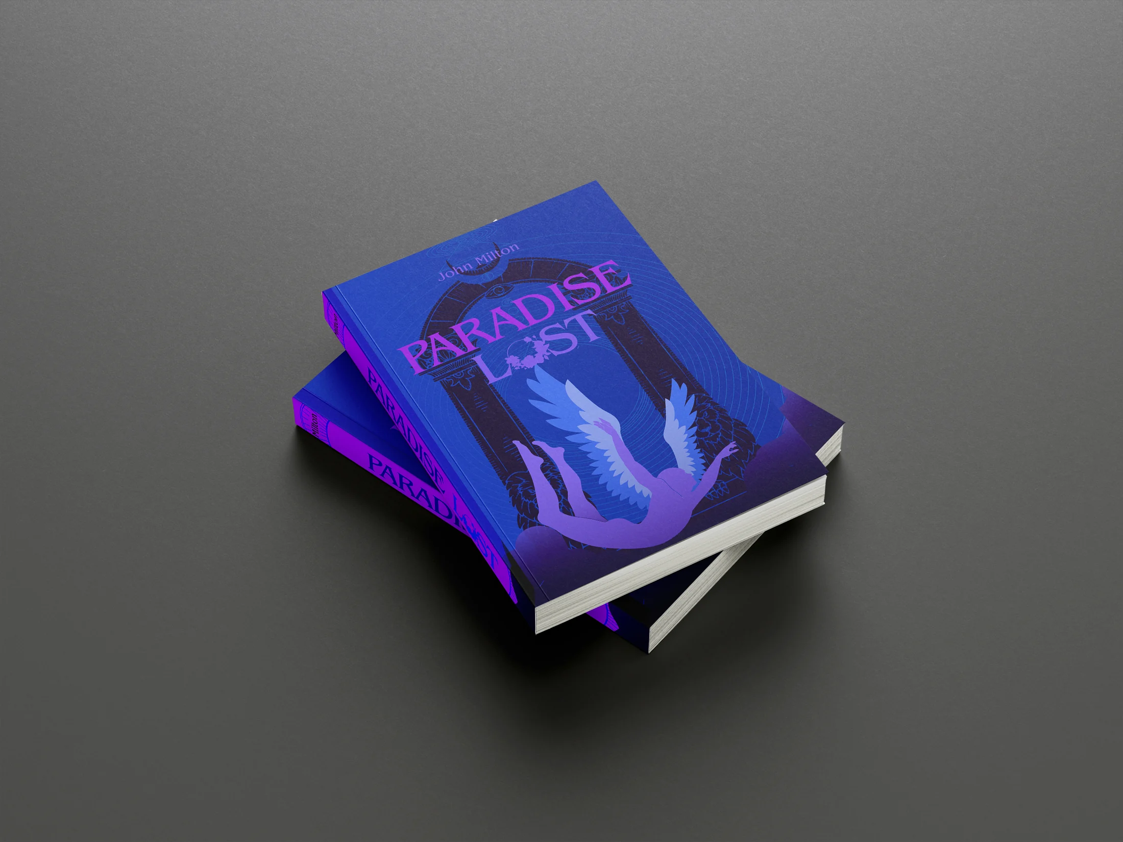
Archived Projects
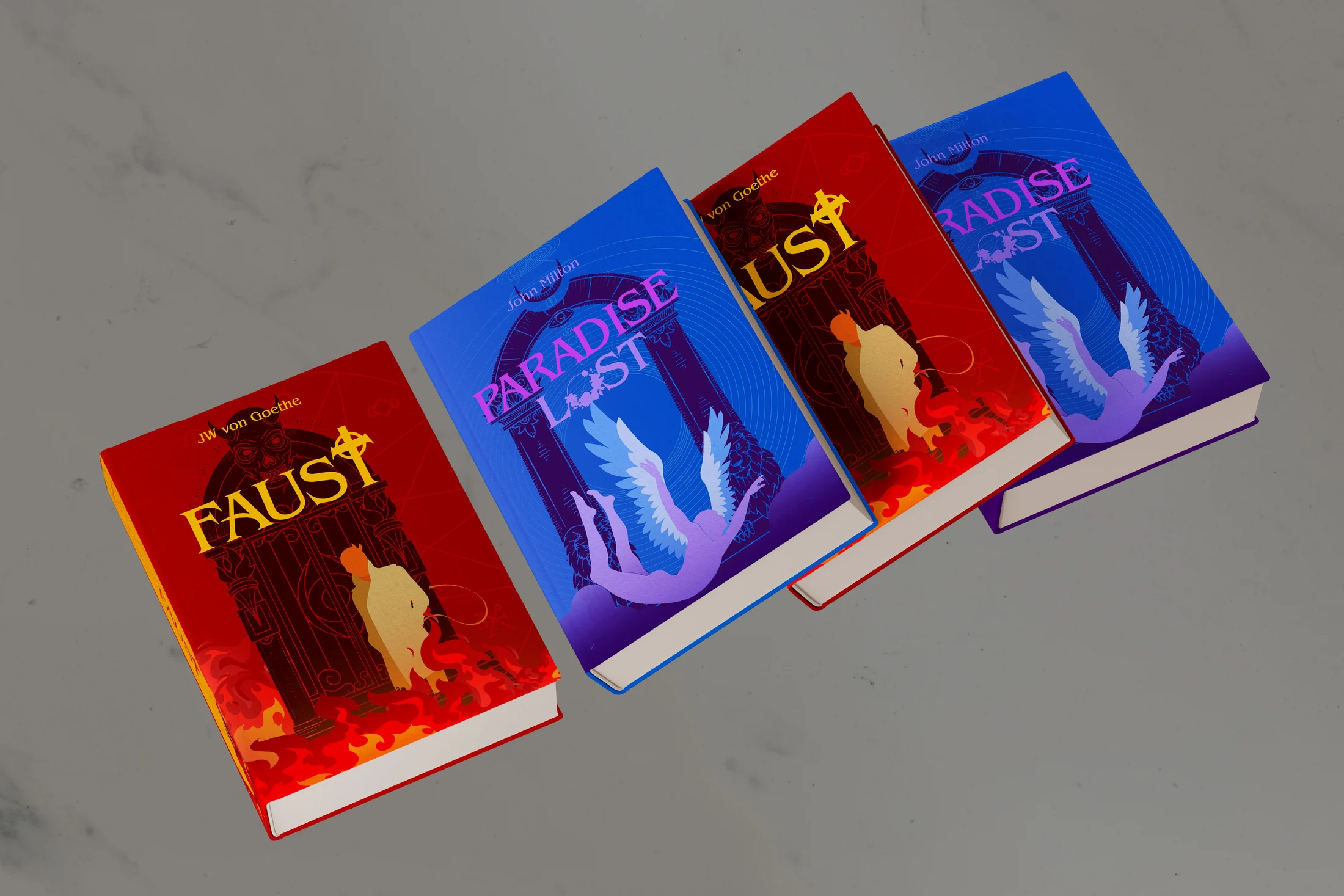
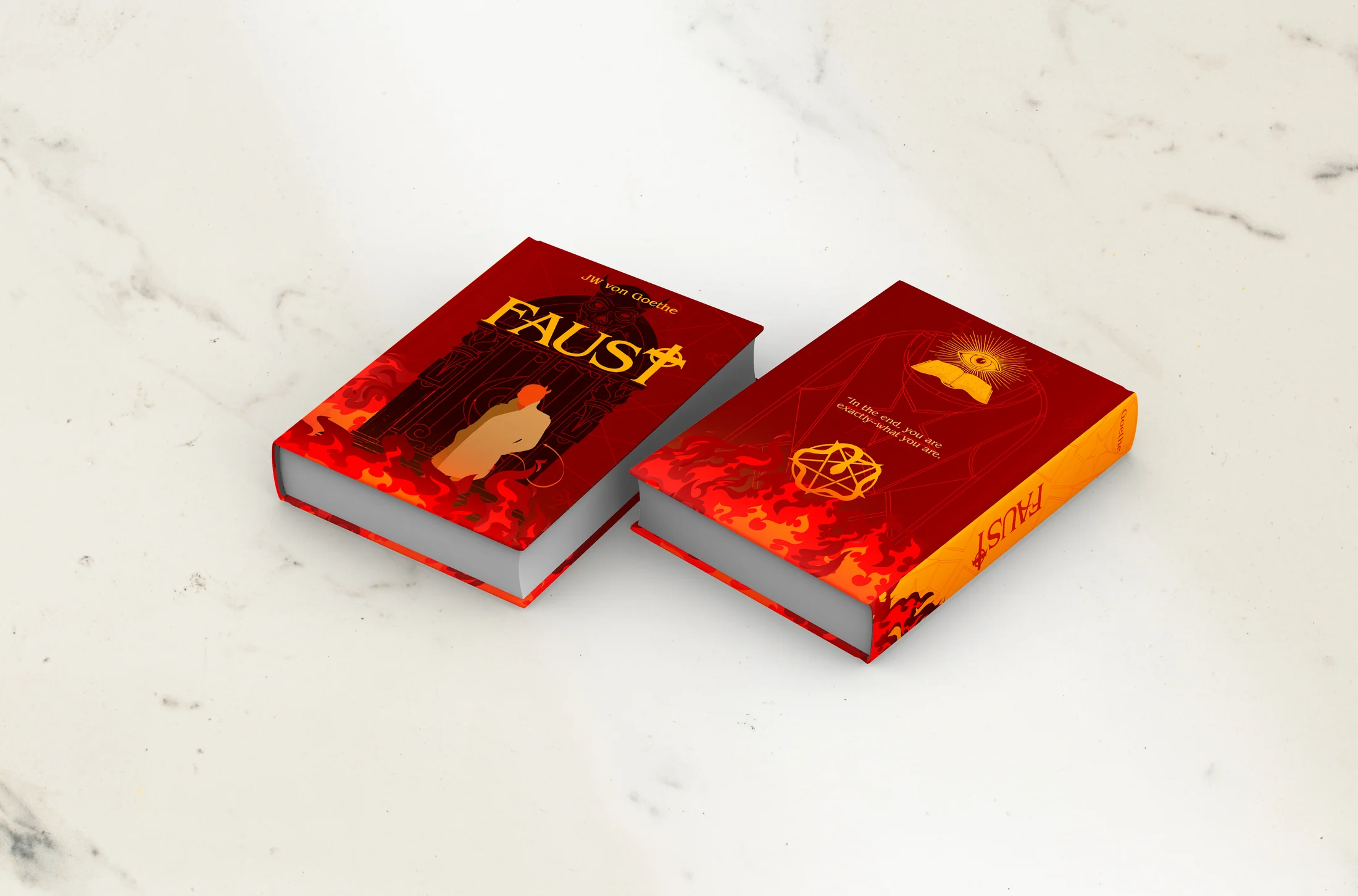
An archive of book-cover redesigns, editorial pieces, information studies, type experiments, advertisements, and exhibition work made between 2019 and 2024.
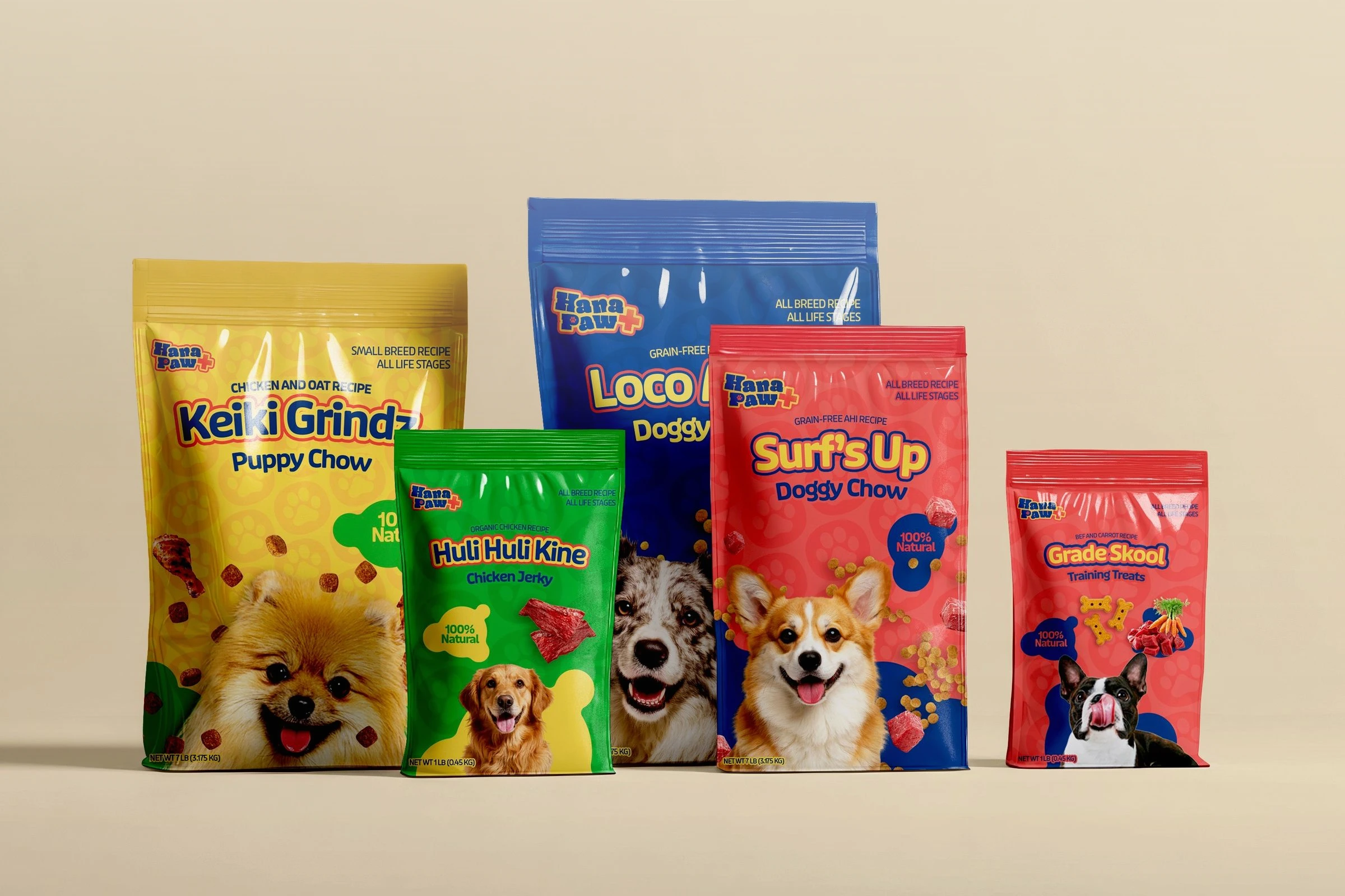
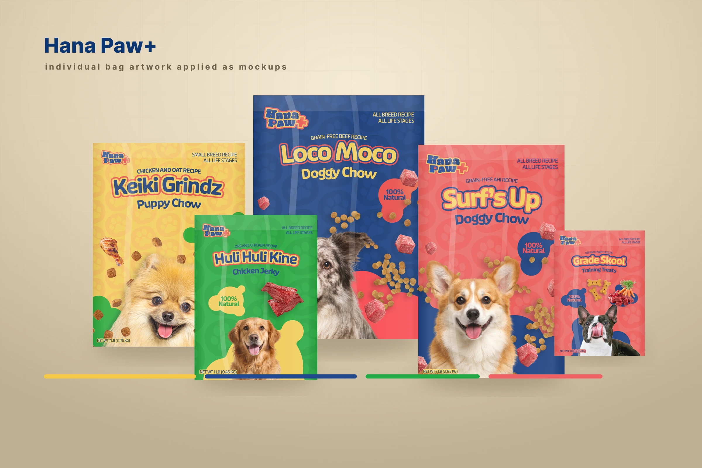
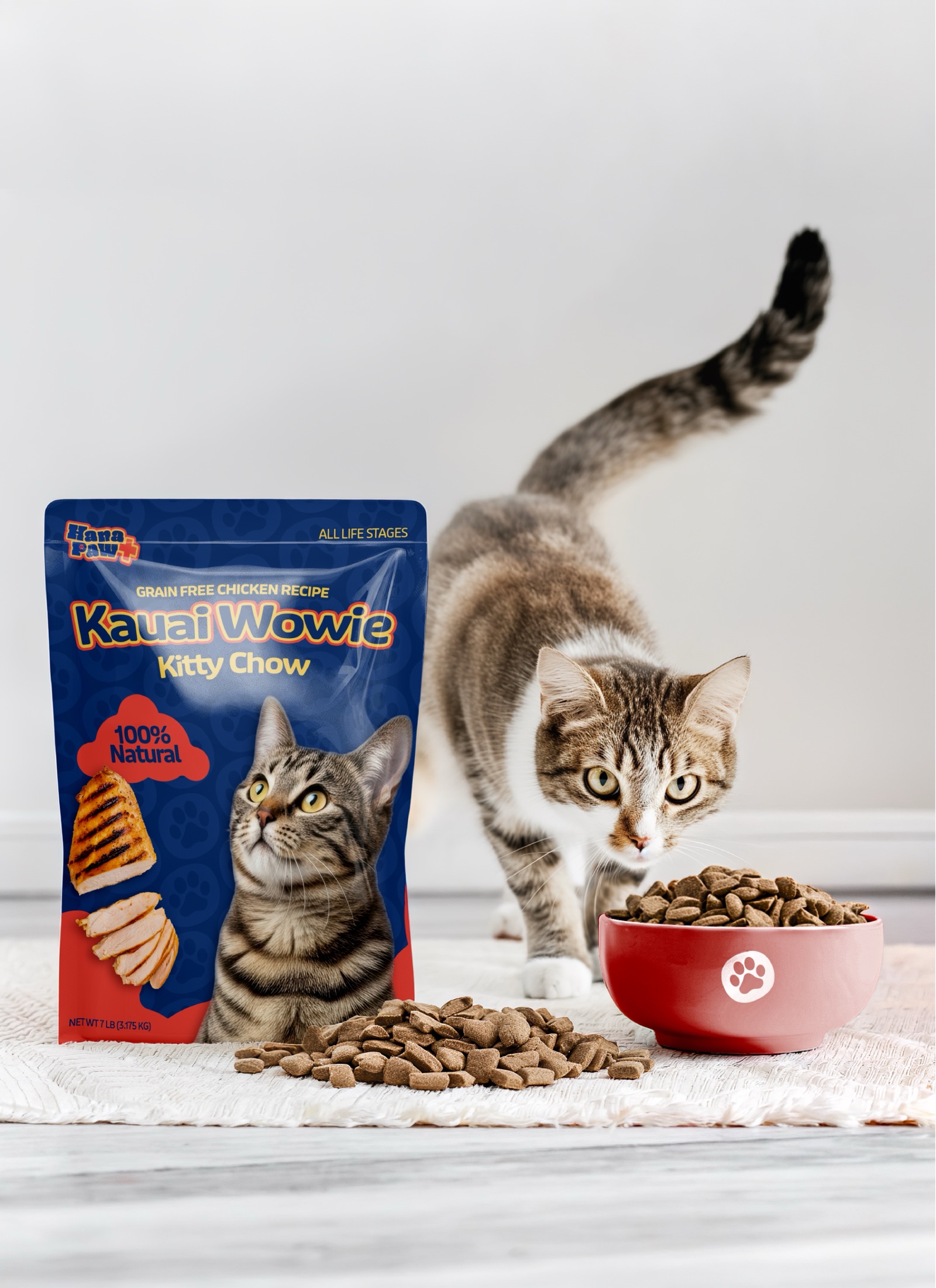
Hana Paw Pet Goods
A client pet-products idea I led through positioning, naming and trademark pitches, identity, packaging, factory development, and a broader retail family.