2025 / Packaging / Identity / Illustration
Hana Paw Pet Goods
A local pet-products identity and packaging system built around playful primary color, real ingredients, and pet owners who treat animals like family.
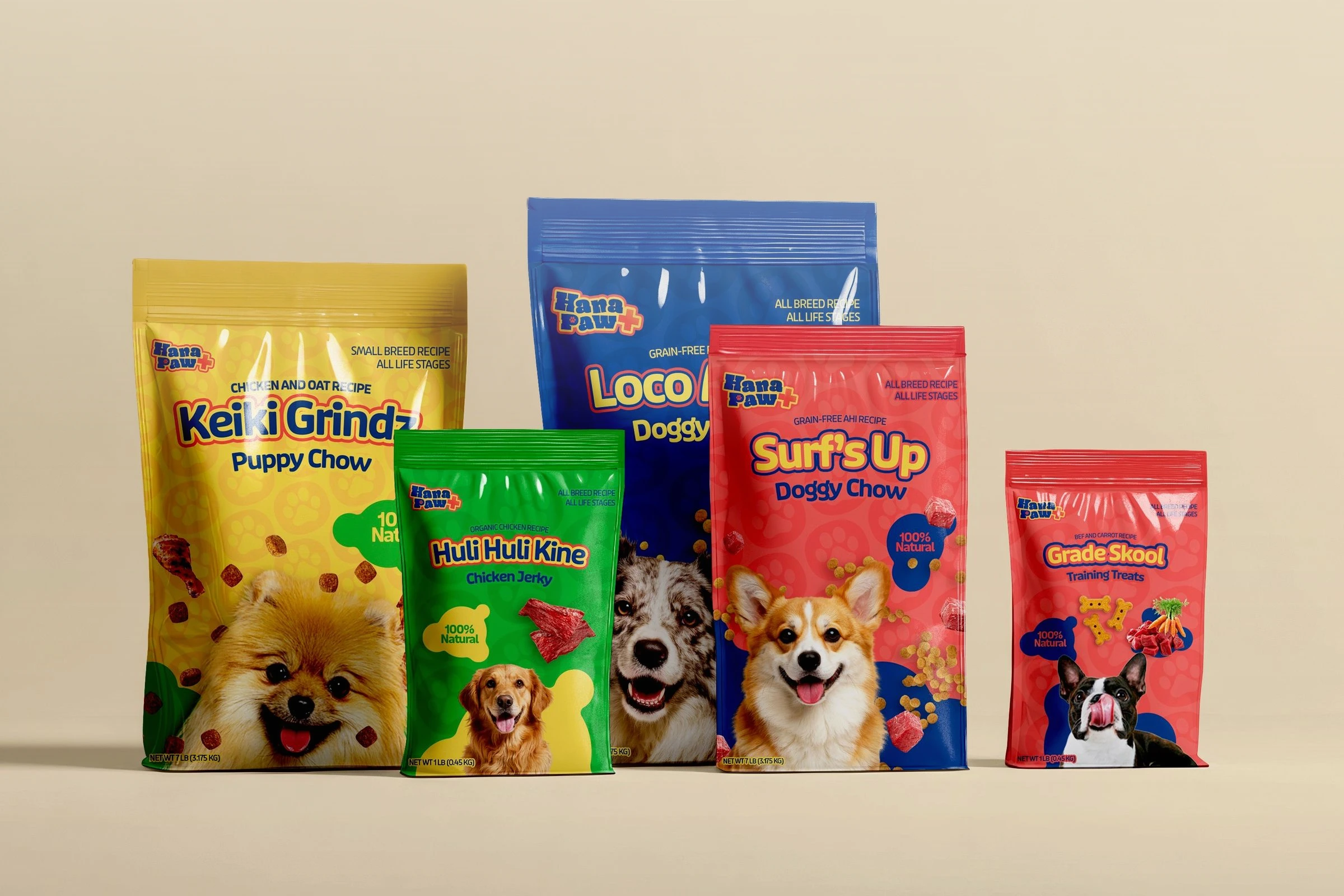
Brand direction, naming, identity, packaging, and production development
Hana Paw
Client brand development
Positioning, naming pitches, identity, packaging, and factory coordination
Brand system, Packaging, Retail graphics
Hawaii
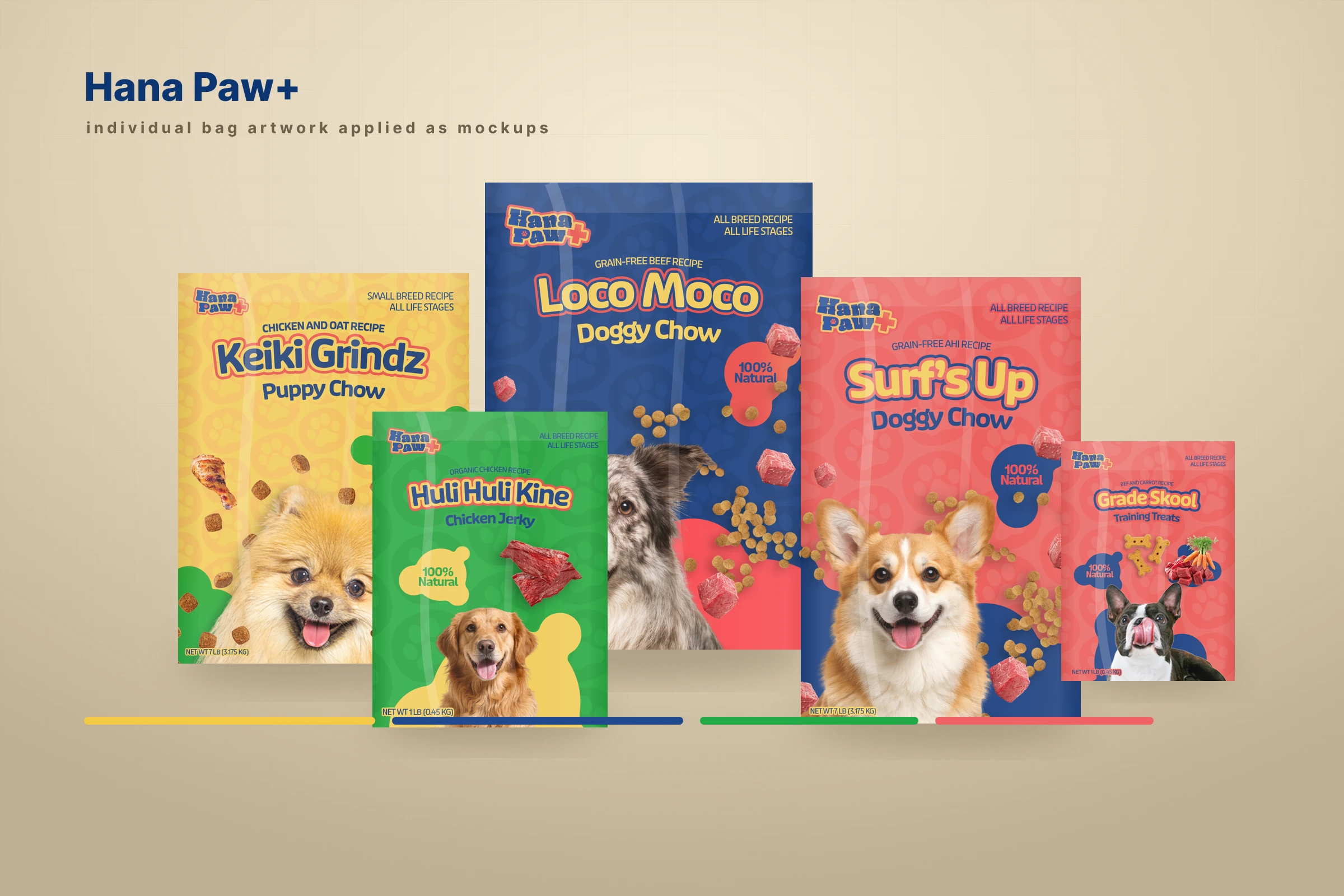
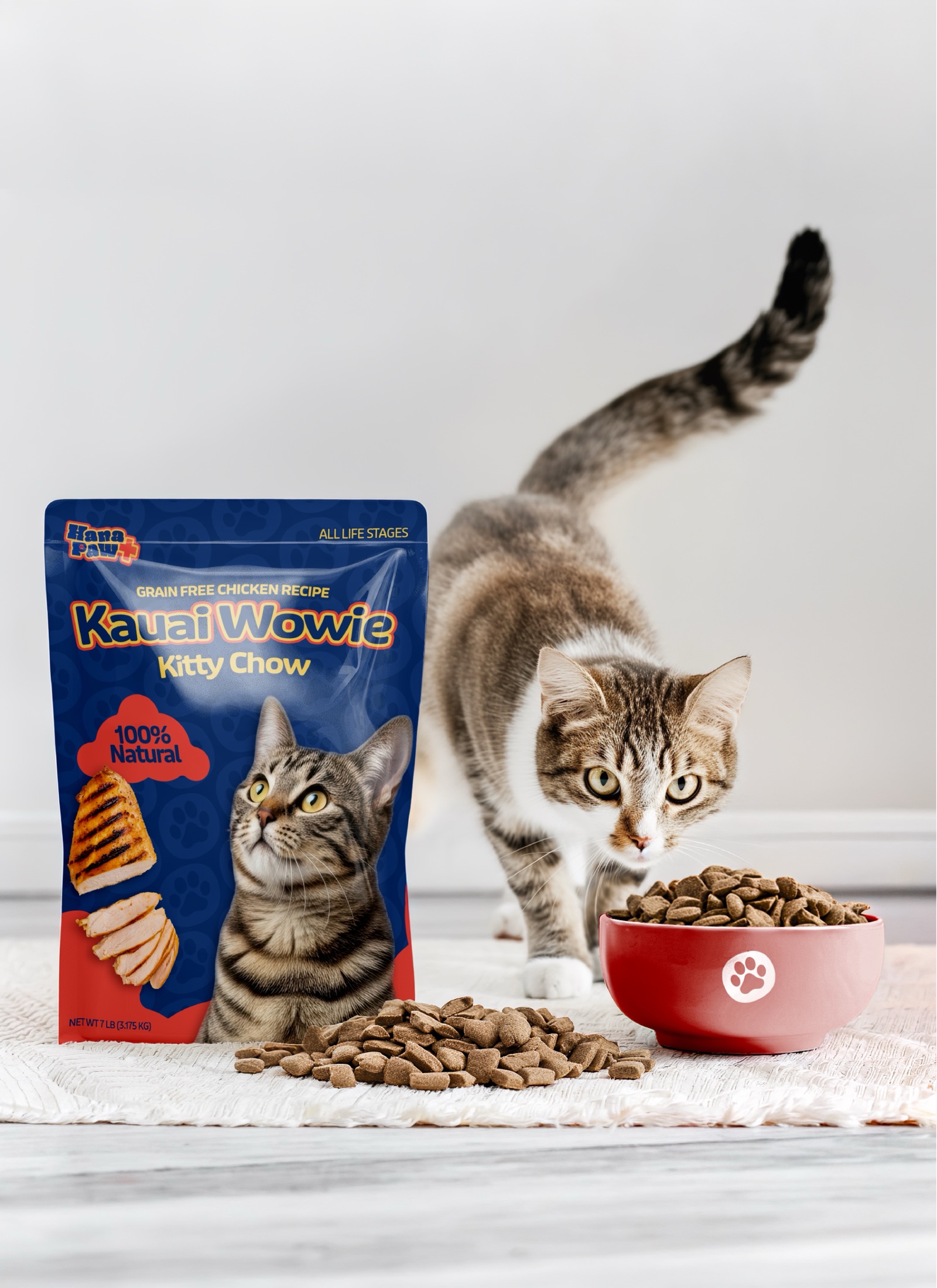
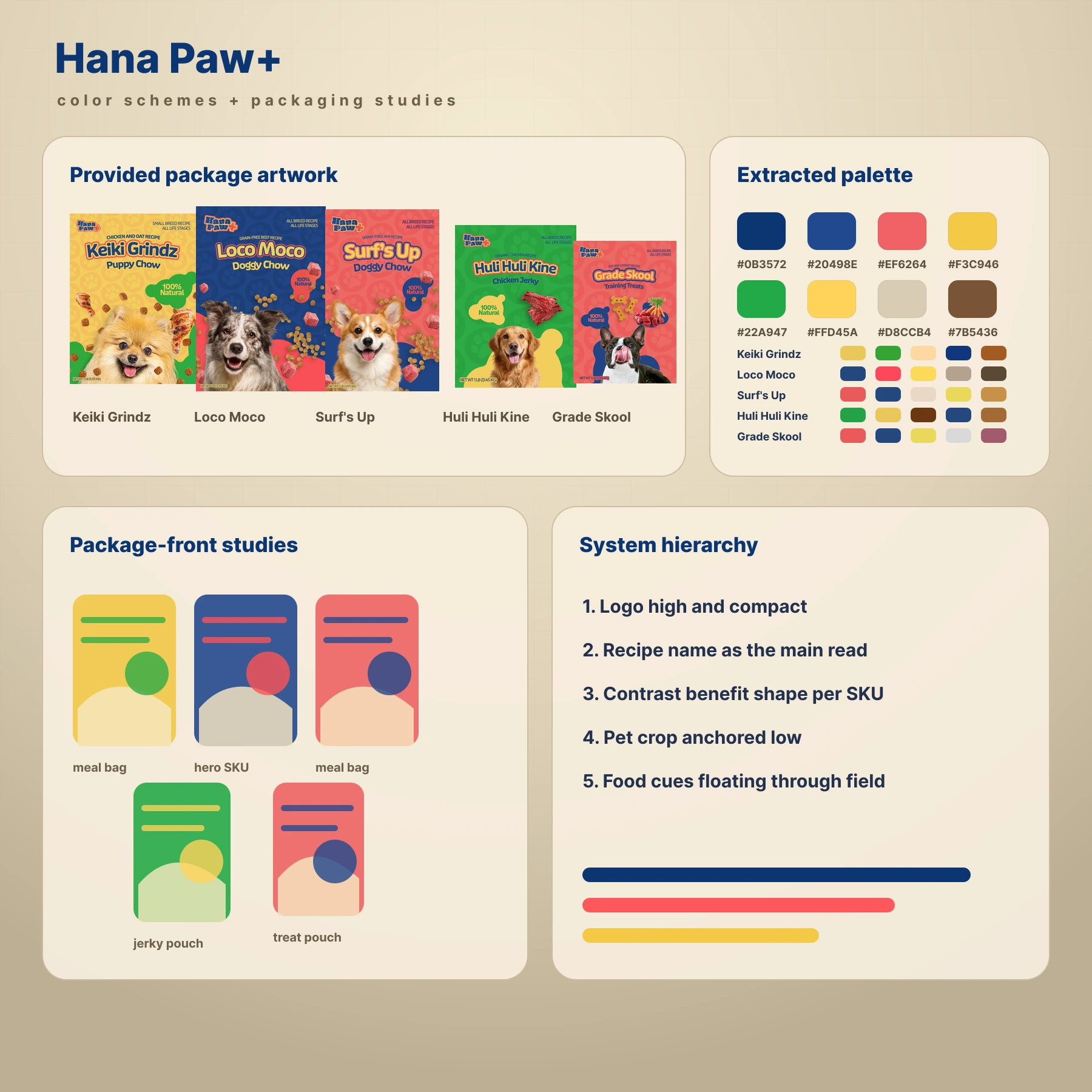
Family-first pet care
The brand treats pets as family without losing the clarity needed on a retail shelf.
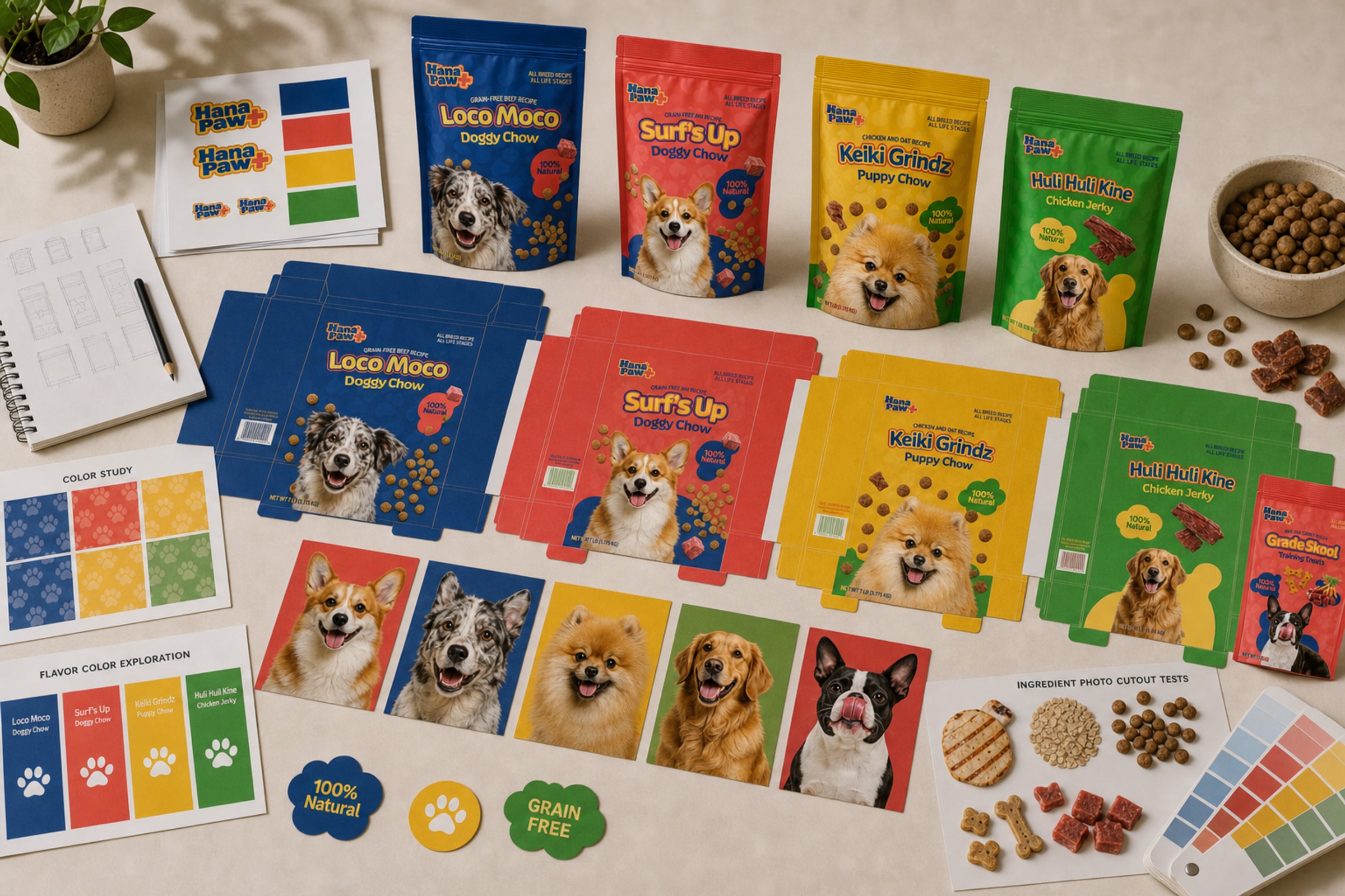
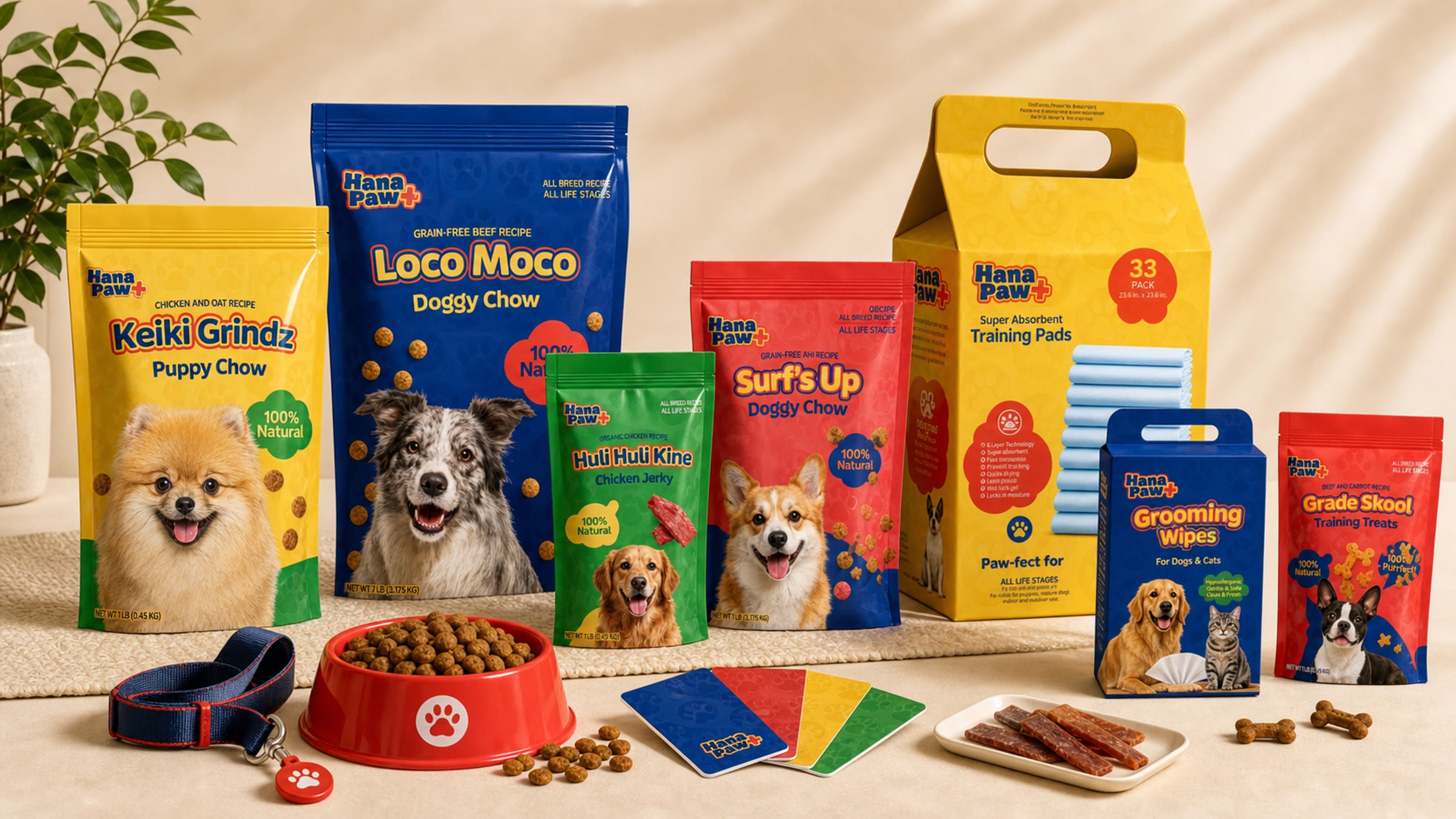
Hana Paw uses energetic primary colors, friendly packaging, and direct product hierarchy to speak to owners who want real food, organic ingredients, and safer everyday care products.
Brief
The client came to me with a broad idea for a local pet-products line. I helped shape the product direction, developed and pitched names for trademark review, created the identity and packaging system, and worked directly with the client and factory as the line moved into physical product development.
Concept
I developed the name Hana Paw with Aloha Gourmet as a play on Pau Hana, the end-of-day phrase used in Hawaii for relaxing after work or school. The name suggests a last stop for pet goods: the product line a customer reaches for when they want real food, organic ingredients, and fewer chemicals in the products they bring home.
The visual direction uses energetic primary colors to allude to childhood playfulness. That helped the brand speak to pet owners who see their pets as more than companion animals: they are furry, four-legged children and part of the family.
System
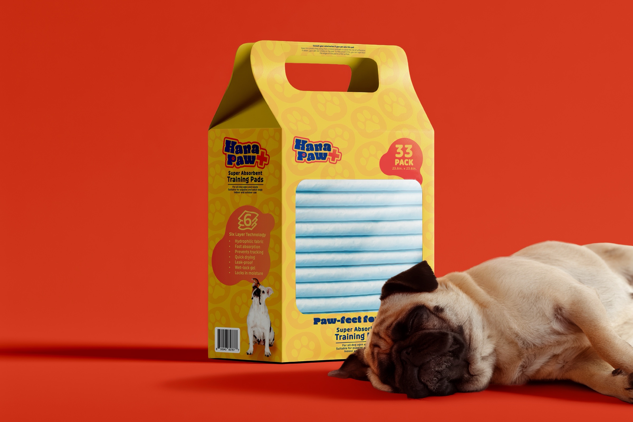
The identity and packaging system is designed to extend across food, treats, training pads, grooming items, and other pet goods. Color, illustration, package hierarchy, and product naming all work together so the line feels friendly but easy to shop.
Outcome
The branding is playful, but the message stays clear: Hana Paw makes happy, healthy pets. The system gives the product line enough warmth for pet owners and enough structure to keep expanding as new products move into production.
Image archive
6 selected visual moments
Related work
Continue through the archive
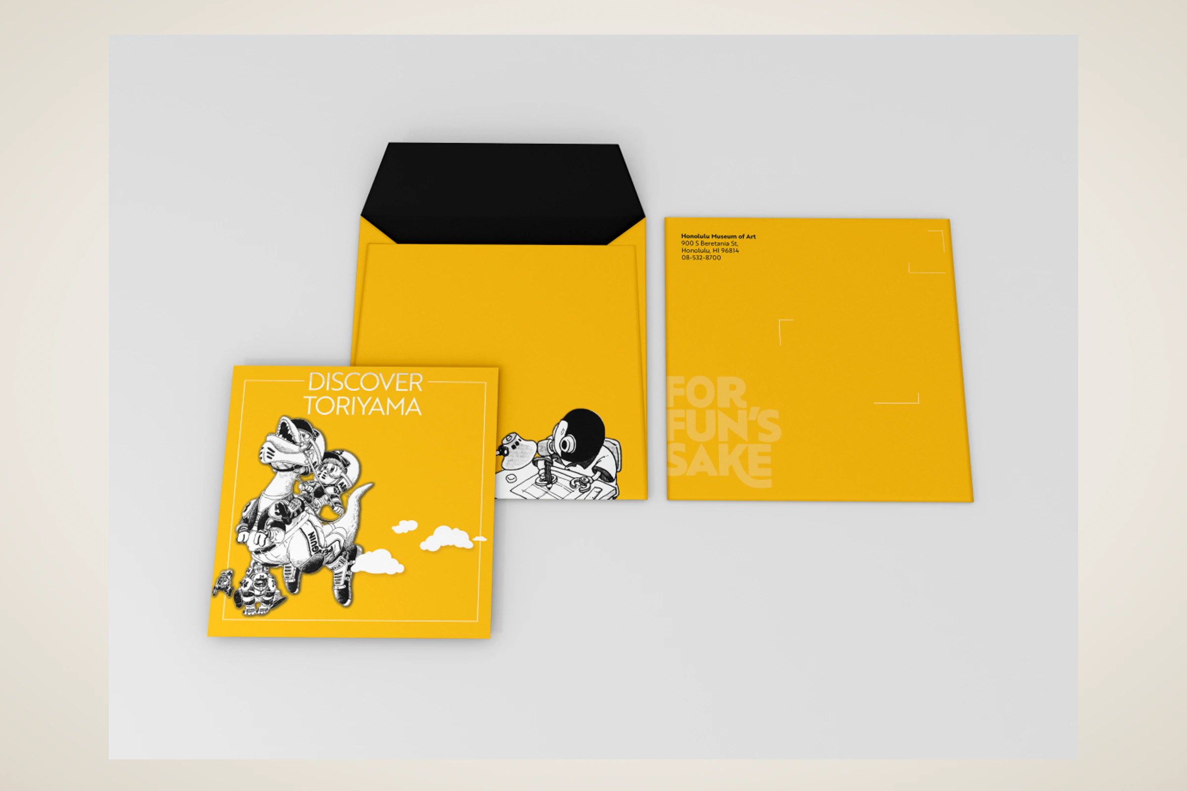
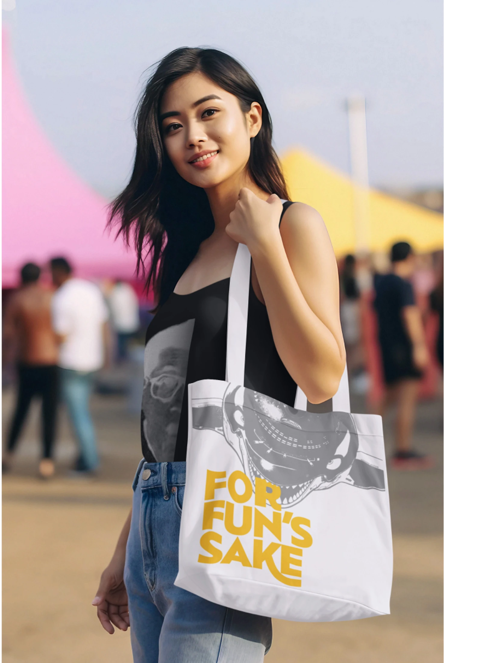
Toriyama Early Works Exhibition
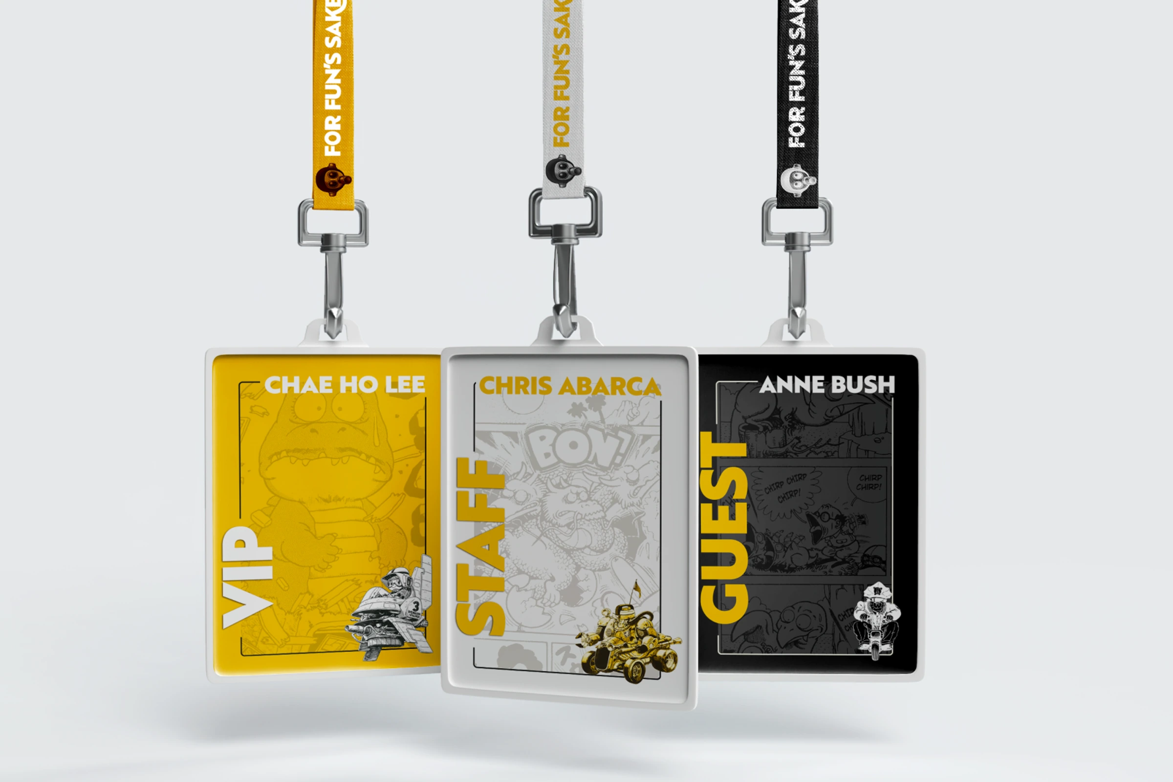
A self-initiated exhibition concept for Akira Toriyama's early work, using a strict black, white, and gold palette to build a coordinated visitor campaign.
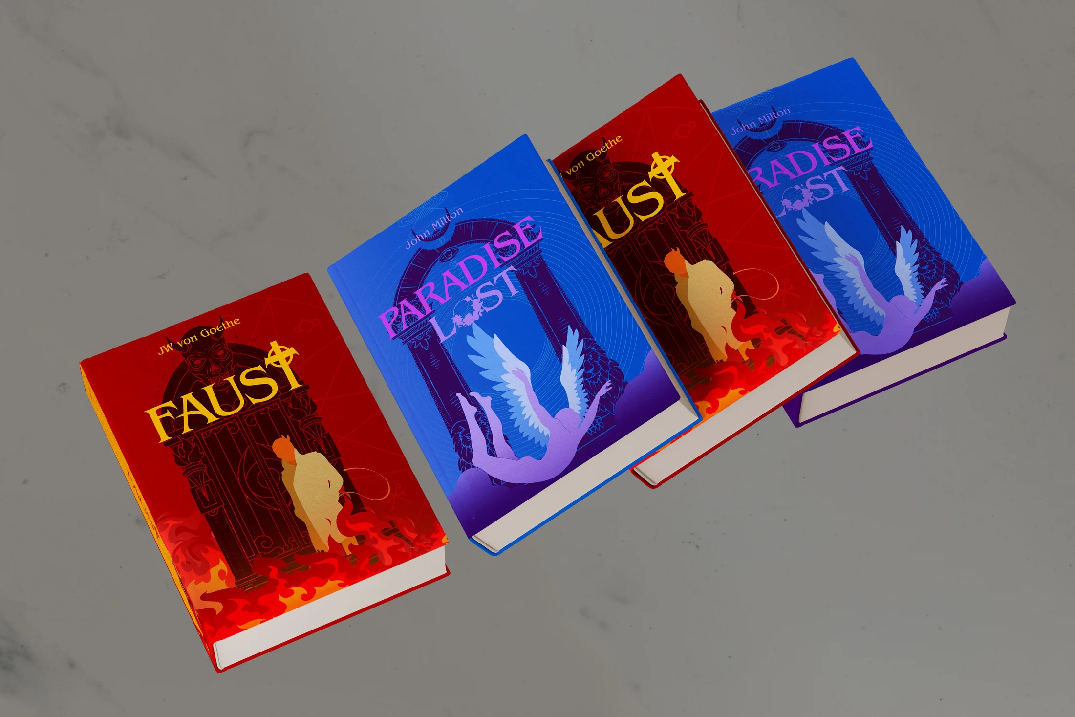

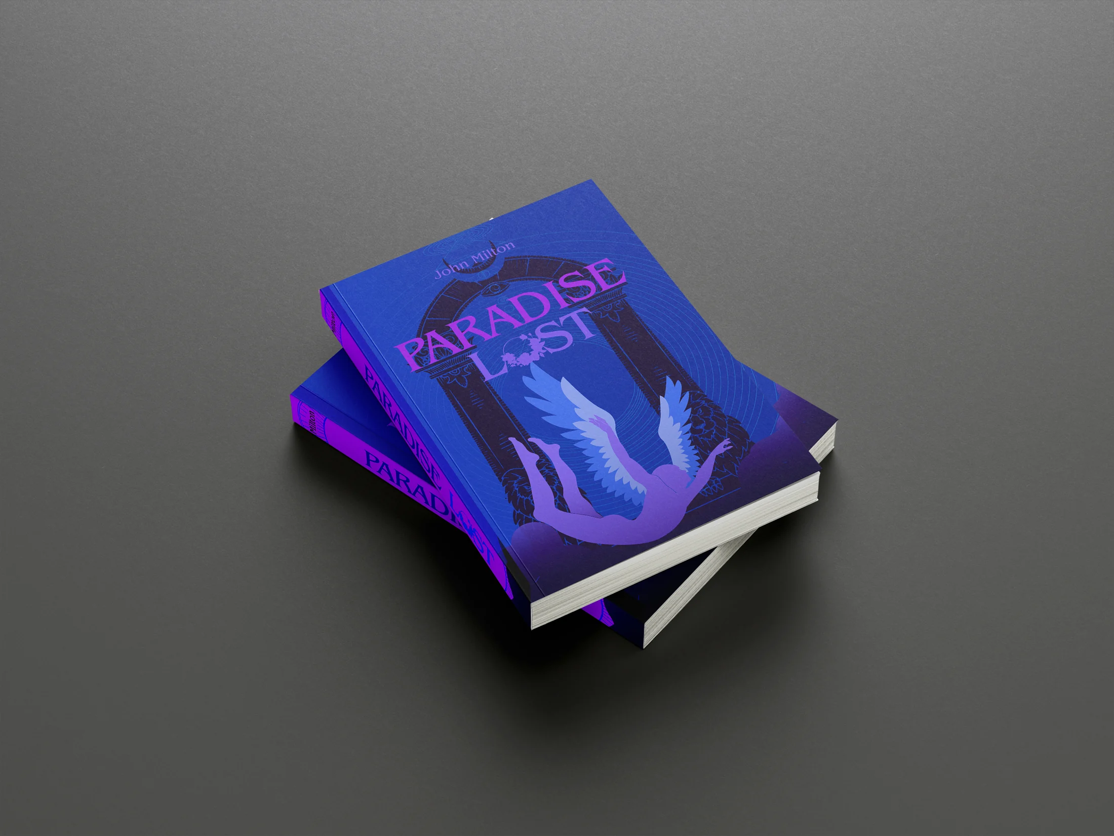
Archived Projects
An archive of book-cover redesigns, editorial pieces, information studies, type experiments, advertisements, and exhibition work made between 2019 and 2024.