2019-2024 / Archive / Editorial / Print / Illustration
Archived Projects
Selected print, editorial, advertising, type, and illustration studies from 2019–2024, gathered as an evolving record of earlier work.
Art direction, graphic design, and illustration
Selected clients and self-initiated studies
Book covers, Posters and booklets, Advertising, Type and information studies
Honolulu
Book-cover redesign
Two favorite texts became a focused illustration and object-design study.
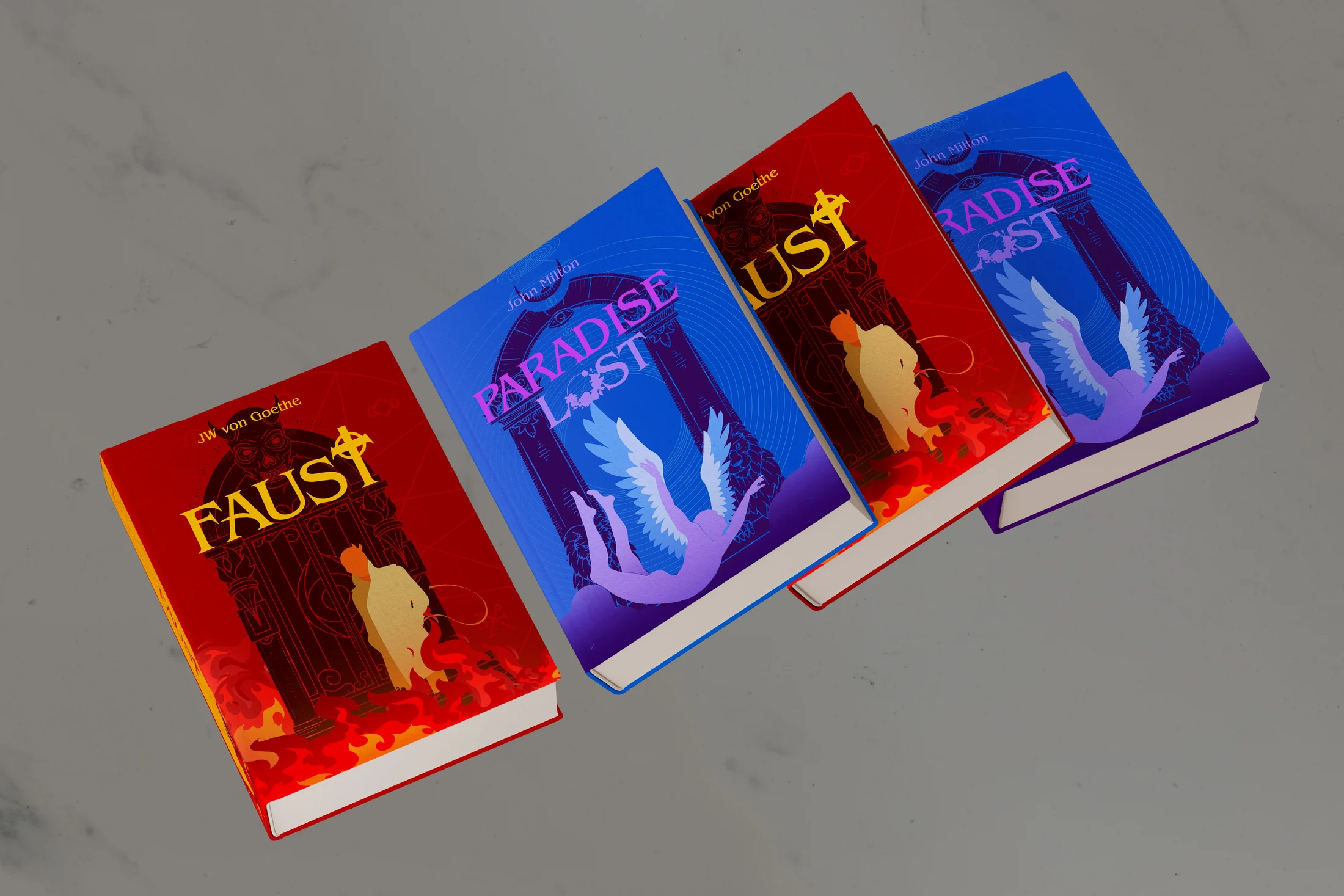
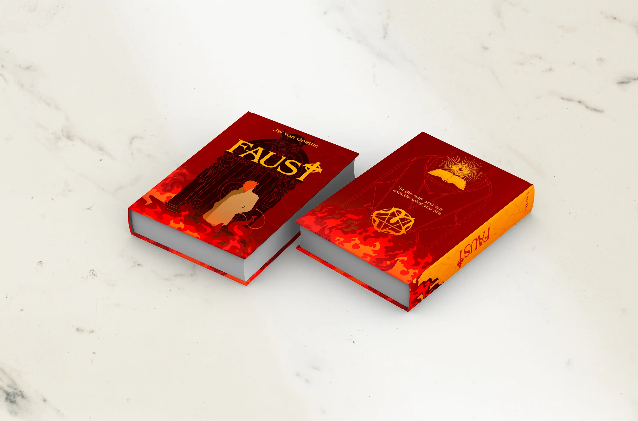
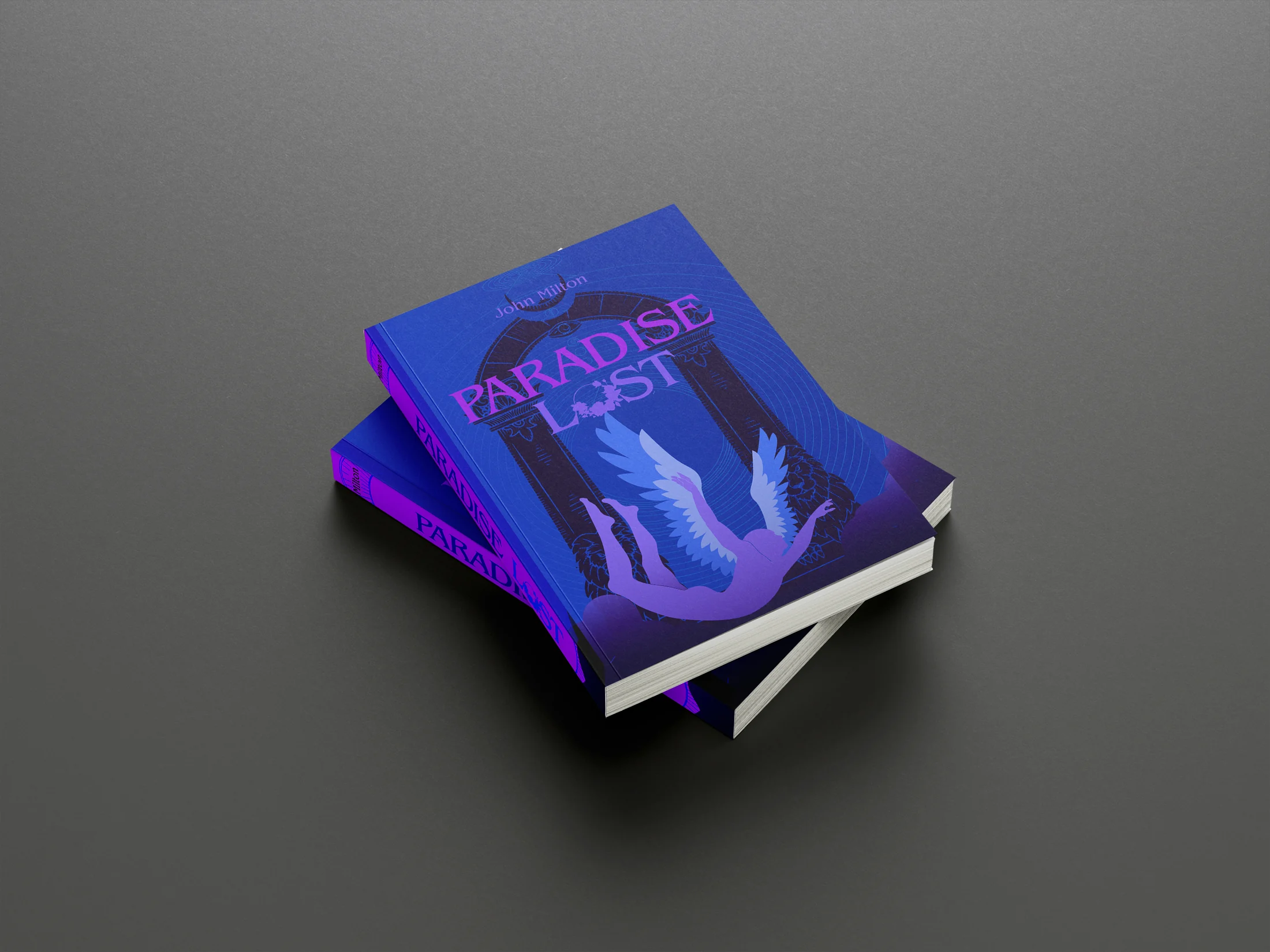
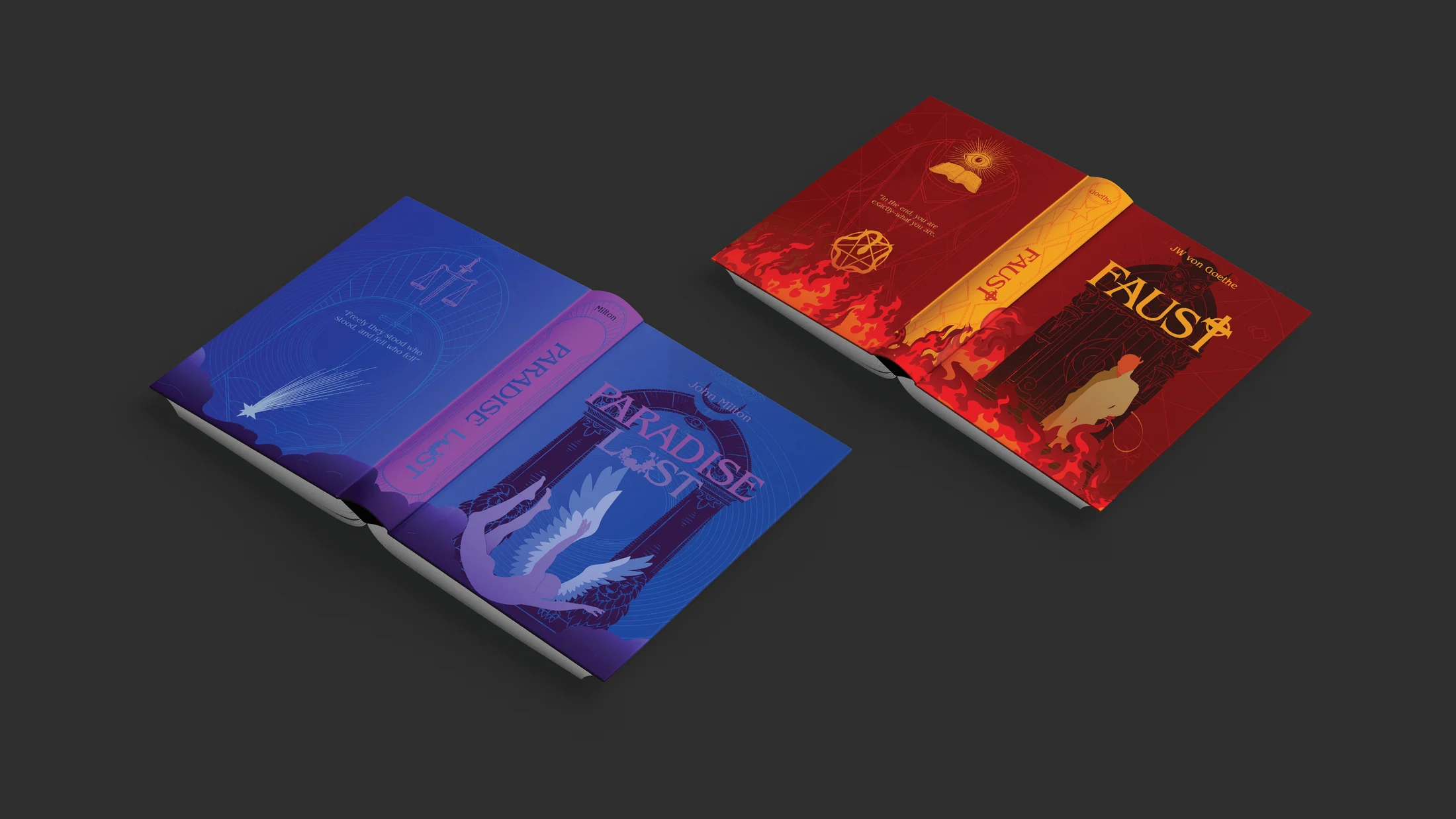
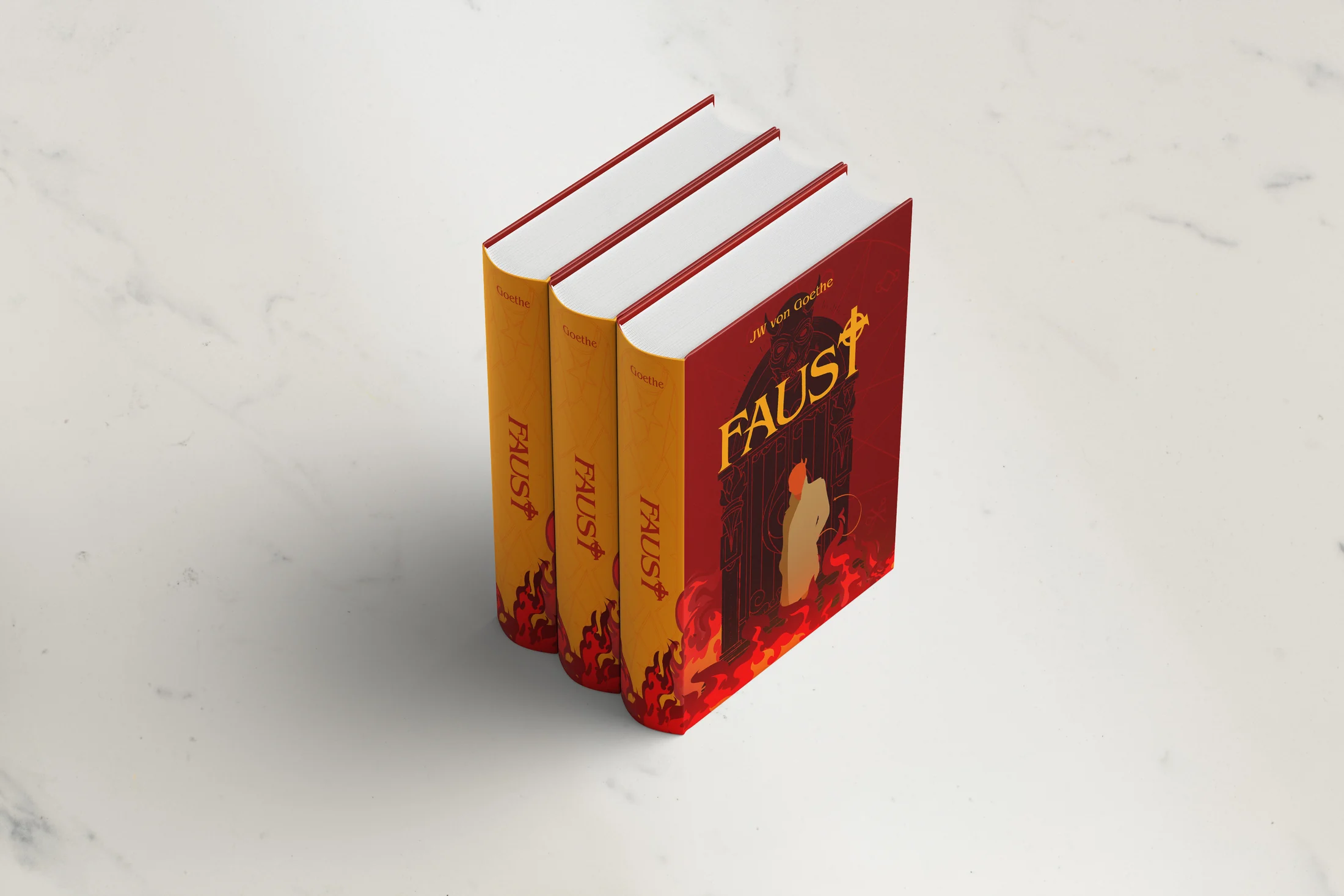
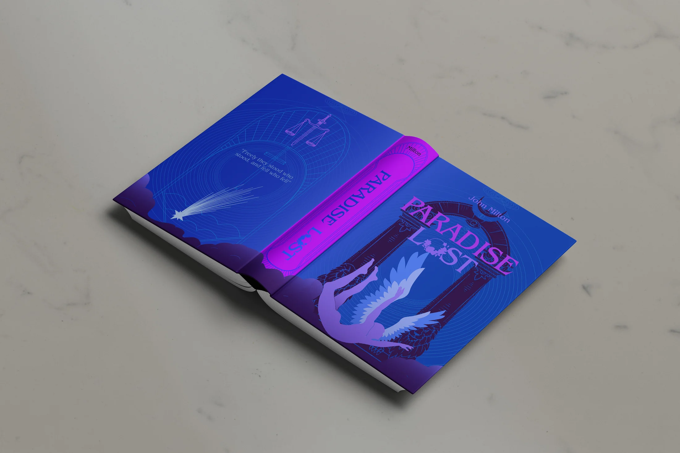
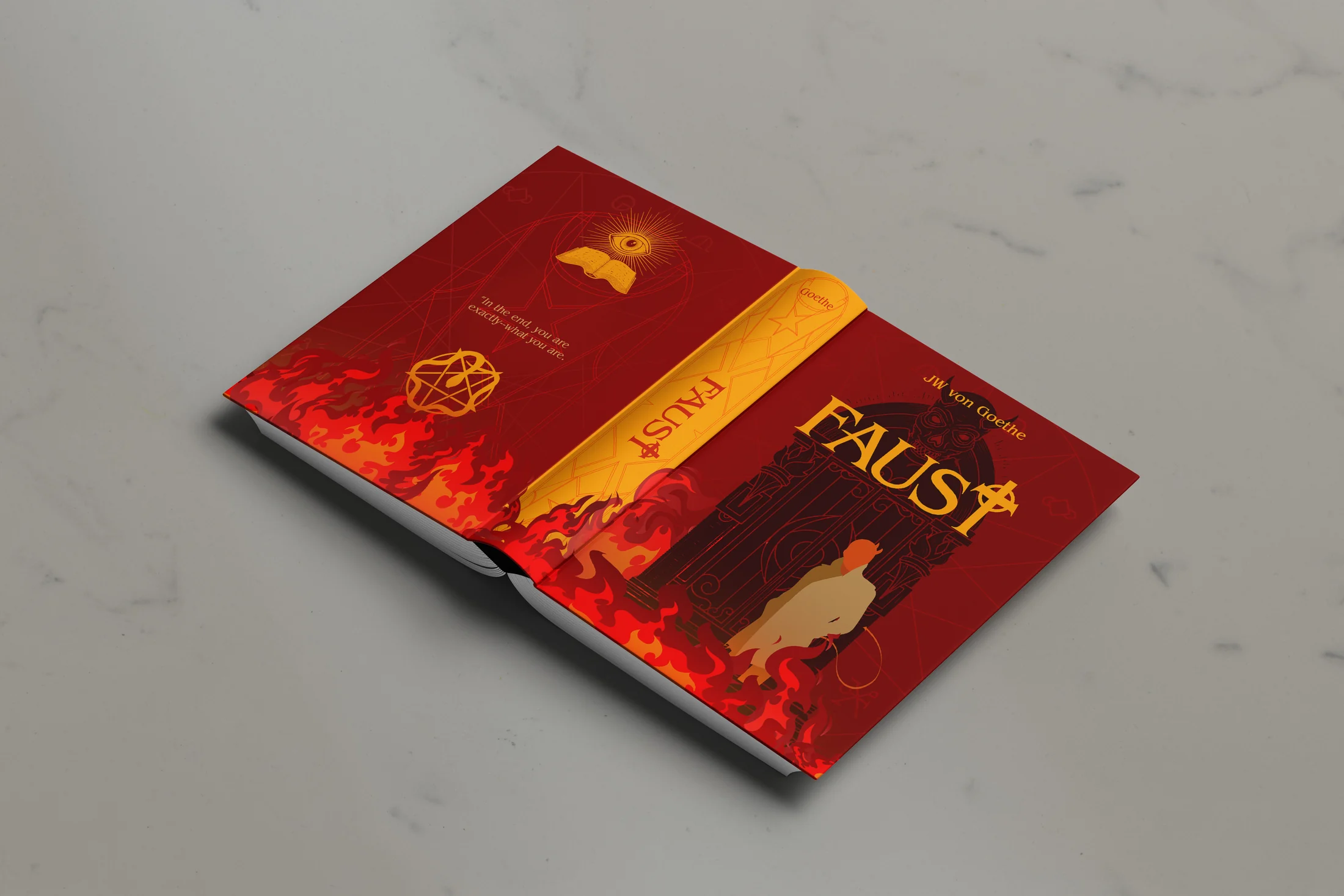
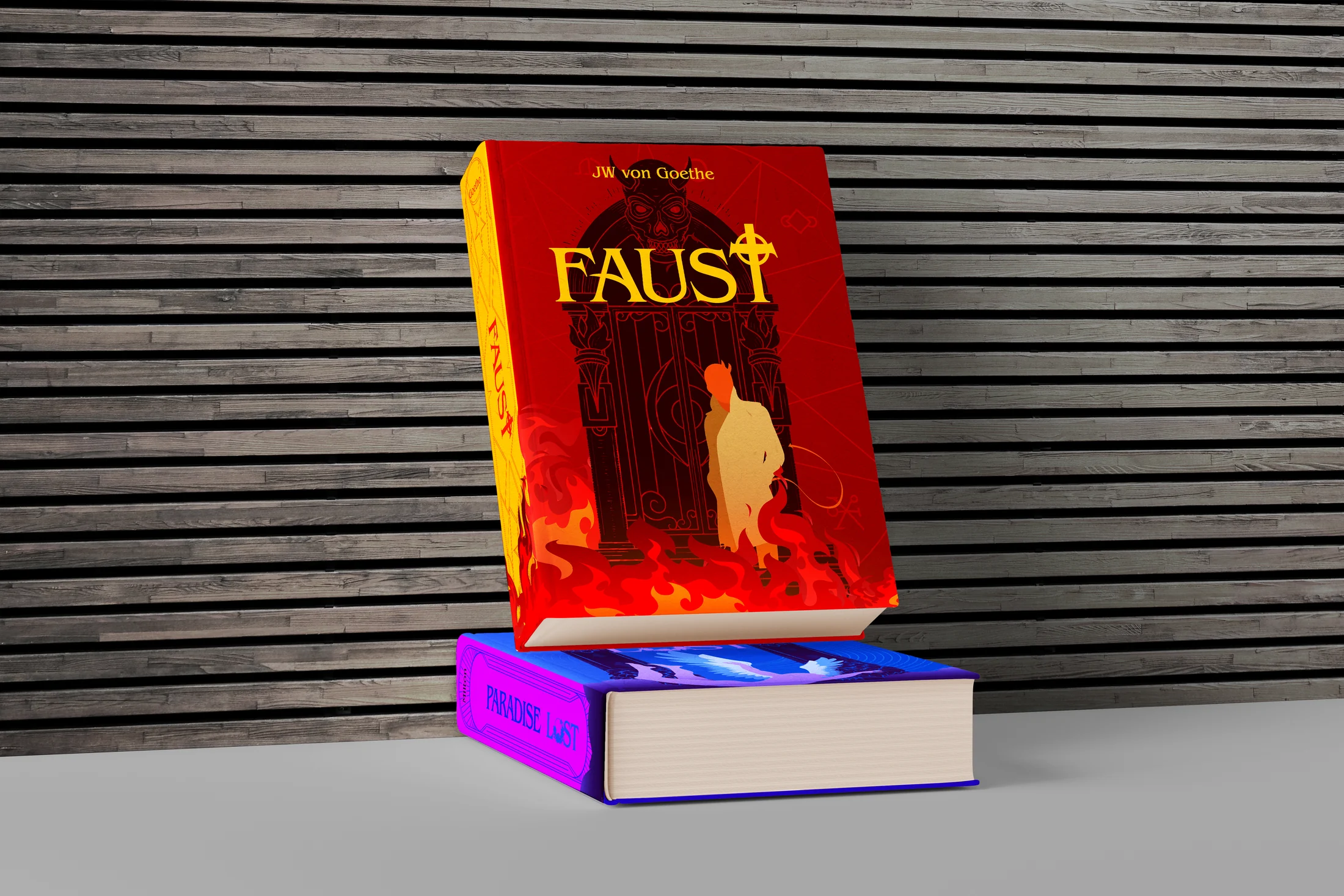
Faust and Paradise Lost were redesigned as a pair without flattening their different emotional worlds: Faust burns in red and orange, while Paradise Lost falls through blue and violet. Shared scale, typography, and physical mockups connect the books as one self-study.
Book-cover redesign
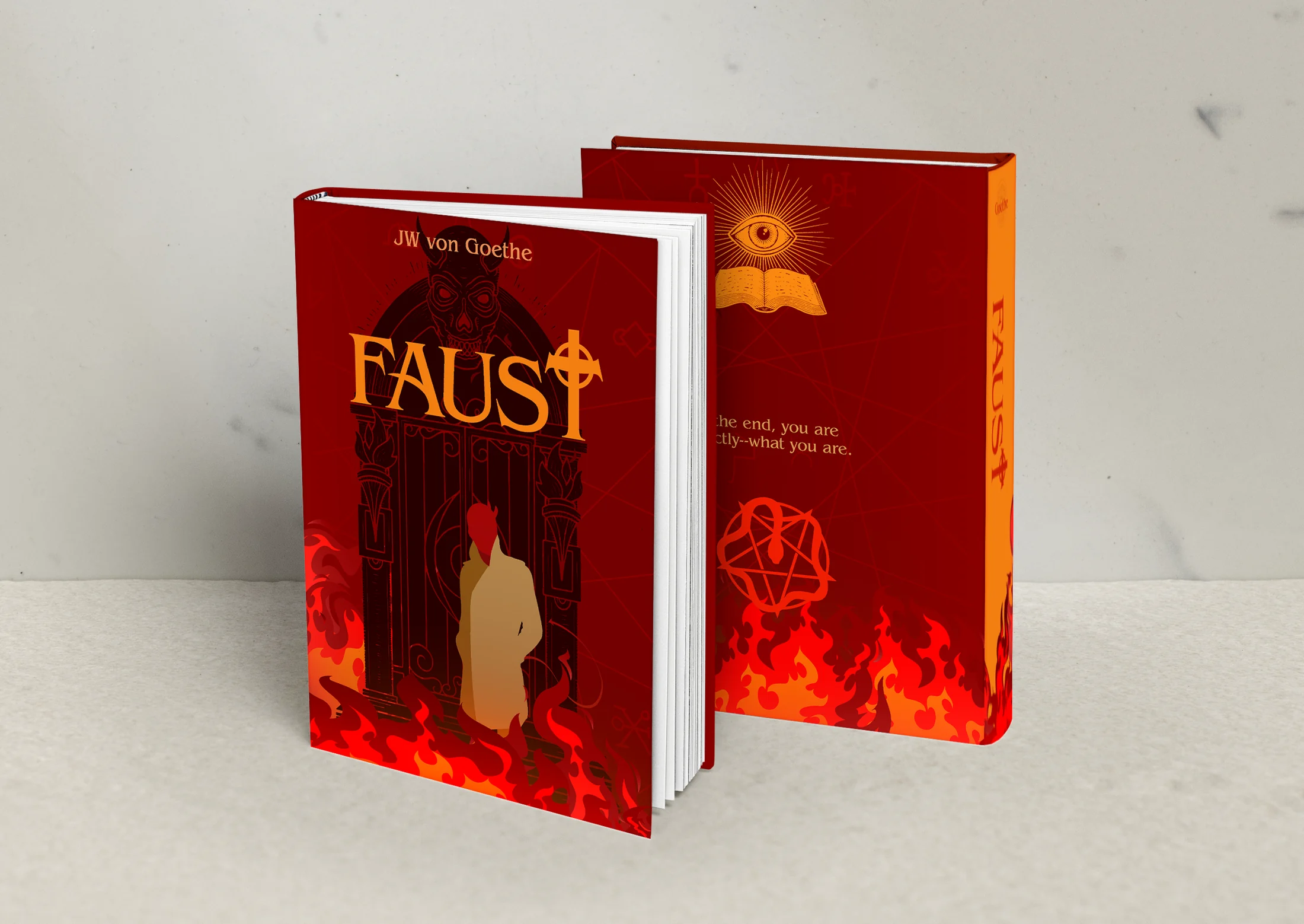
This began as a fun self-study and a test of my illustrative skills at the time. I redesigned cover sleeves for two of my favorite books, Faust and Paradise Lost, treating them as a related pair while giving each story its own atmosphere.
For Faust, a hot red-orange field and a small central figure create tension between temptation and consequence. Paradise Lost moves into blue and violet, using a falling figure and colder space to shift the emotional register. The shared typography, scale, and mockup language keep the two books connected.
The study goes beyond a flat cover. Spines, back covers, hardback wraps, paired displays, and multiple editions show how each illustration behaves as a physical book.
Print, information, and identity studies
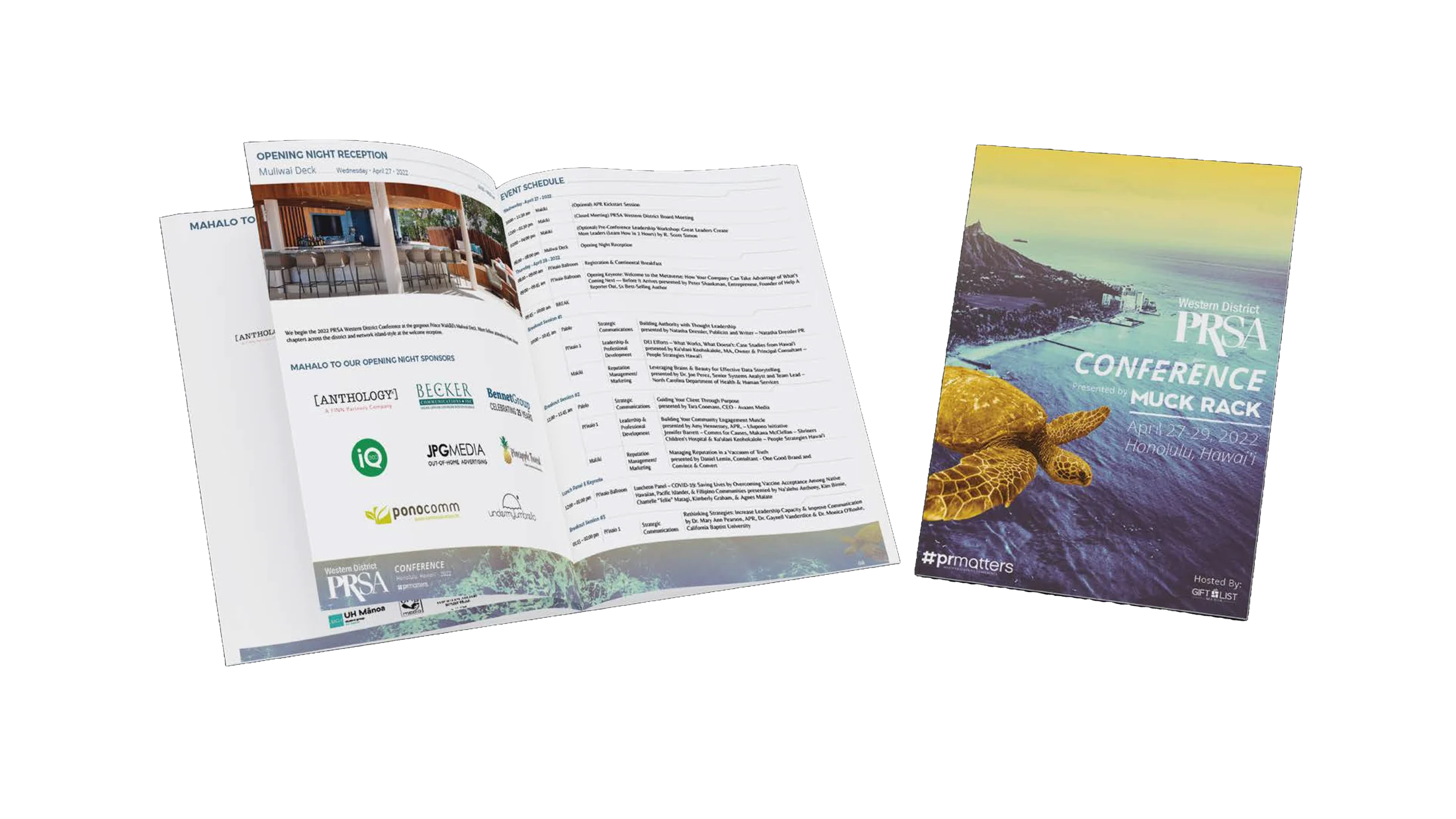
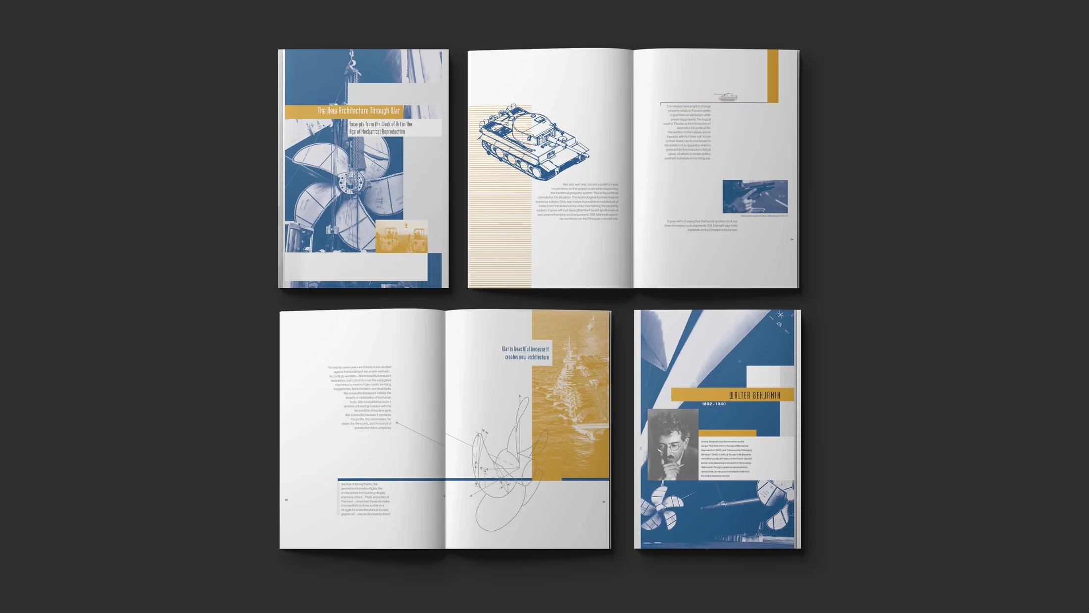
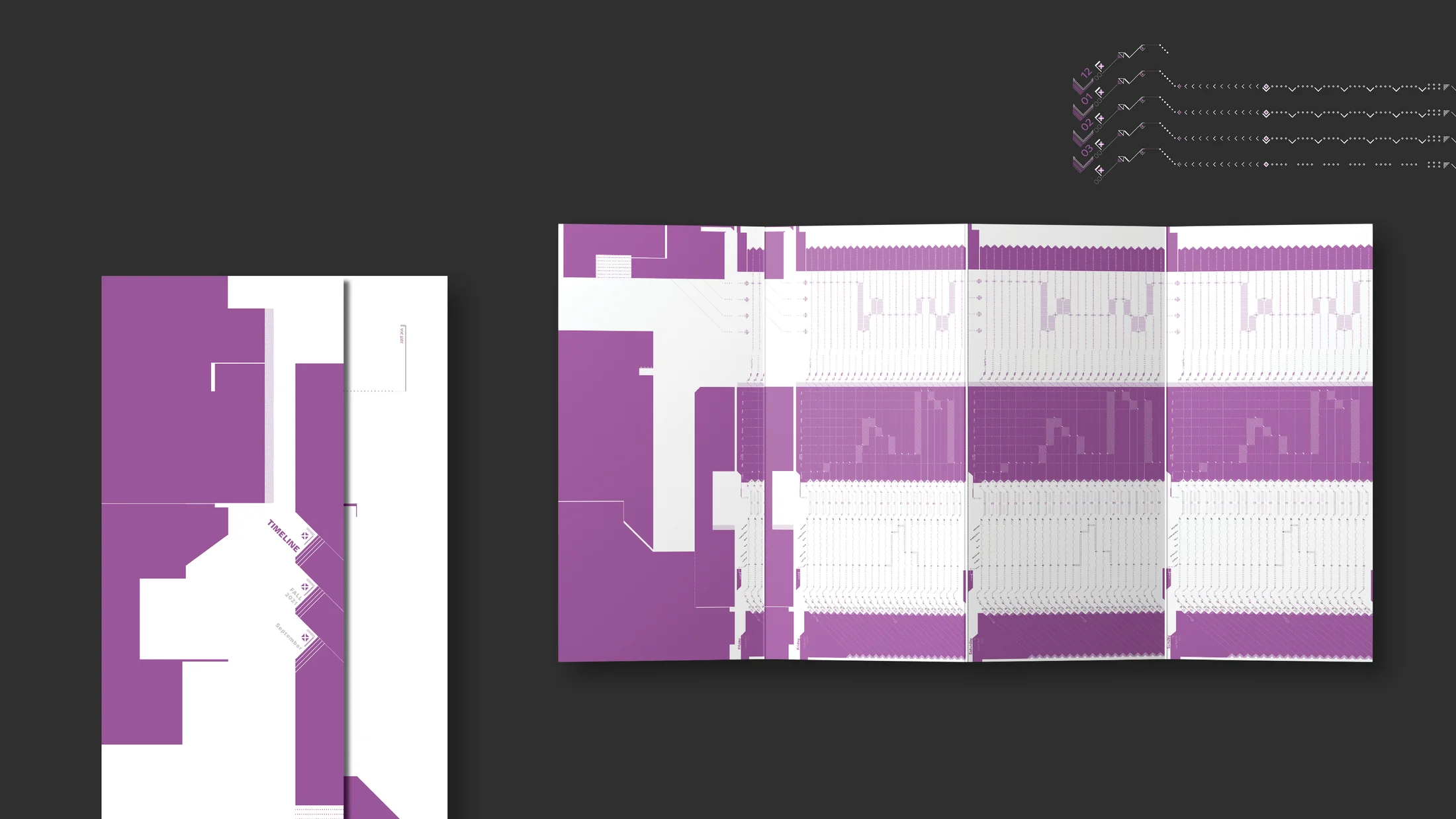
The larger archive gathers independent posters, booklets, chart studies, print advertisements, and other earlier work. Some pieces are quick formal exercises; others became public-facing outcomes in magazines, newspapers, and exhibition spaces.
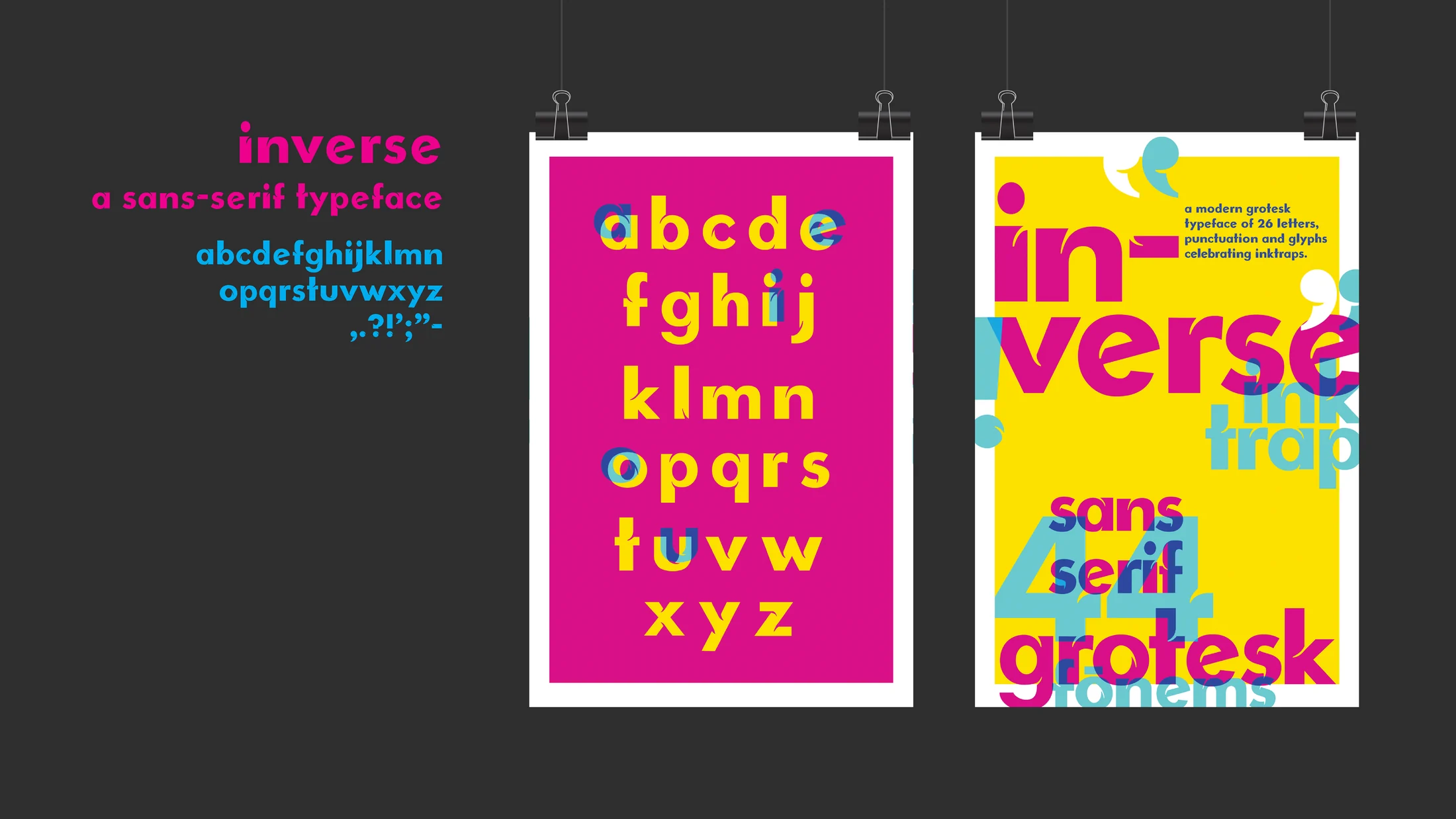
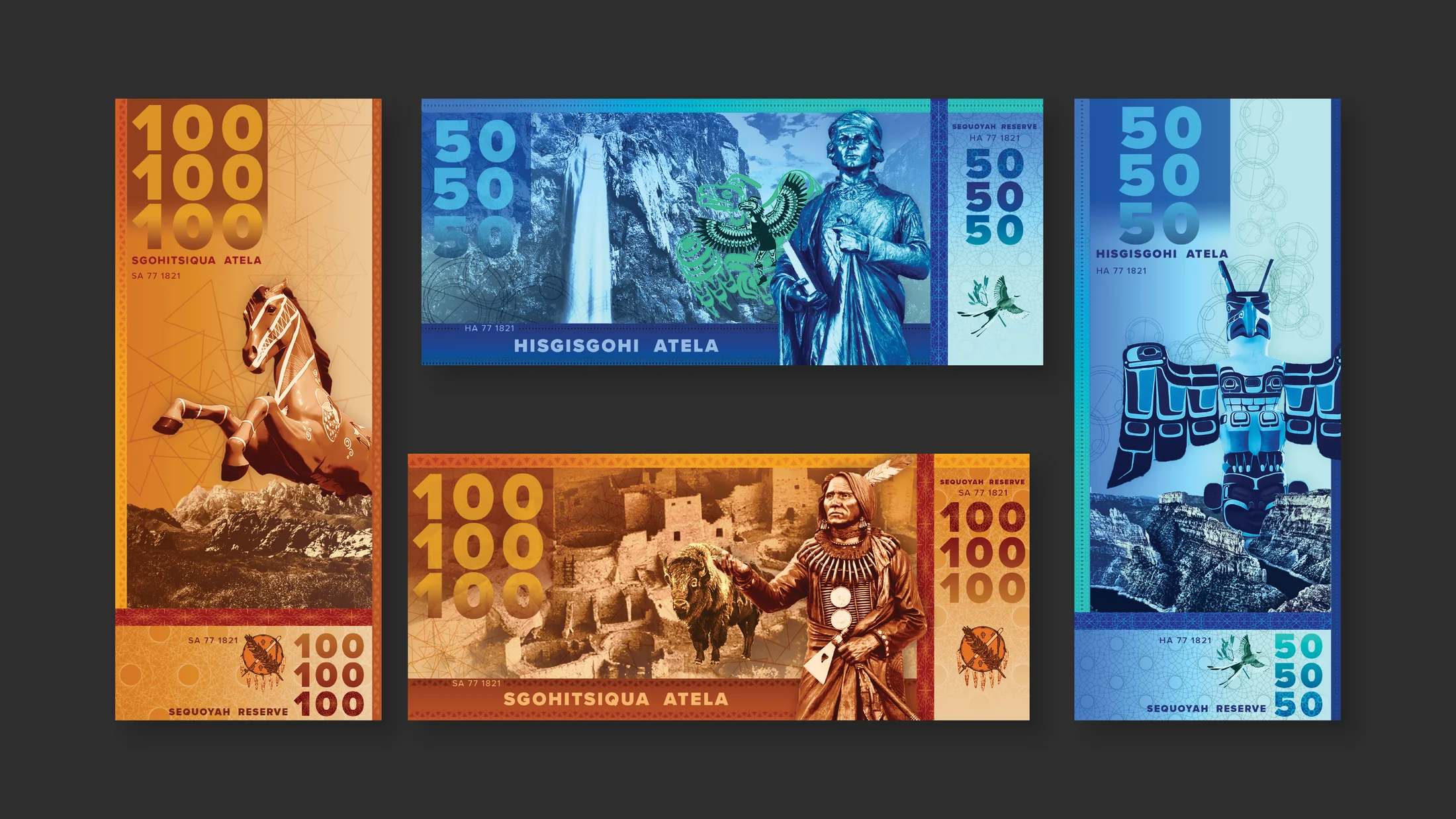
One type study draws from Futura and from ink traps used before modern printing techniques. Instead of hiding those practical cuts, the design enlarges them until they become the defining visual feature. A fictional currency project takes a different approach, using denomination, pattern, portraiture, and national symbolism to build a coherent system for an imagined nation-state.
Published and installed work
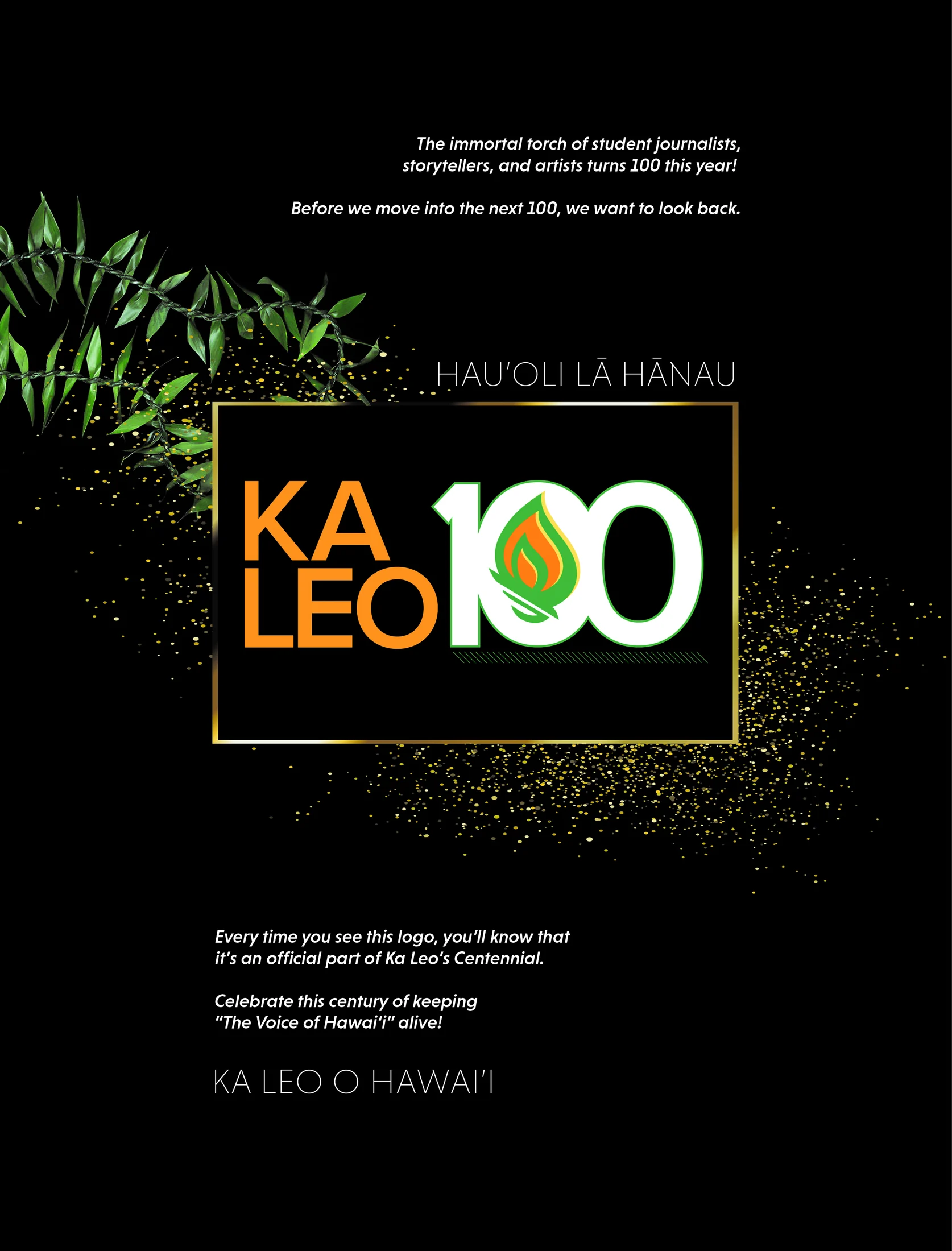
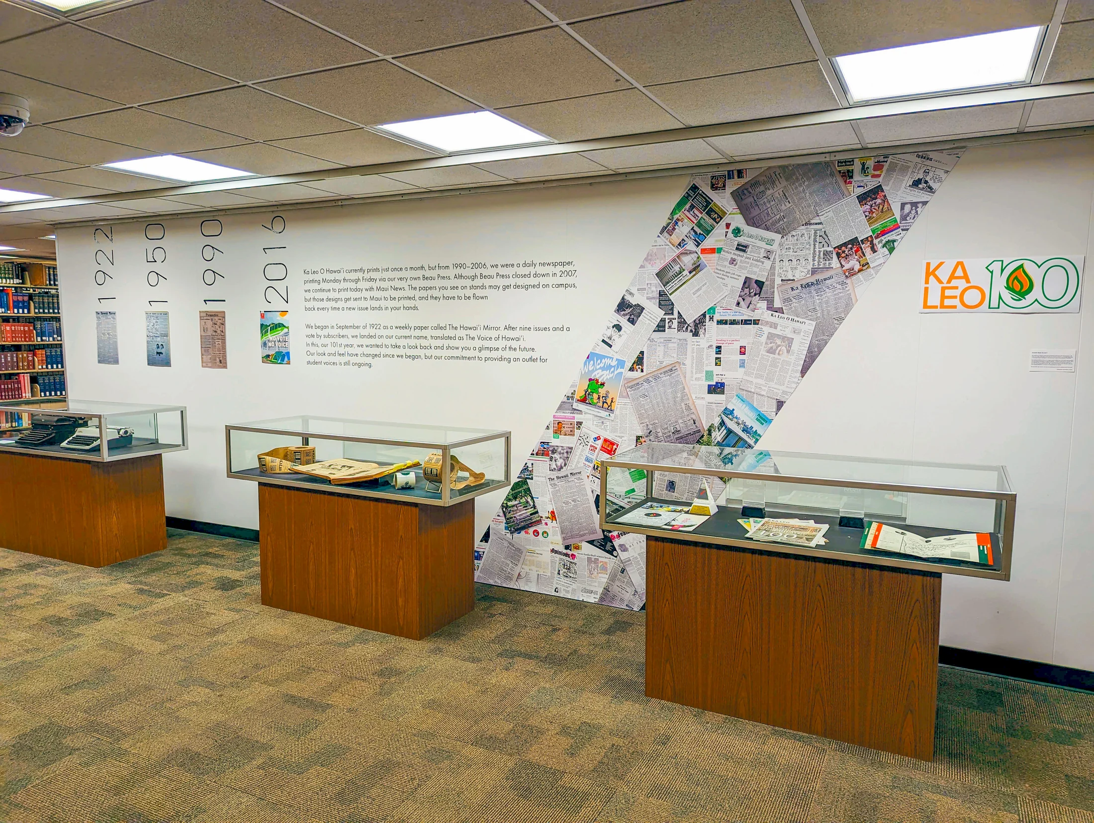
The Ka Leo centennial work demonstrates how a compact printed advertisement can expand into a spatial experience. The advertisement, exhibition graphics, and physical installation share a visual language while adapting to very different scales.
Together these projects document a period of experimentation: learning how typography, illustration, information, material, and format can each carry a story.
Image archive
16 selected visual moments
Related work
Continue through the archive
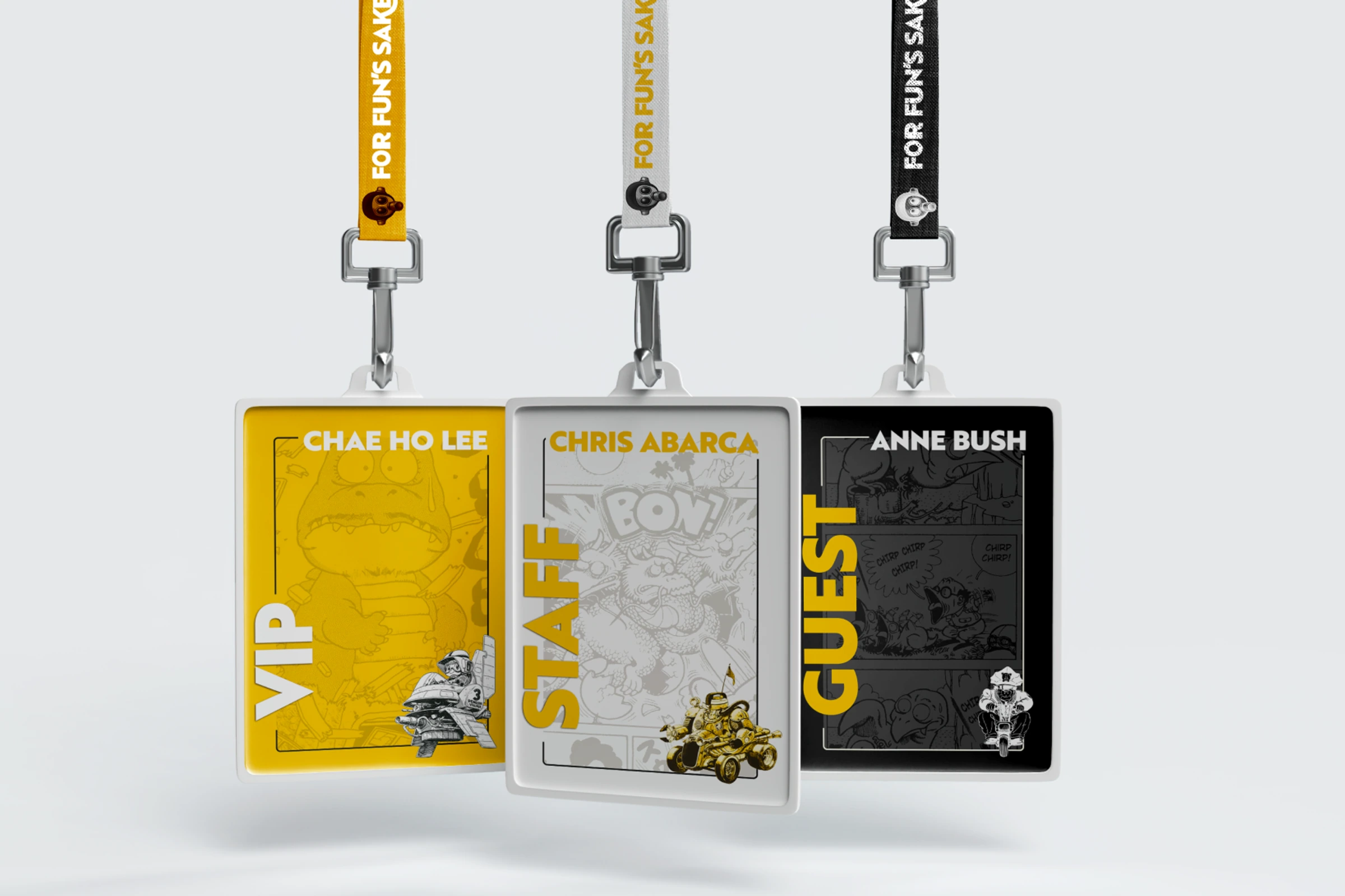
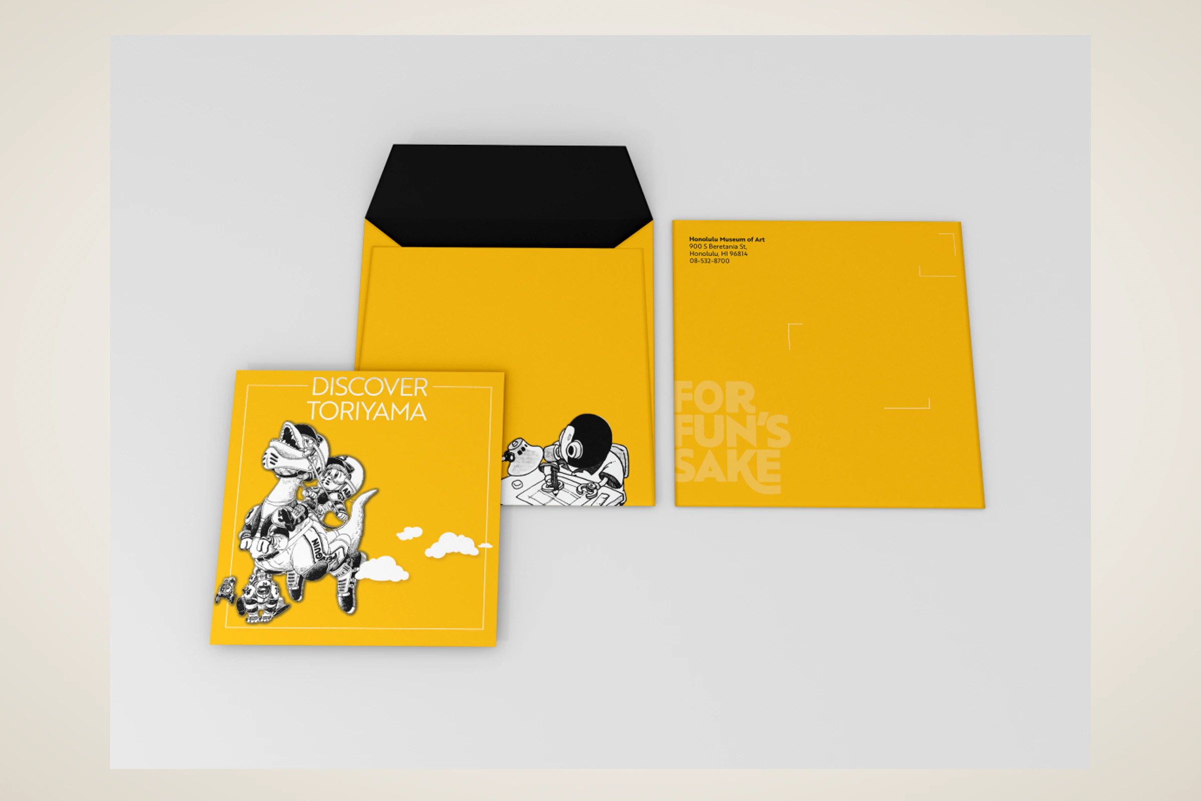
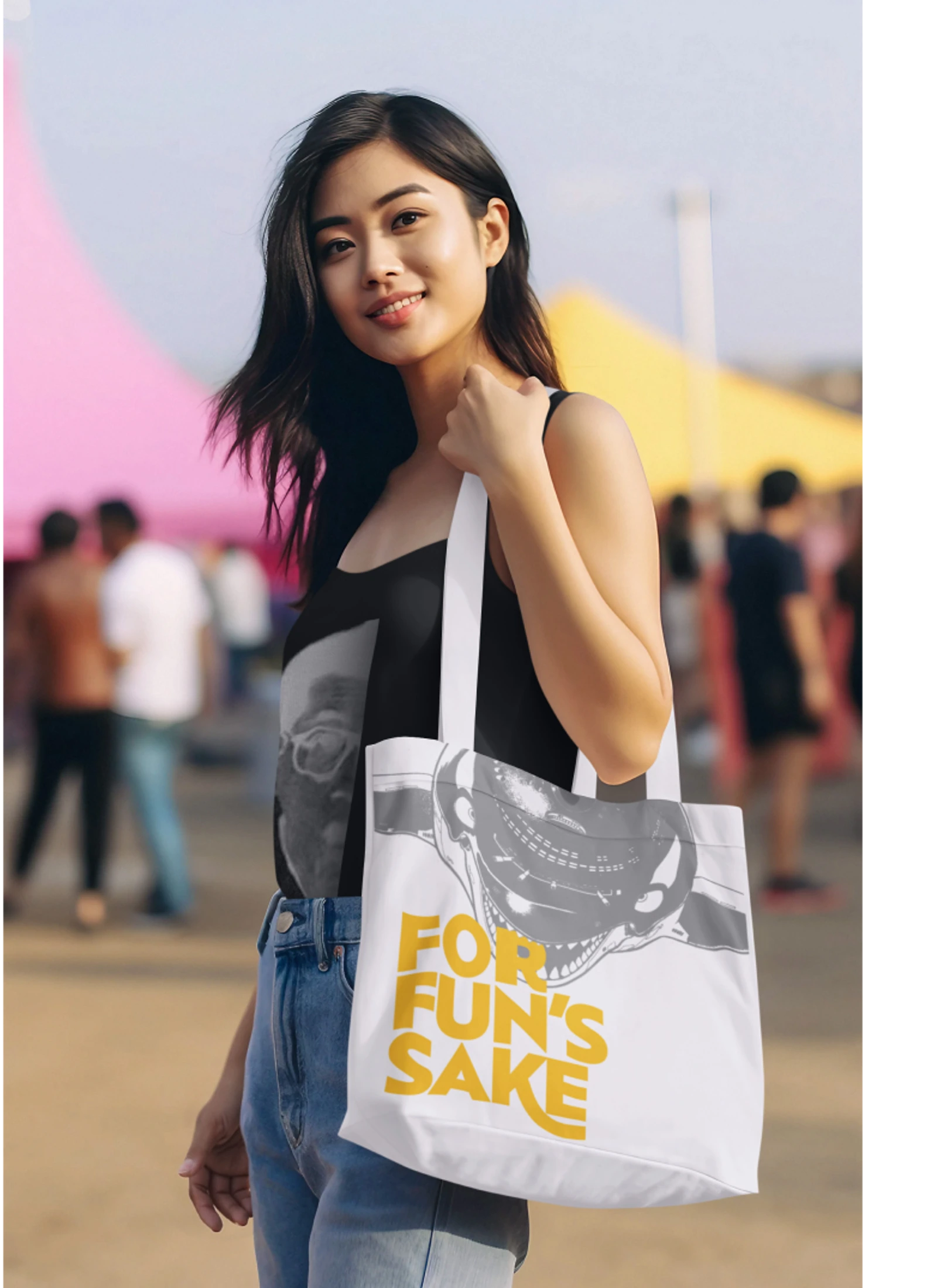
Toriyama Early Works Exhibition
A self-initiated exhibition concept for Akira Toriyama's early work, using a strict black, white, and gold palette to build a coordinated visitor campaign.
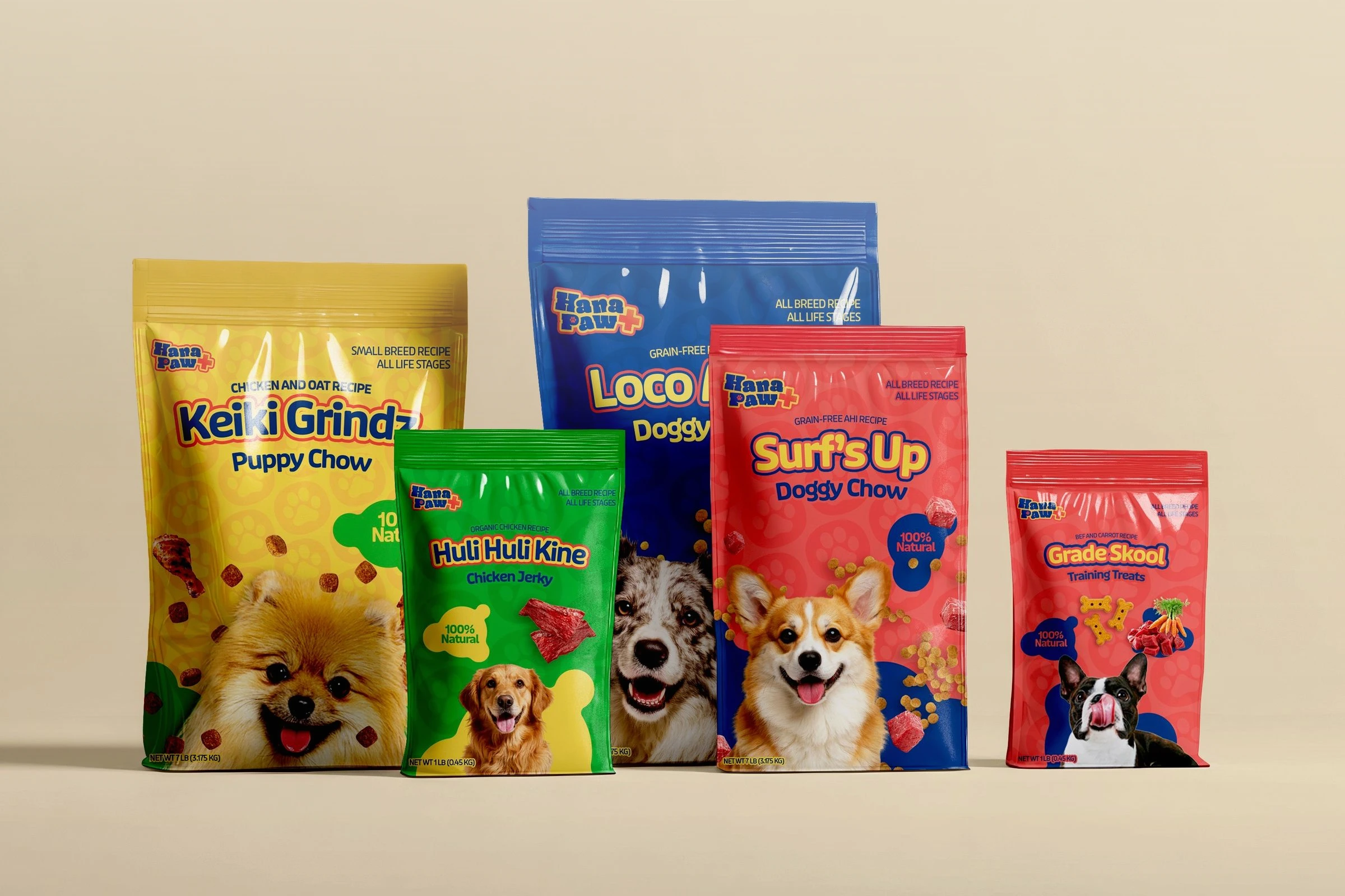
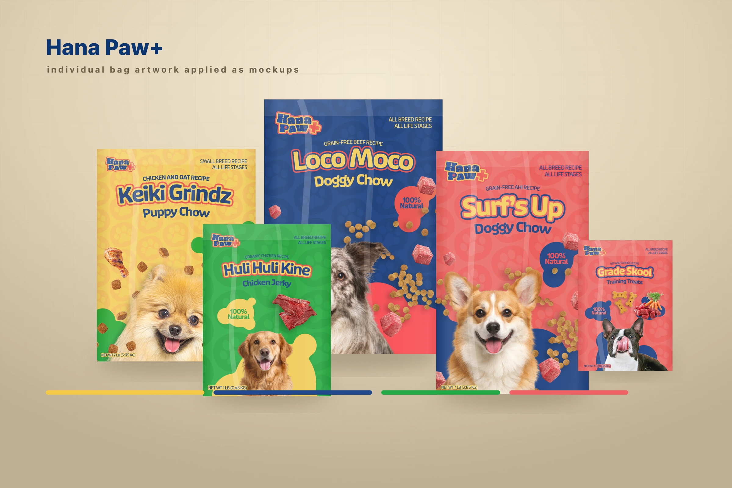
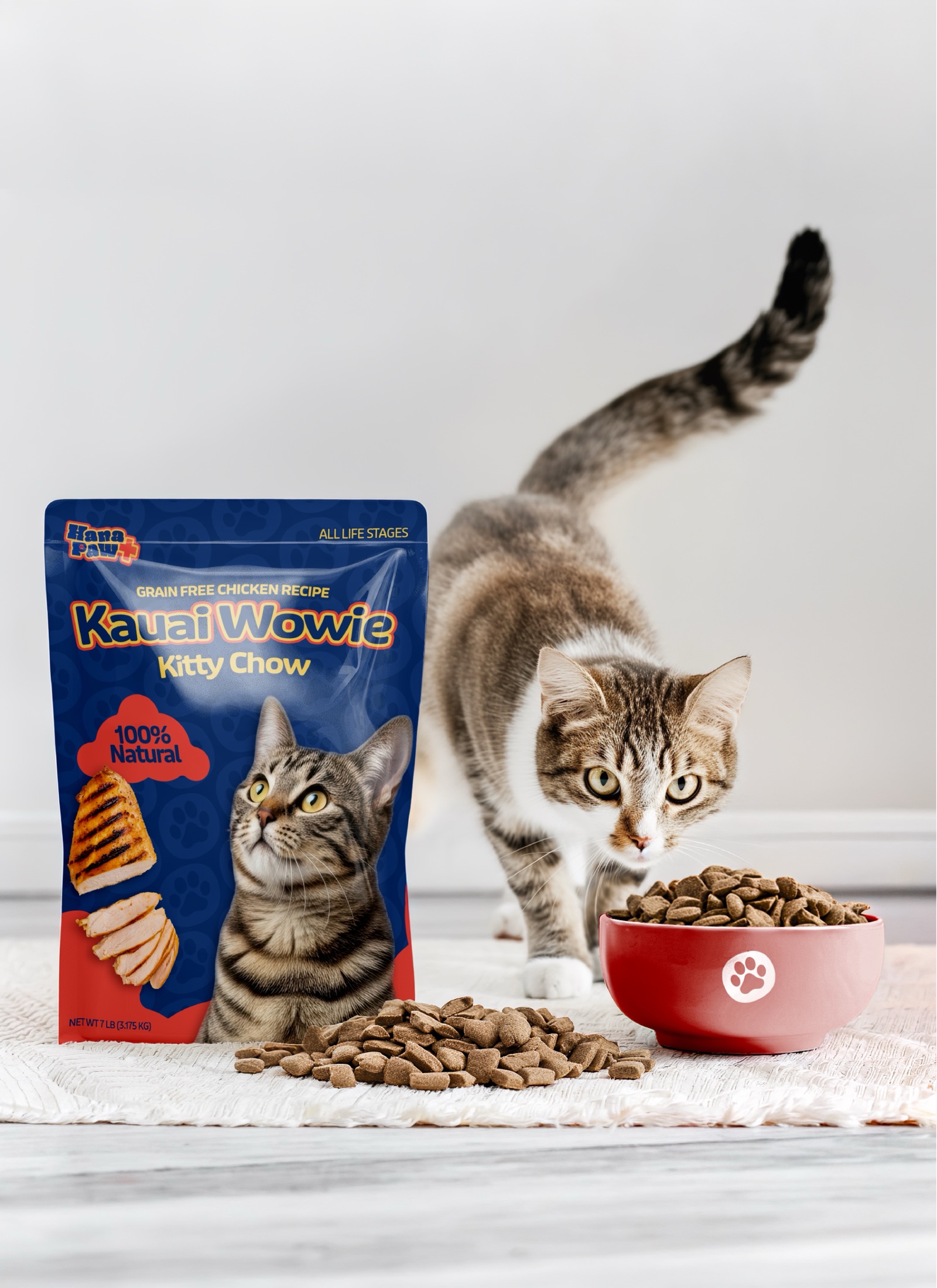
Hana Paw Pet Goods
A client pet-products idea I led through positioning, naming and trademark pitches, identity, packaging, factory development, and a broader retail family.