2024-2026 / Packaging / Identity / Art Direction
Island Living Eco Goods
An end-to-end client brand program that turned a broad product idea into an affordable Hawaii eco-goods line.
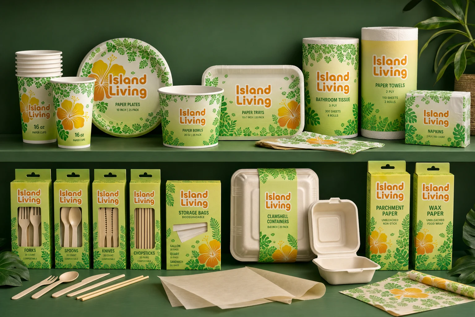
Brand direction, naming, identity, packaging, and production development
Island Living
Client brand development
Positioning, naming pitches, identity, packaging, and factory coordination
Packaging, Brand system, Product photography
Hawaii
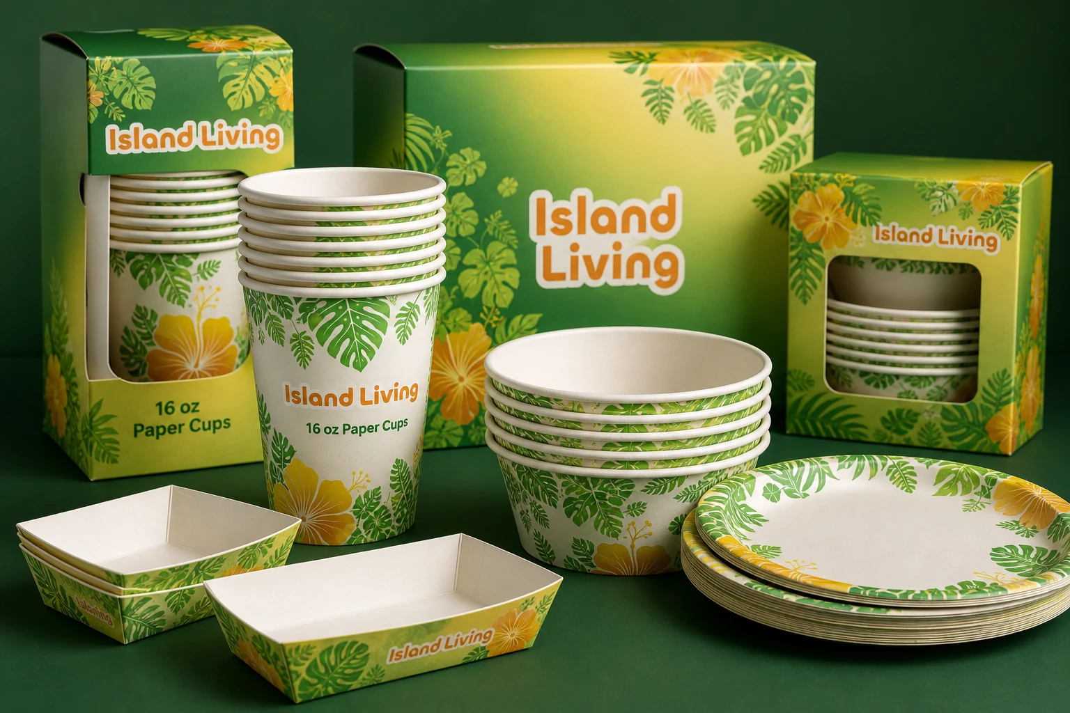
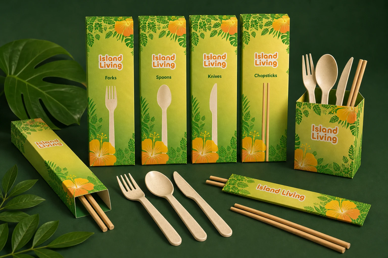
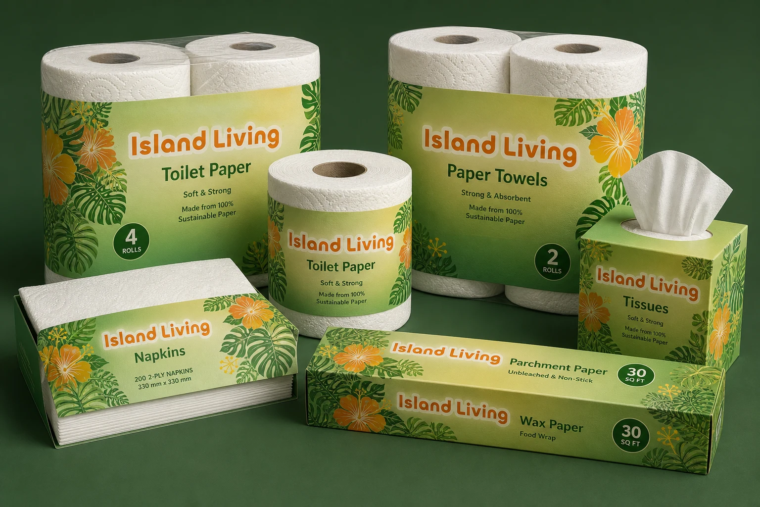
Packaging direction
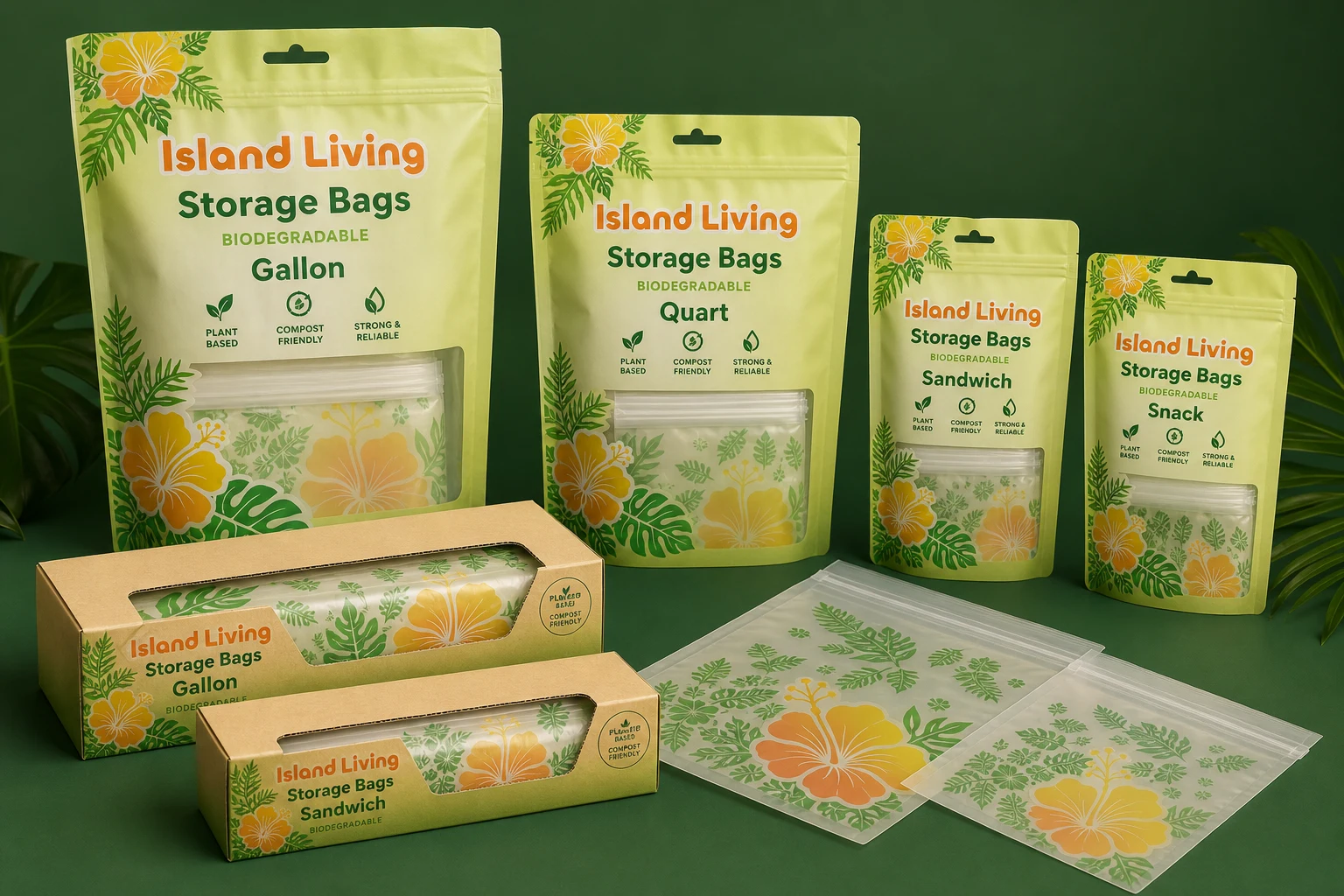
The system turns familiar eco cues into a brighter Hawaii retail presence.
The direction keeps the product line easy to recognize as sustainable while moving beyond beige, generic eco packaging through rich greens, tropical plant forms, and yellow-to-orange warmth.
Brief
The client came to me with a broad idea to make a new product line. I led the direction toward an affordable eco brand rather than another general household-goods brand, then developed and pitched naming directions for trademark review, built the identity and packaging system, and worked directly with the client and factory to develop the physical line.
Concept
The need was clear: Hawaii did not have a locally made eco goods line that felt accessible, useful, and visually connected to island living. I wanted the brand to balance two ideas: recognizable eco cues like greens, plants, and natural materials, and the feeling of bright sunny Hawaii days.
The wordmark was kept modern and legible, with small curves added to soften the blocked type and quietly reference the recycling triangle. That detail helped the identity feel more natural without losing the clarity of a practical retail brand.
System
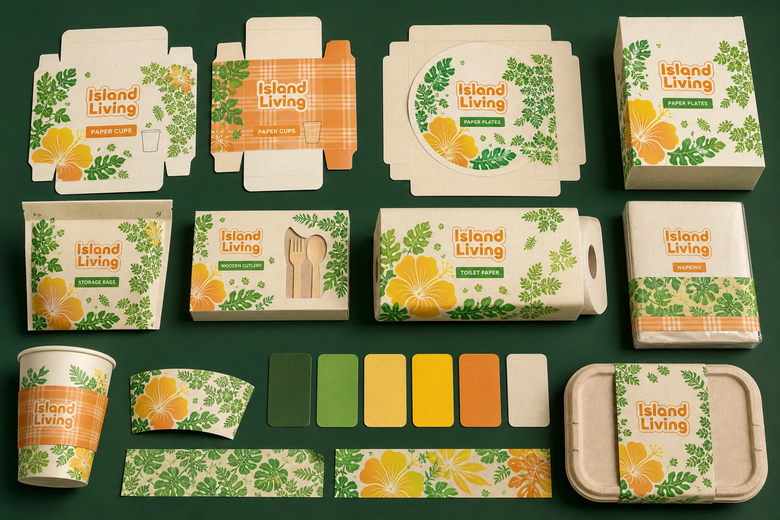
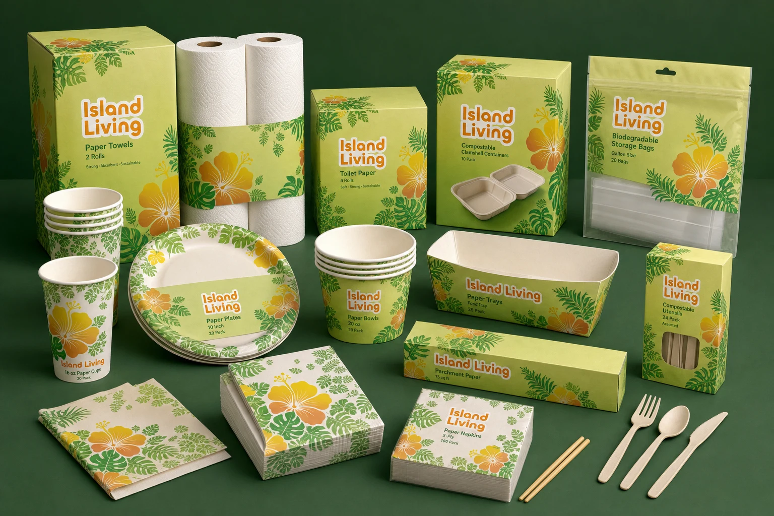
The packaging language centers native and familiar Hawaii plant forms: monstera leaves, banana leaves, hibiscus, and plumeria. Rich greens and vibrant green-to-yellow gradients own most of the visual field, while a bright yellow-to-burnt-orange focal point balances the product logo and gives the line a warmer shelf signal.
Outcome
The final direction gives the client a clear eco position and a flexible package system that can expand across cups, plates, bowls, trays, household paper, storage bags, cutlery, and compostable containers while still feeling local, recognizable, and affordable.
Image archive
6 selected visual moments
Related work
Continue through the archive
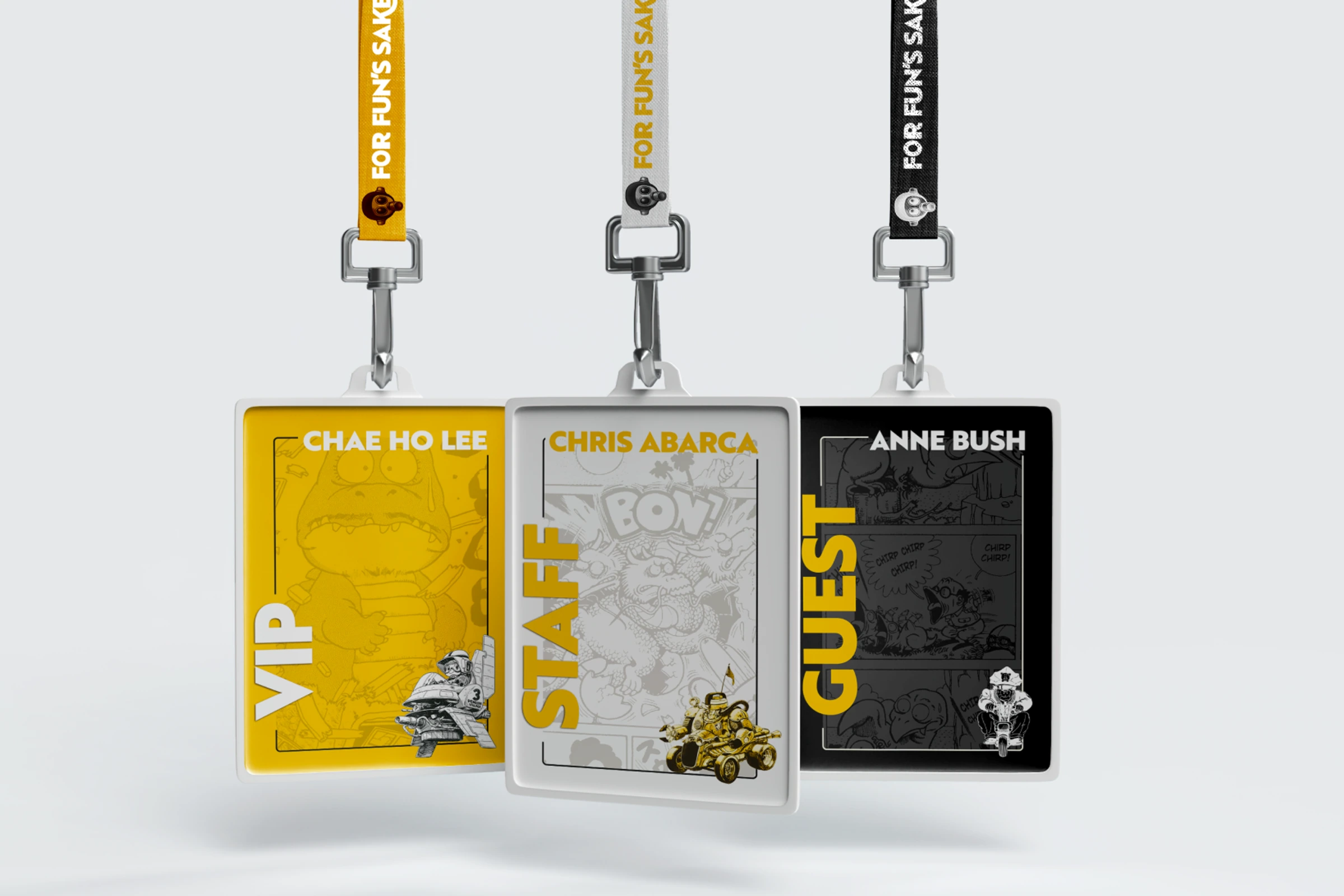
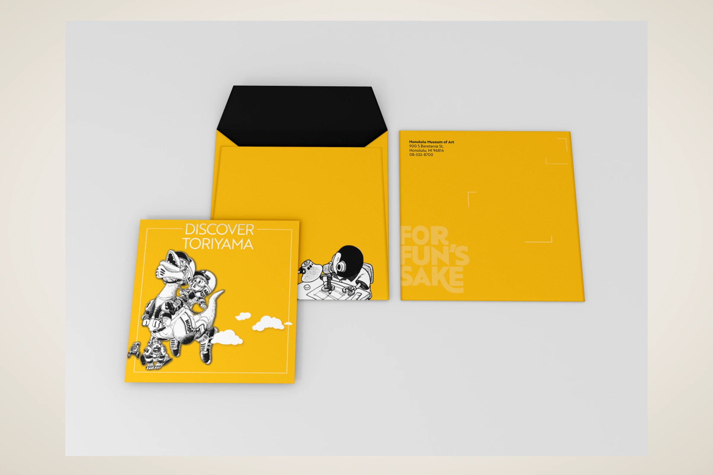
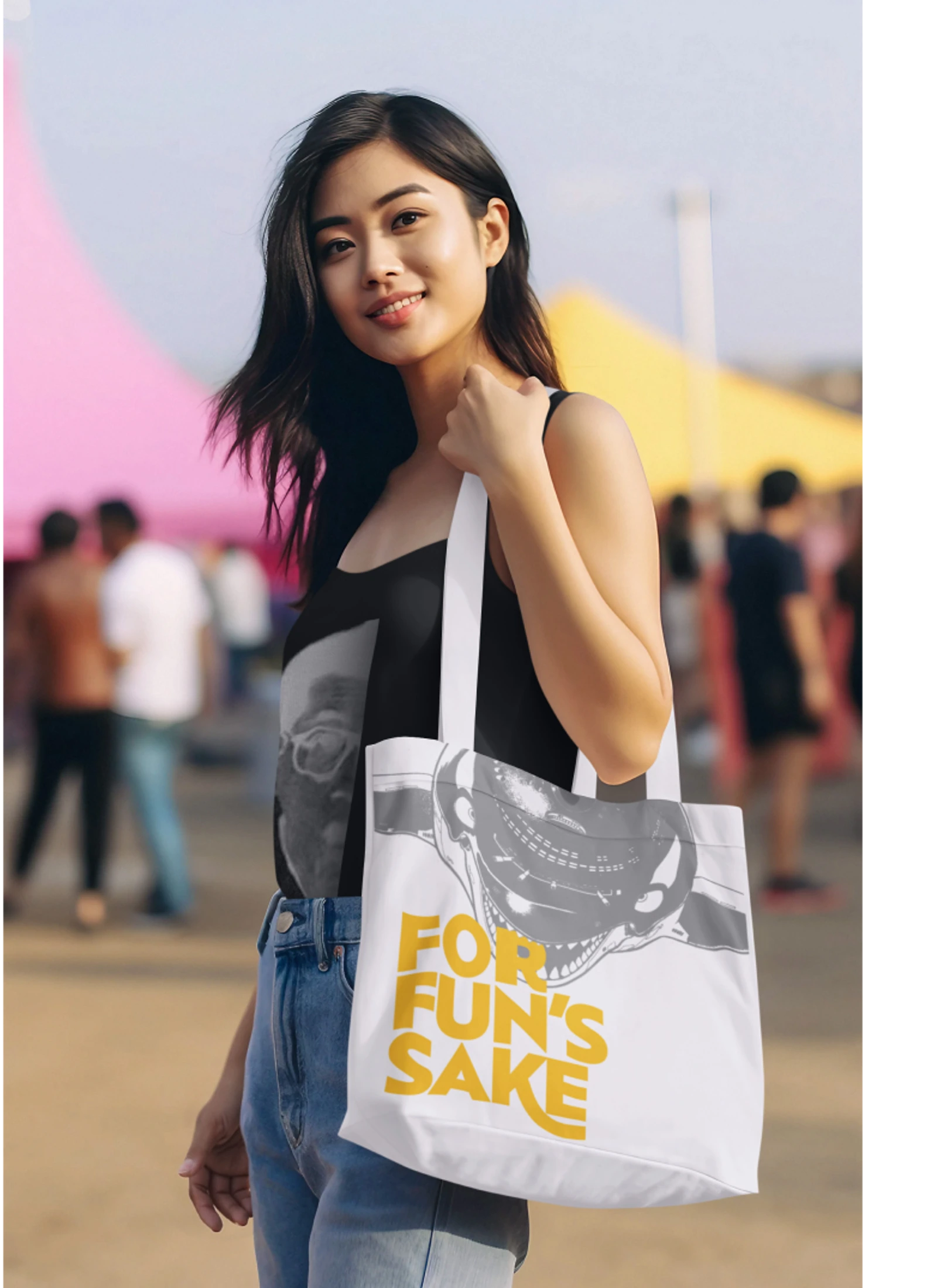
Toriyama Early Works Exhibition
A self-initiated exhibition concept for Akira Toriyama's early work, using a strict black, white, and gold palette to build a coordinated visitor campaign.
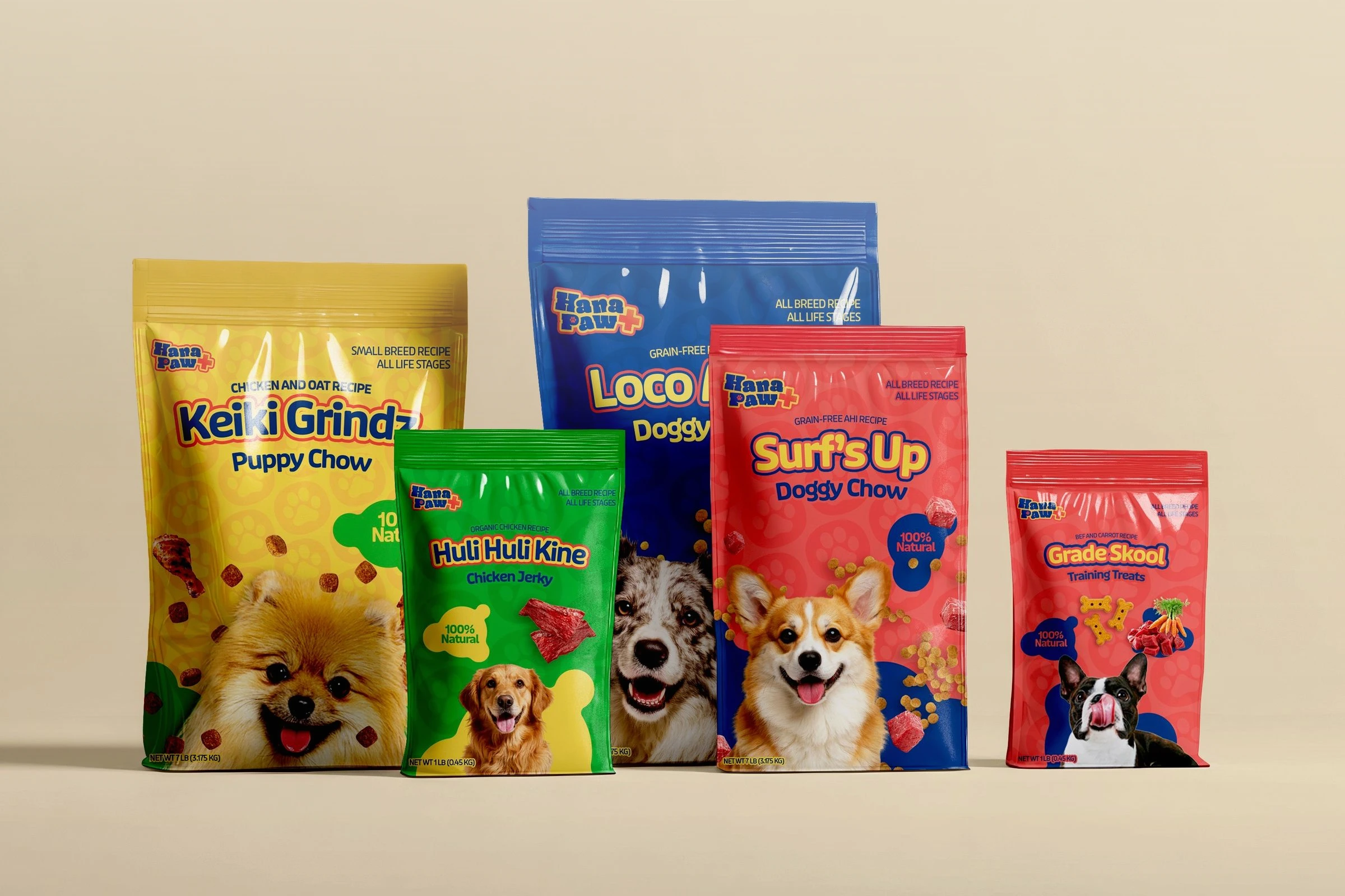
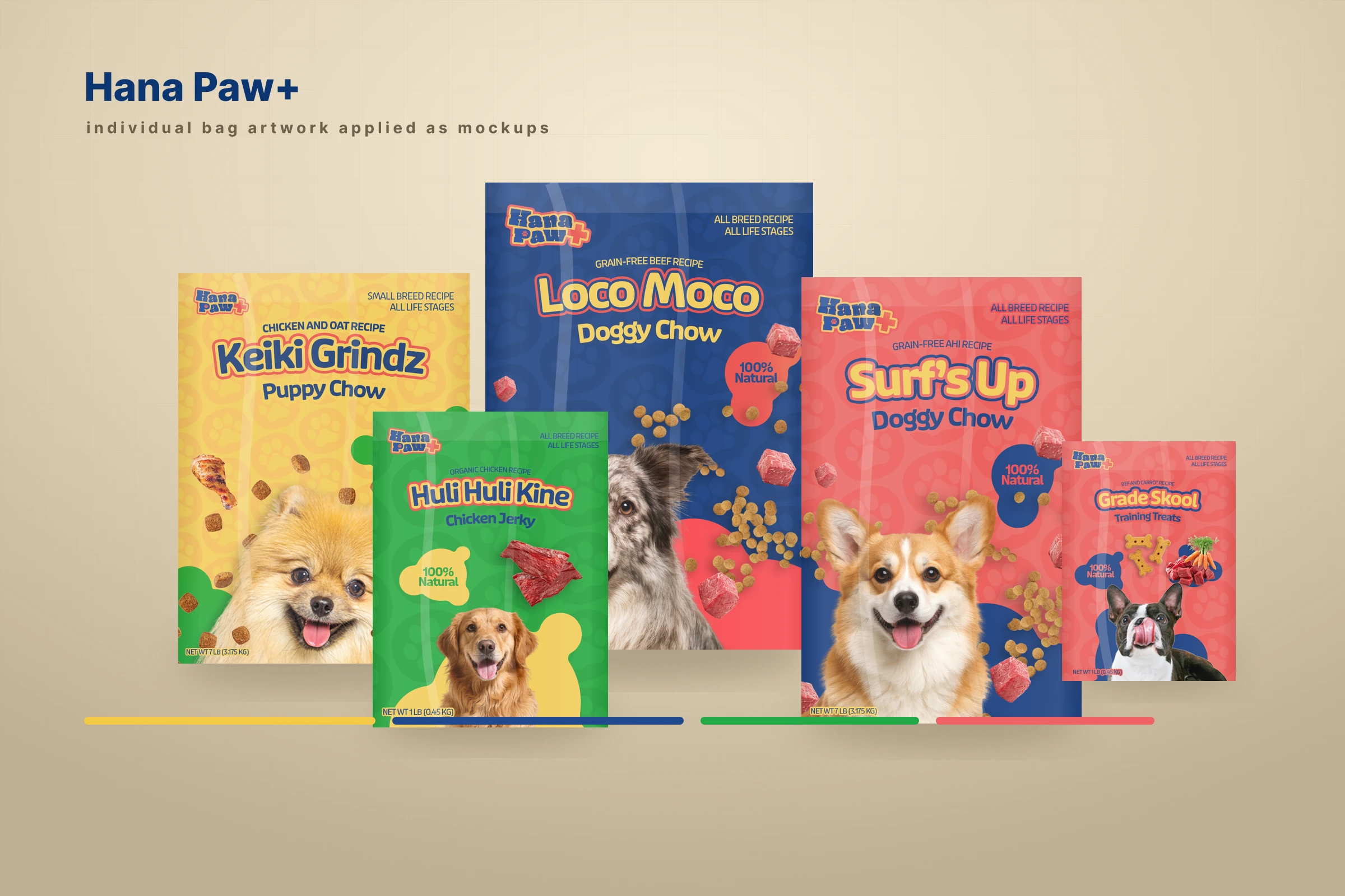
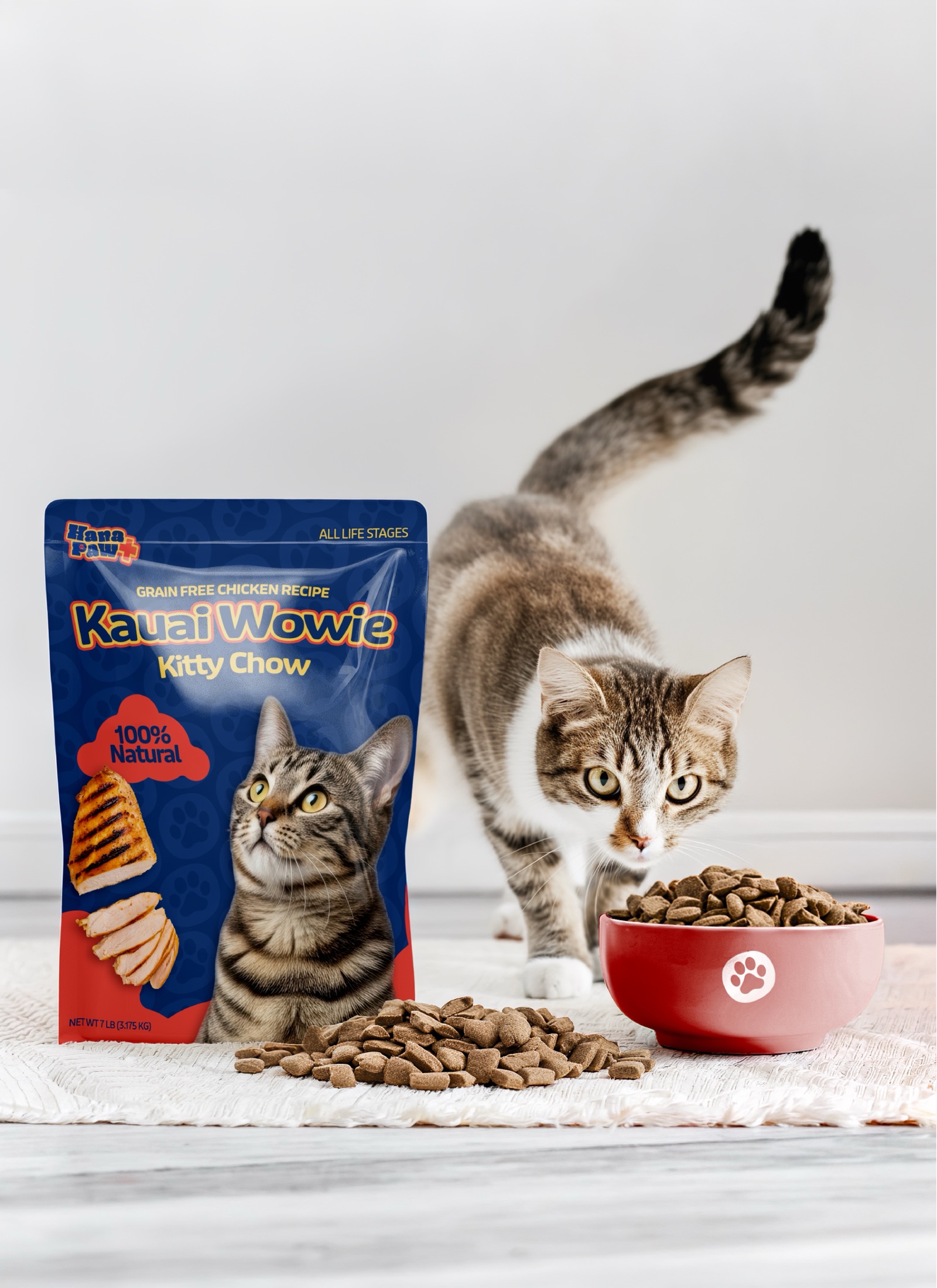
Hana Paw Pet Goods
A client pet-products idea I led through positioning, naming and trademark pitches, identity, packaging, factory development, and a broader retail family.