2018-2023 / Identity / Campaign / App
Manoa Now Identity
A student media and program rebuild that grew from hands-on design into creative leadership, team management, app growth, events, and a stronger financial position.
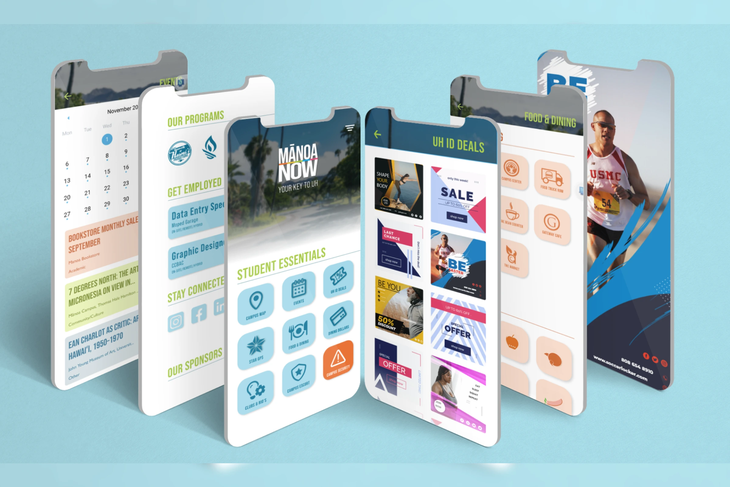
Graphic Designer to Program Manager
Manoa Now / UH Student Media
Launched brand and program rebuild
Identity, app growth, campaigns, events, revenue, and teams of 5-35
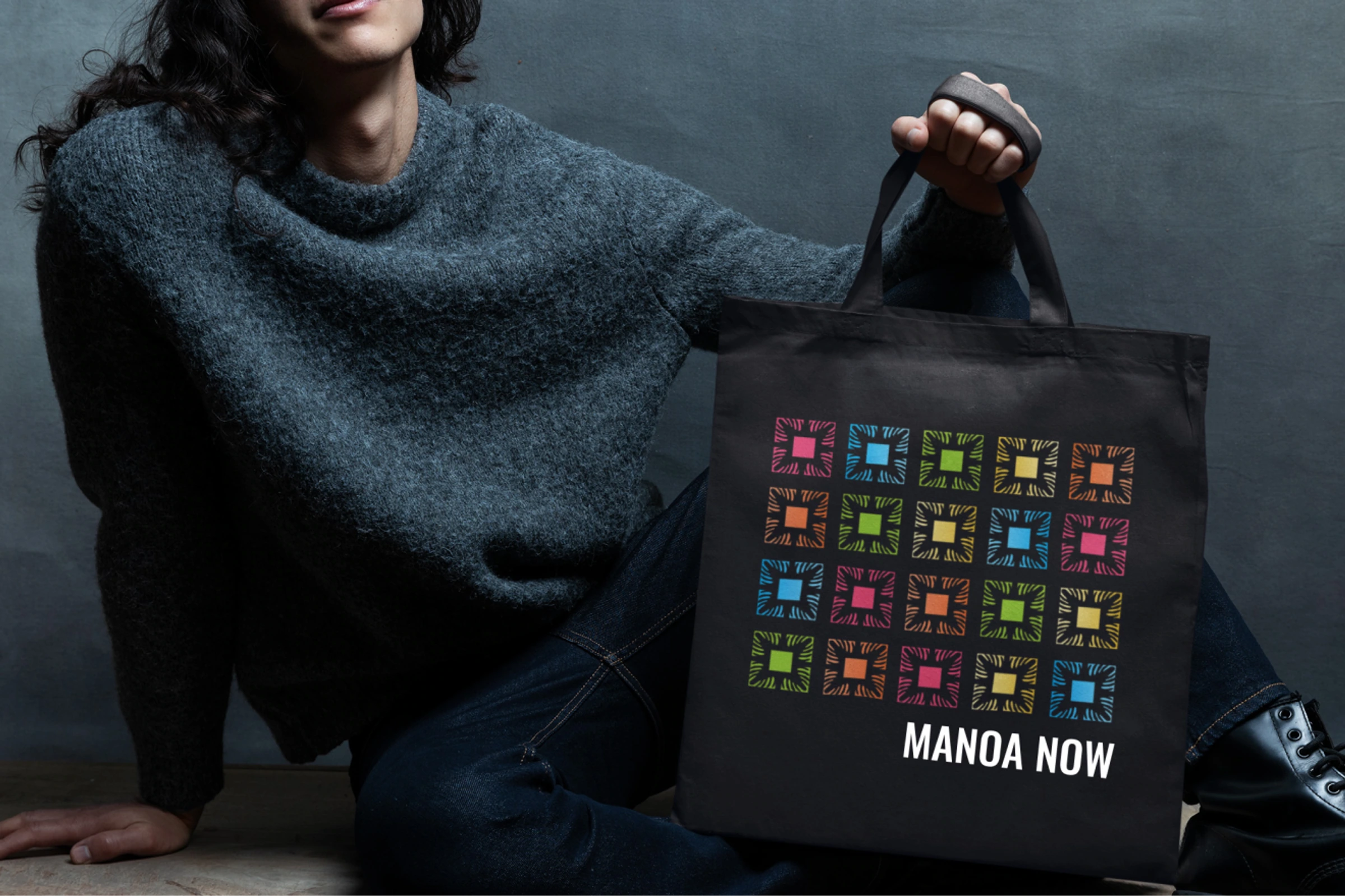
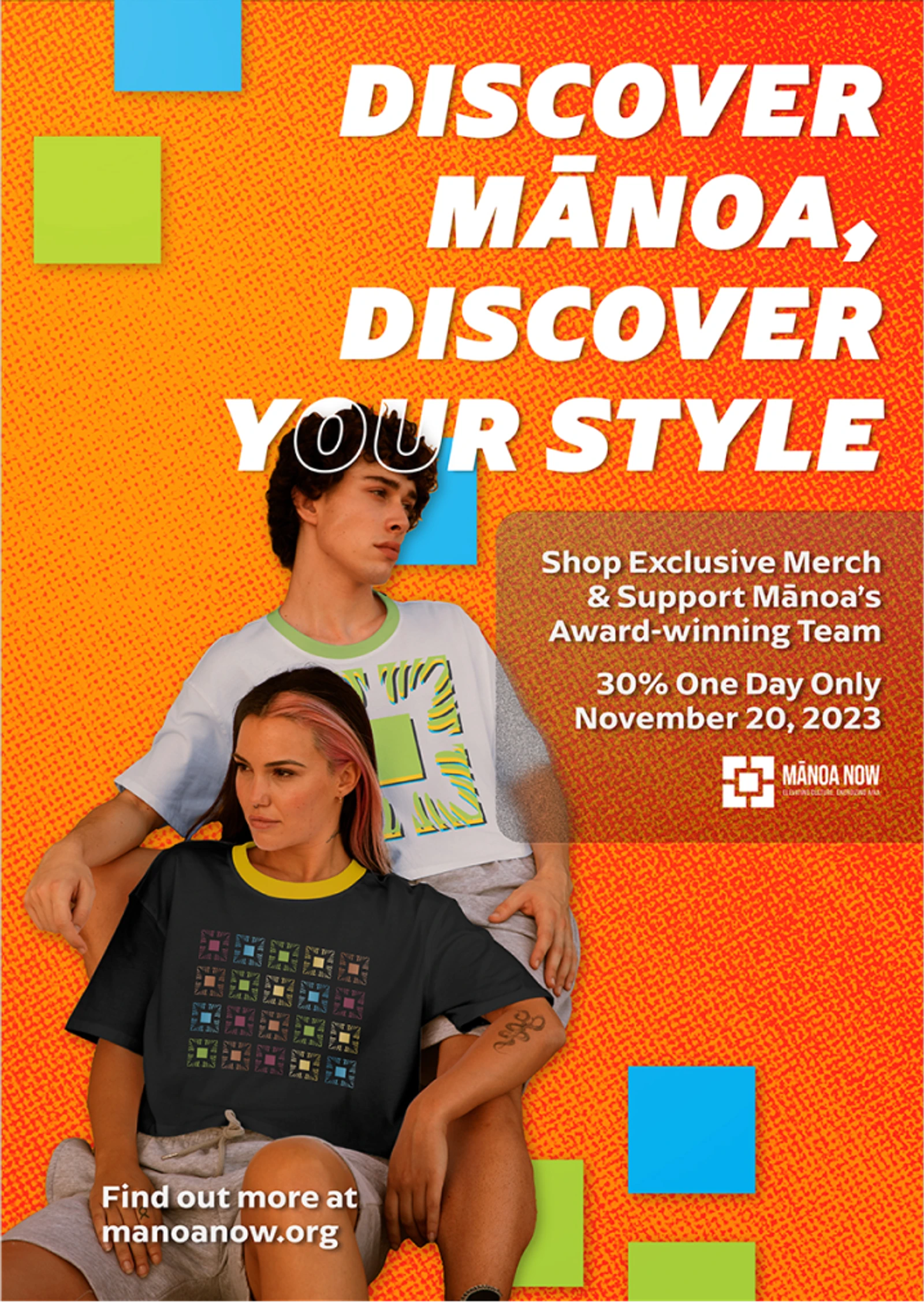
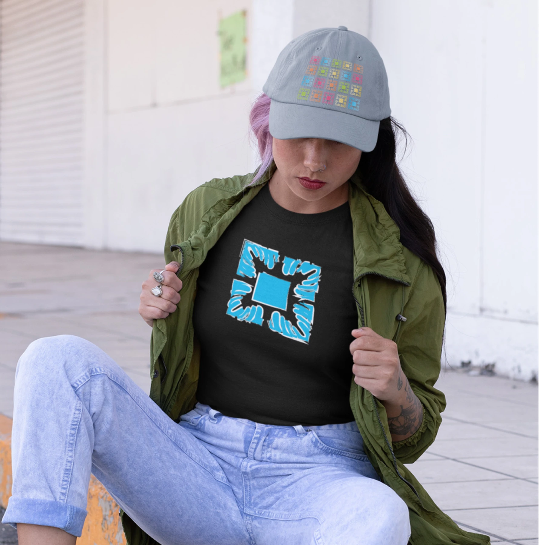
Brand system, Merchandise, Print and digital ads, App interface
Honolulu
Growth through leadership
The work grew from rebuilding the identity into rebuilding how the program reached people and operated.
I started as a graphic designer in 2018 and advanced through design lead, design and marketing lead, and program manager roles. Along the way, I led teams ranging from 5 to 35 people and connected the app, media programs, merchandise, events, and student-facing materials into one stronger public presence.
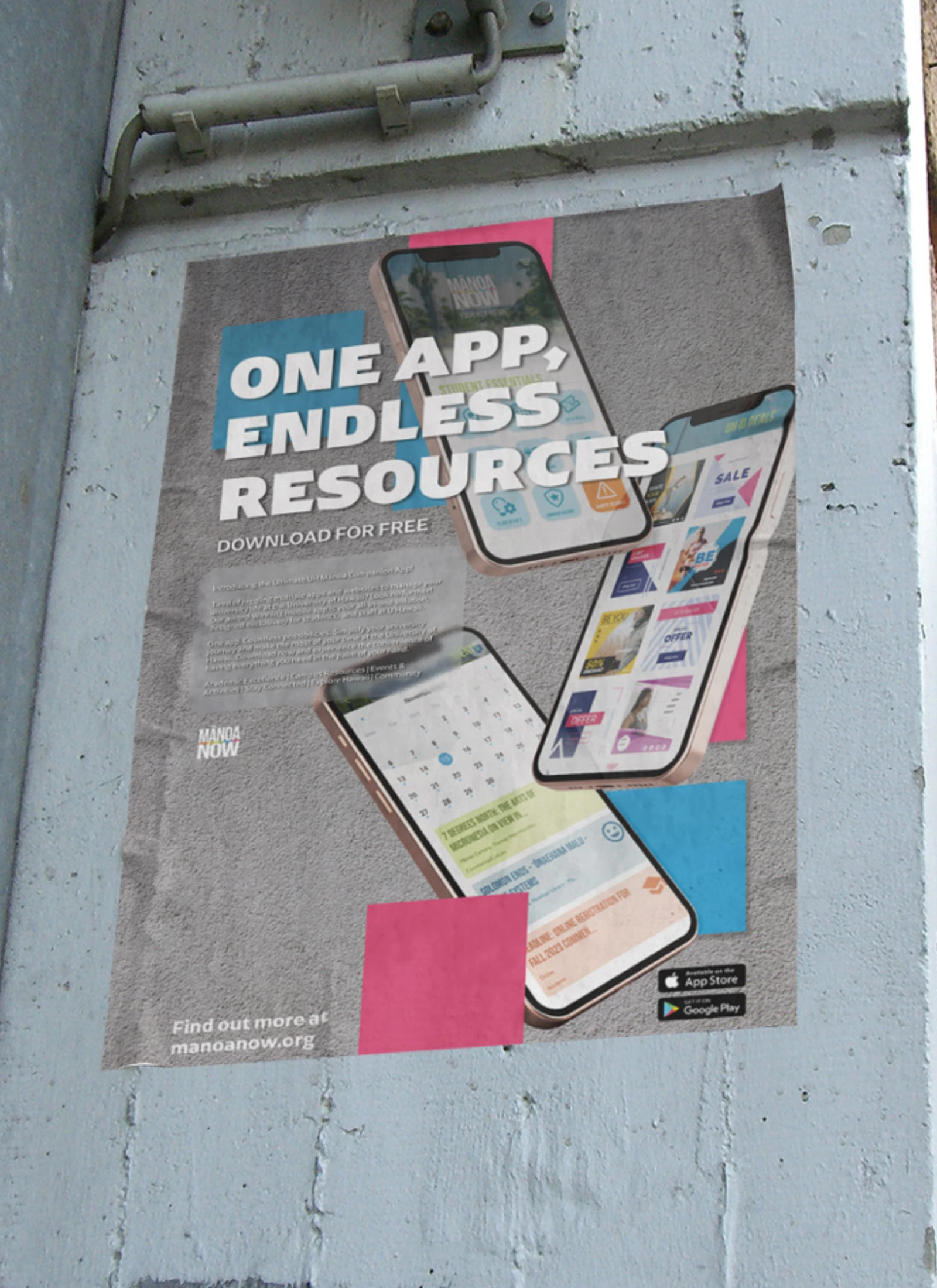
Brief
I joined Manoa Now as a graphic designer in 2018. While working at the University of Hawaii at Manoa, I saw an opportunity to help rebuild one of the main student media programs on campus.
Following the pandemic, the program had two clear needs: it needed clients, and it needed to reestablish itself with students and staff who had not seen much from it for years.
Leadership progression
I was promoted to design lead in 2020, design and marketing lead in 2021, and program manager in 2022. In 2023, I left the Manoa Now position when I was promoted to creative marketing director for the University of Hawaii’s student media programs, encompassing Manoa Now, Ka Leo, KTUH, and Hawaii Review.
Across those roles, I recruited, trained, and managed teams ranging from 5 to 35 people across marketing, cinematography, photography, design, web development, events, vendors, and student media operations.
Concept
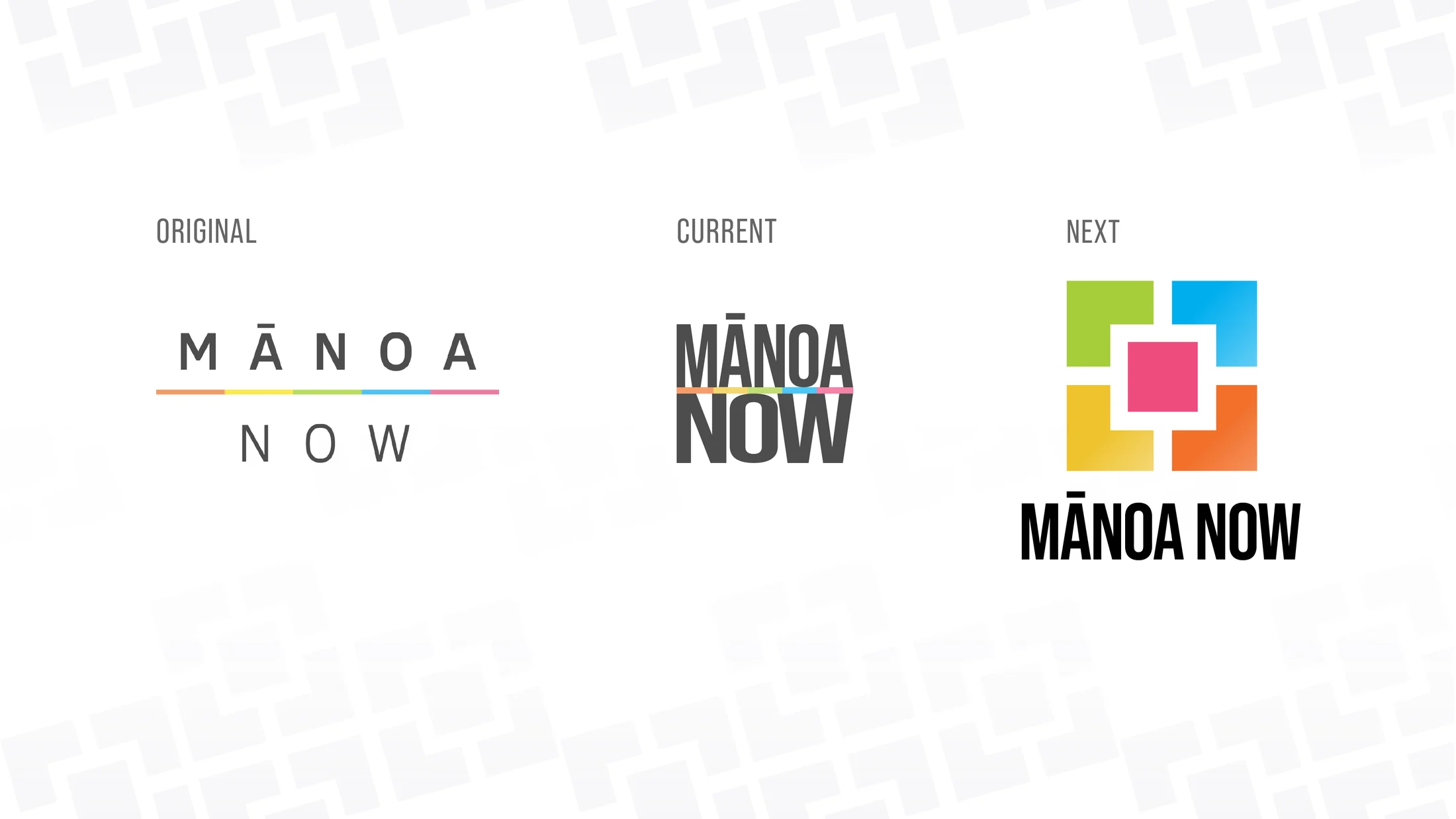
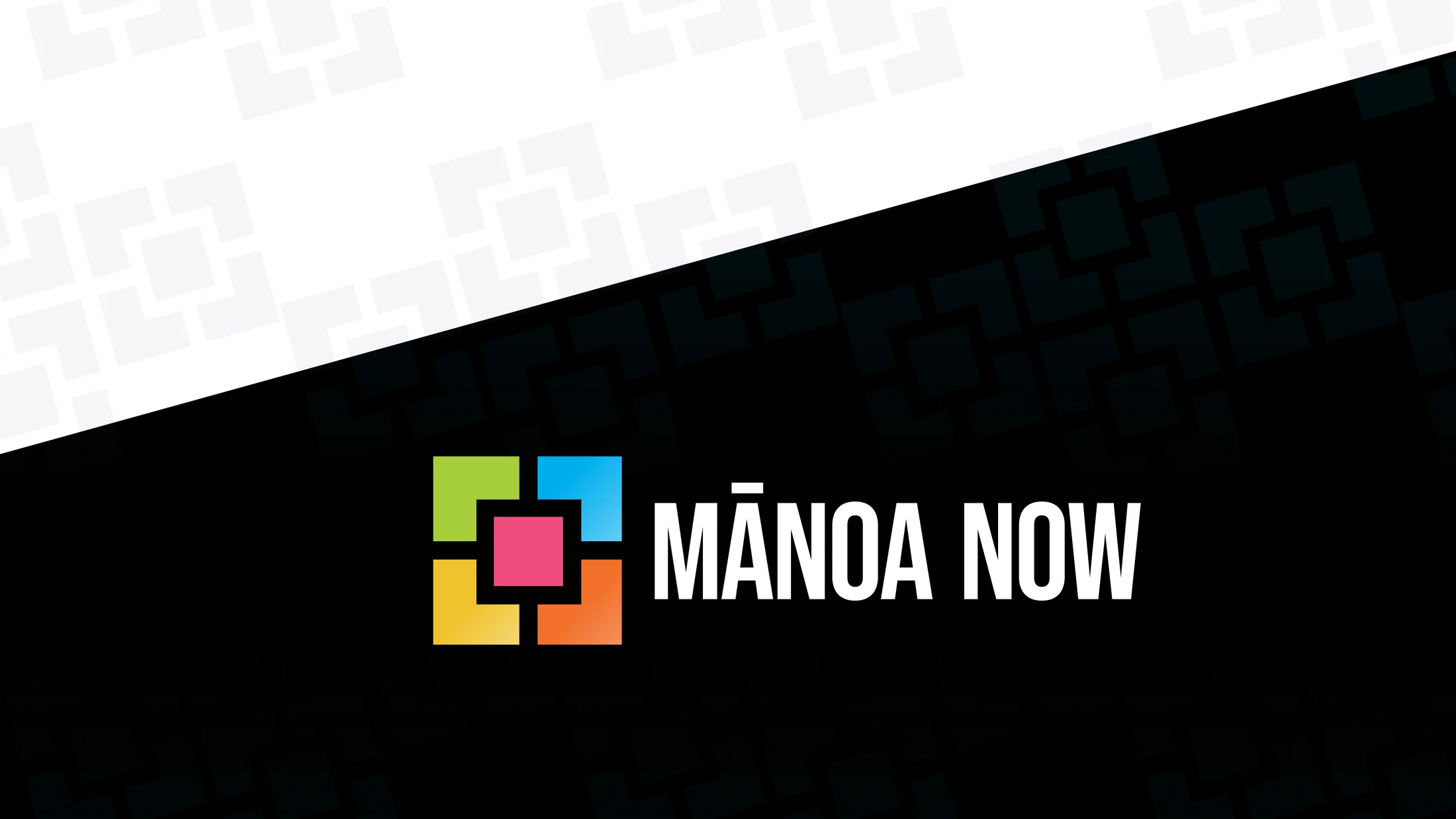
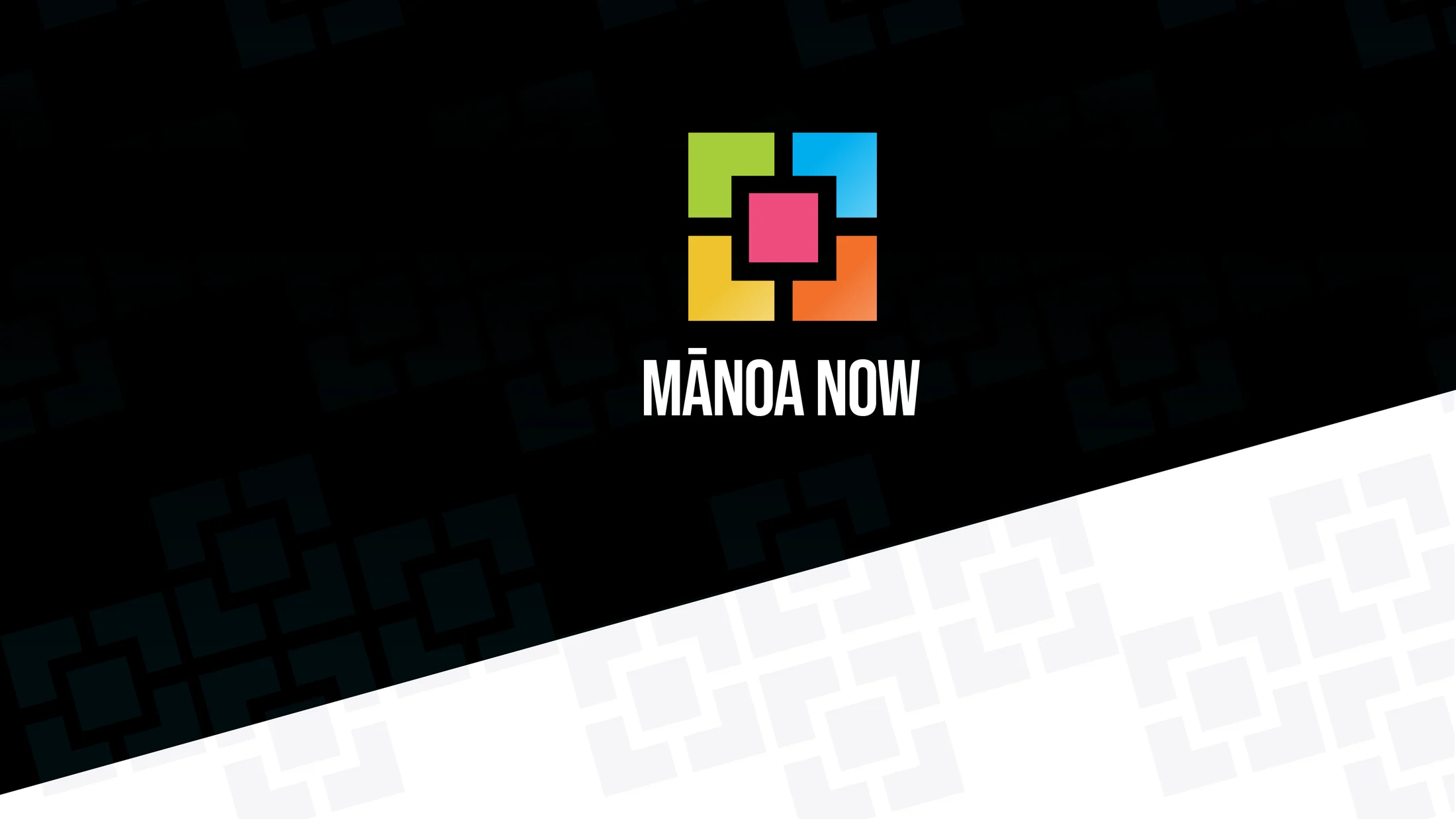
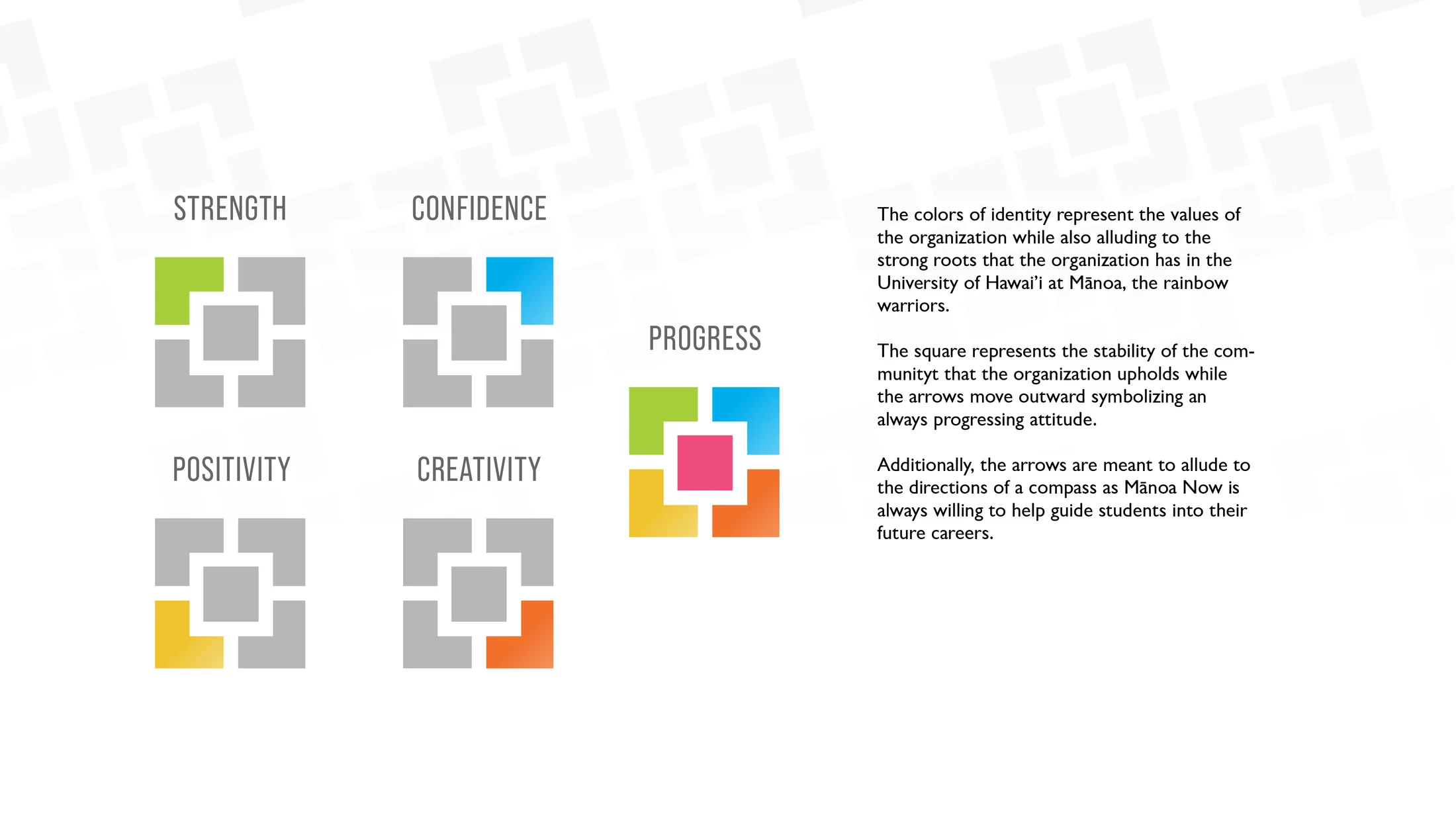
My first step was revisiting the brand and bringing it out of its quiet shelf in order to make a splash in the community. The original identity was a single-layout wordmark with a thin rainbow bar underneath. I rebuilt it as a bold sans serif wordmark that could work stacked or horizontally, then introduced a supporting logo to accompany it.
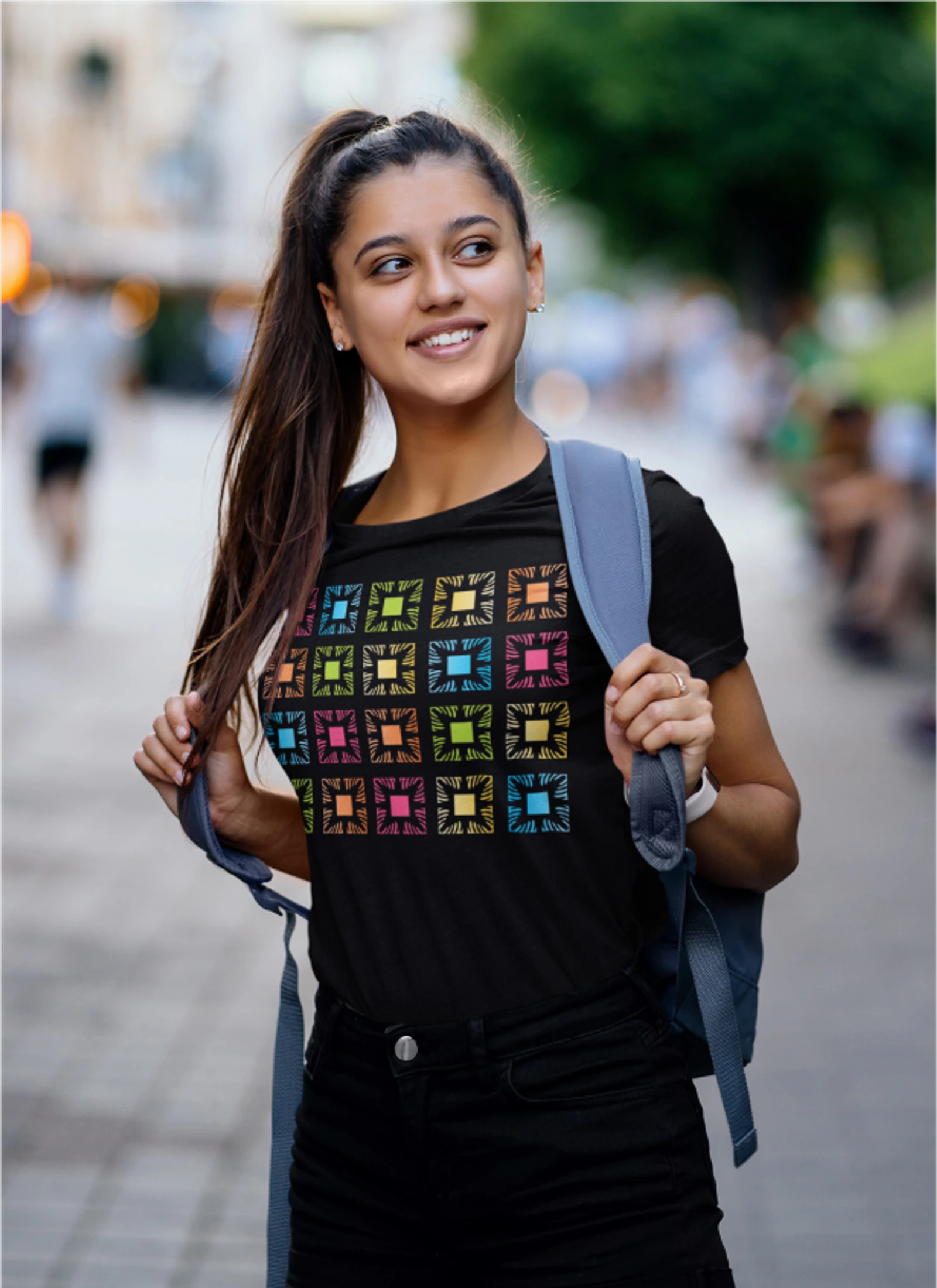
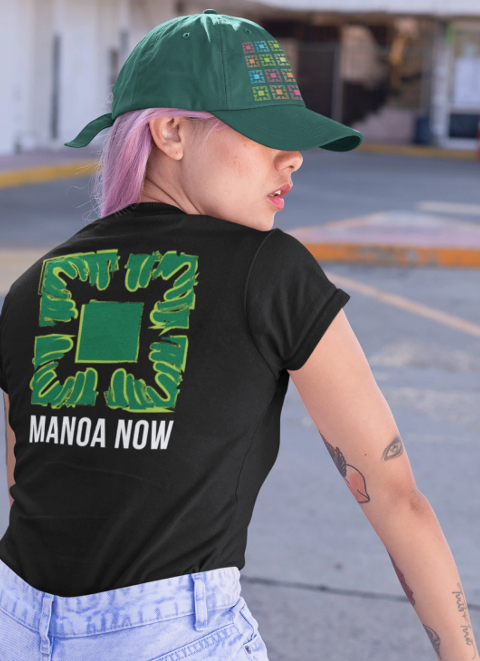
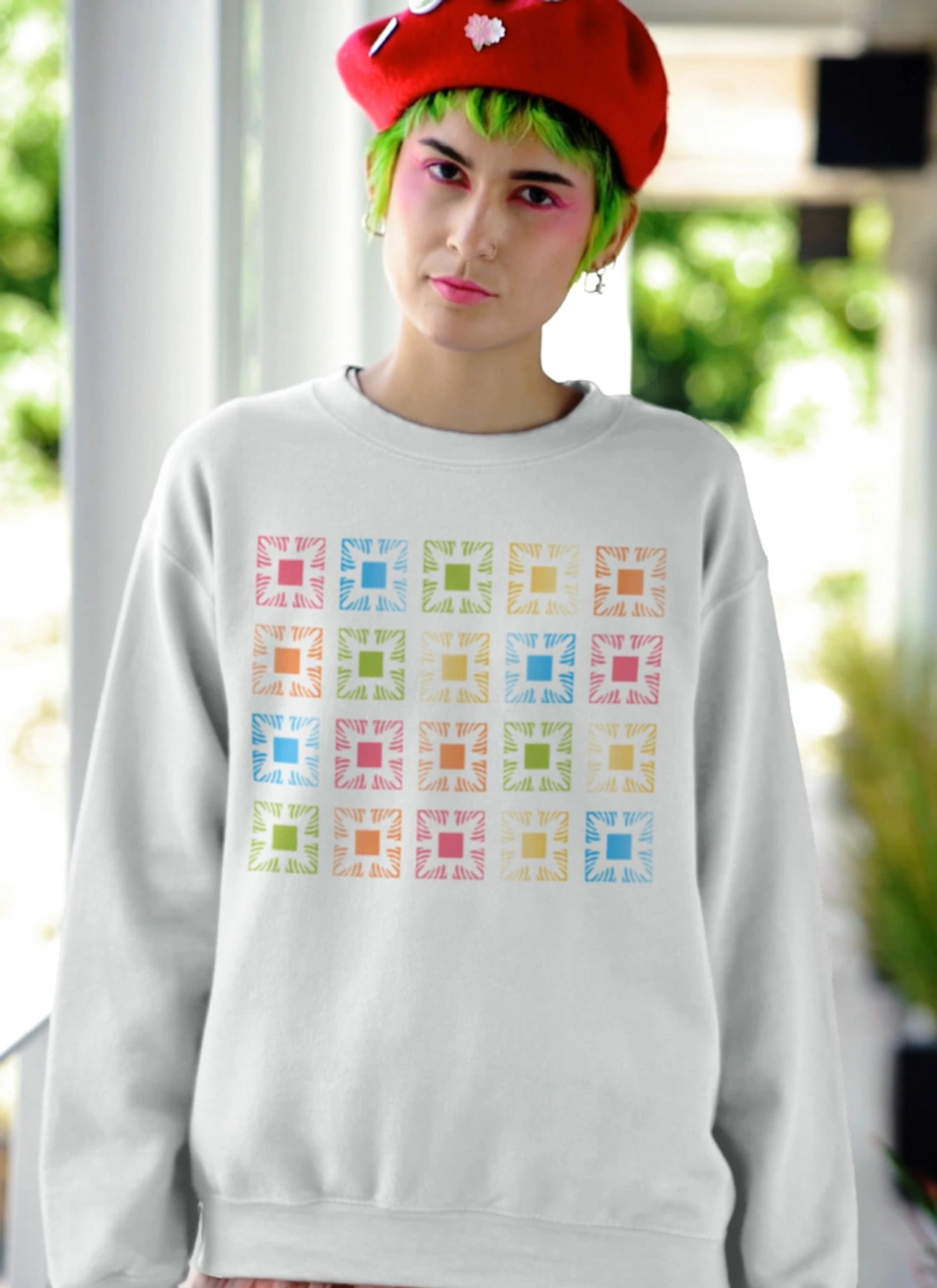
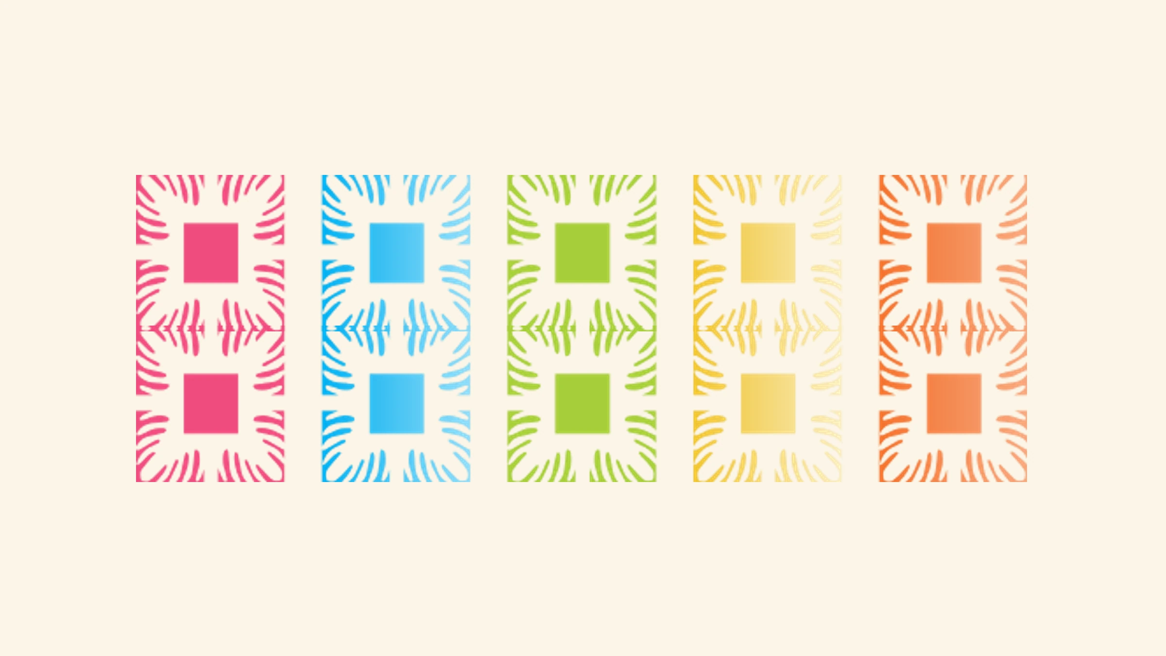
The logo was meant to symbolize the media programs that Manoa Now encompassed, including Ka Leo newspaper, KTUH Radio, Hawaii Review, and the Manoa Now marketing department.
Identity shift
The work was steered toward bold design, bold color, and modern creative that could draw students toward the program, the app, and the marketing materials. If the brand could become part of everyday student life, then local and national businesses had a clearer reason to work with the program and support real digital and physical ad revenue.
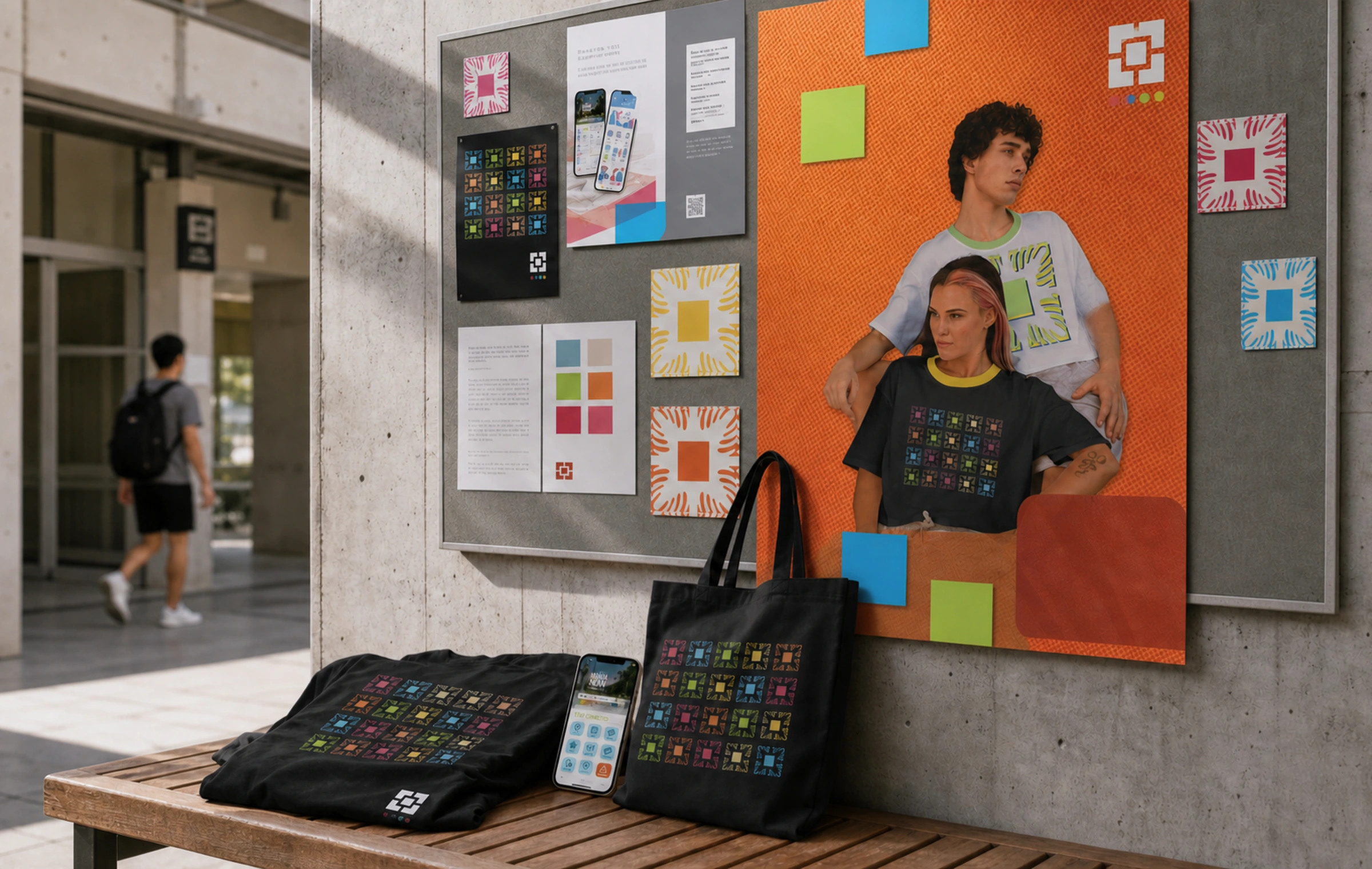
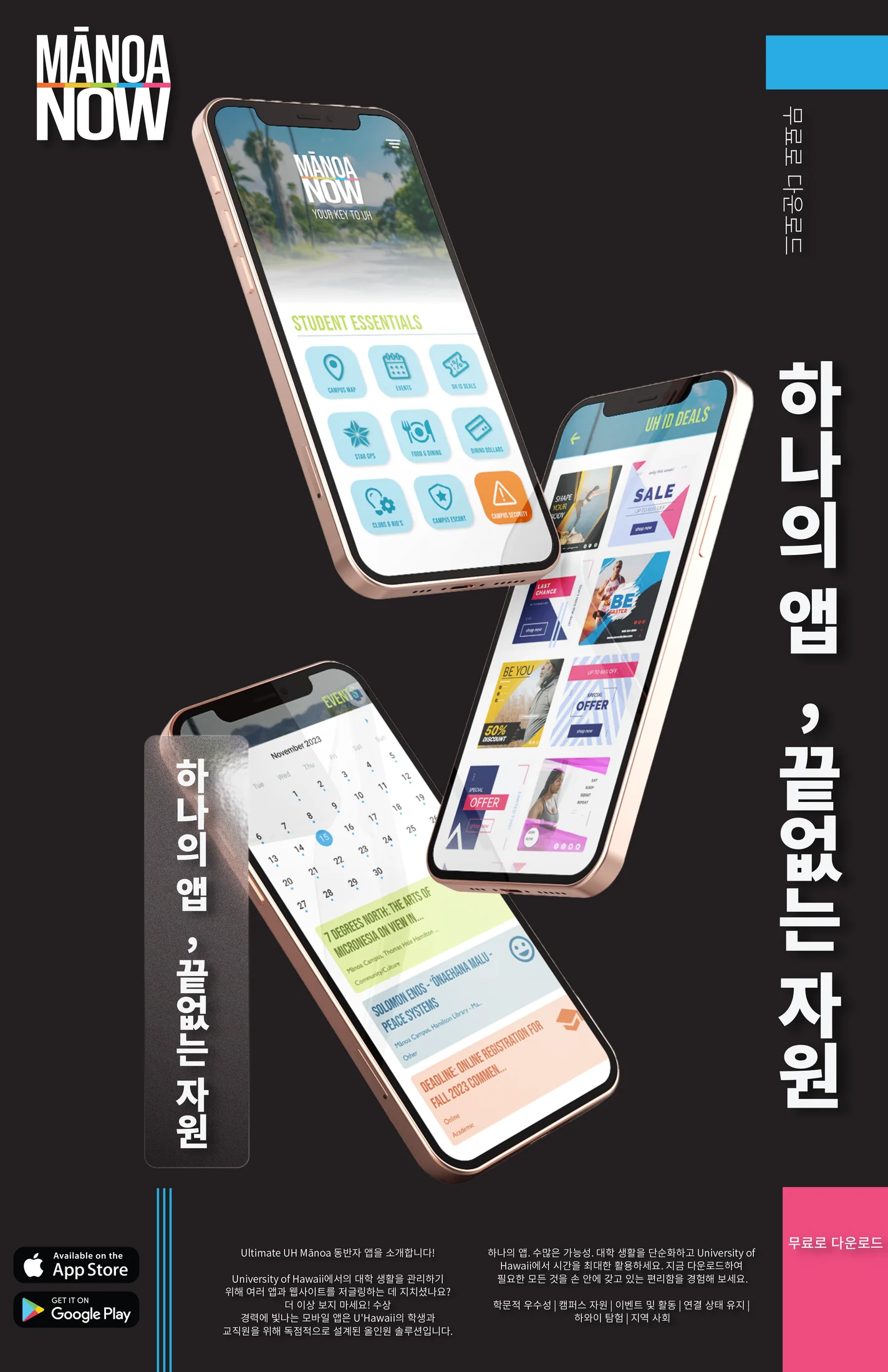
The Behance study shows the larger identity system, including the move from quiet app promotion into a more expressive student-facing campaign.
System
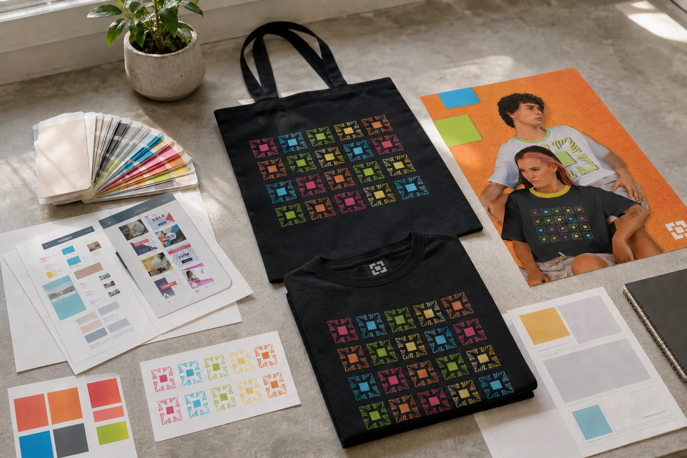
The system moved between app promotion, merchandise, posters, social assets, campaign photography, print advertising, and student recruitment materials. The identity needed enough structure for student teams to keep using it, but enough energy to make students notice it again.
Outcome
By the time I left Manoa Now, the app had surpassed 80,000 downloads. We had built a successful pop-up market with local vendors, filled program appointment books, and helped move the student media programs from a deficit when I came on board to more than $300,000 in the green.
The identity was one part of that outcome. It gave the app, events, services, merchandise, and connected programs a clearer campus-facing voice while the broader leadership work gave the team a stronger structure for growth.
Image archive
15 selected visual moments
Related work
Continue through the archive
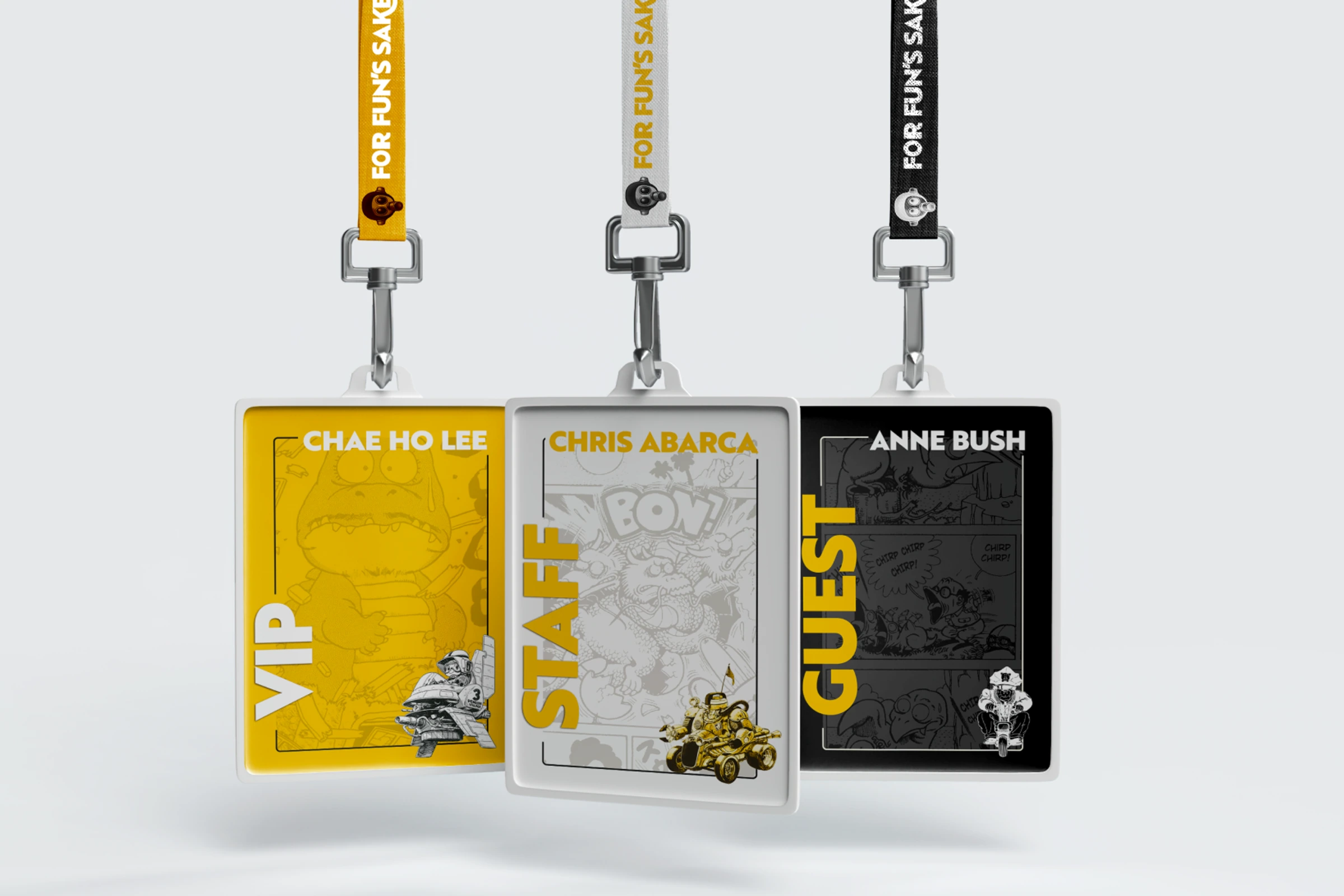
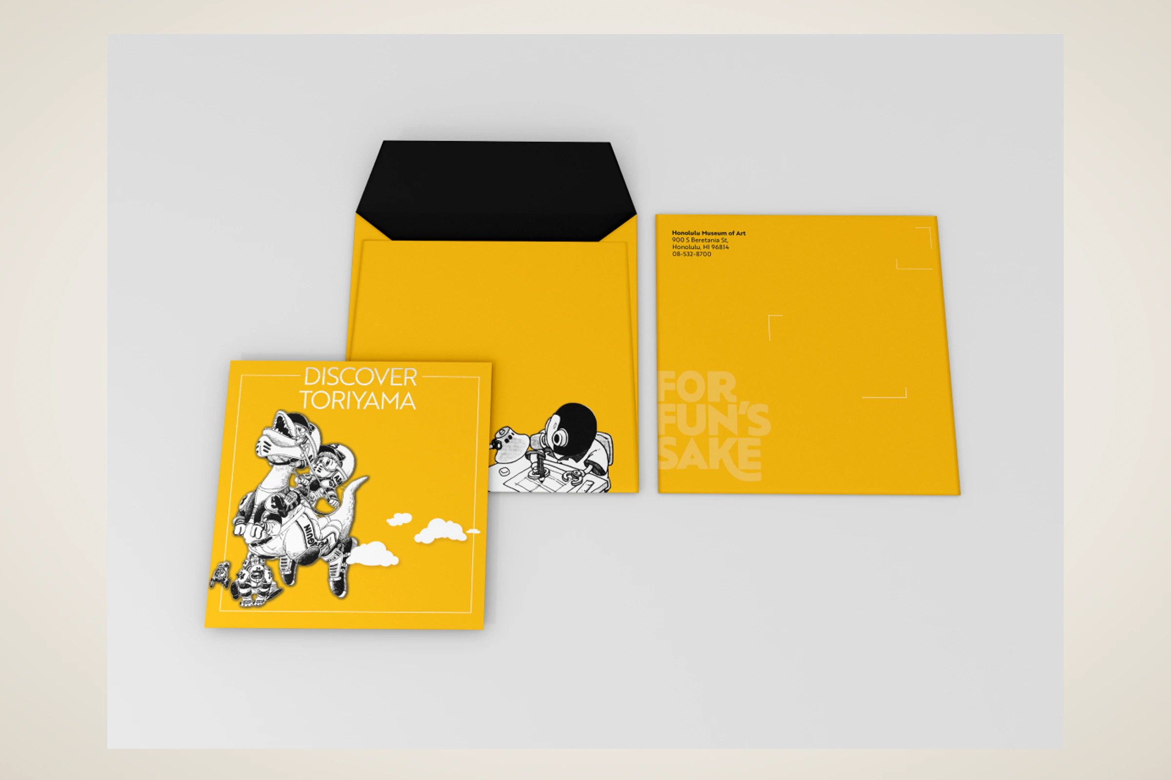
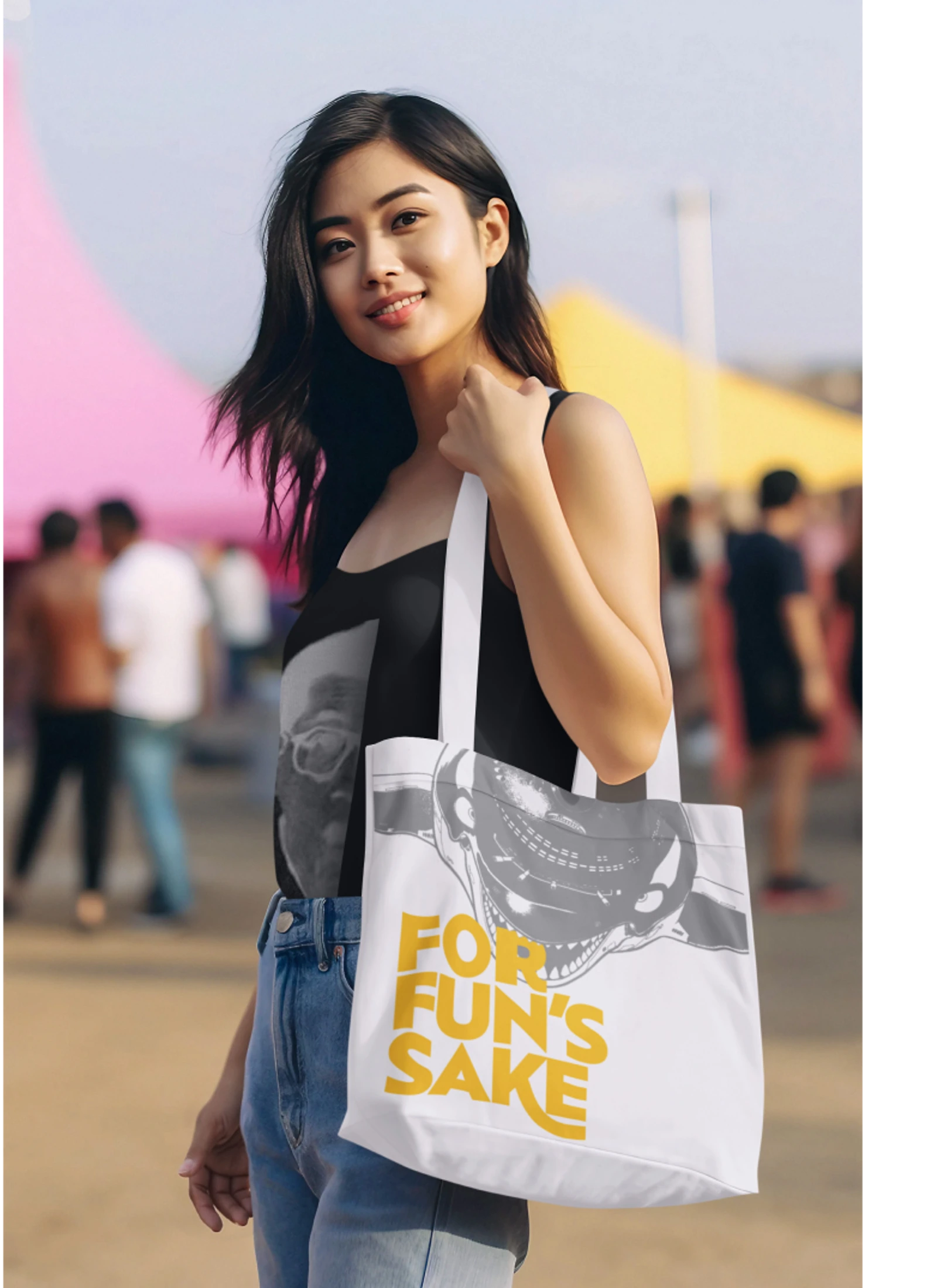
Toriyama Early Works Exhibition
A self-initiated exhibition concept for Akira Toriyama's early work, using a strict black, white, and gold palette to build a coordinated visitor campaign.
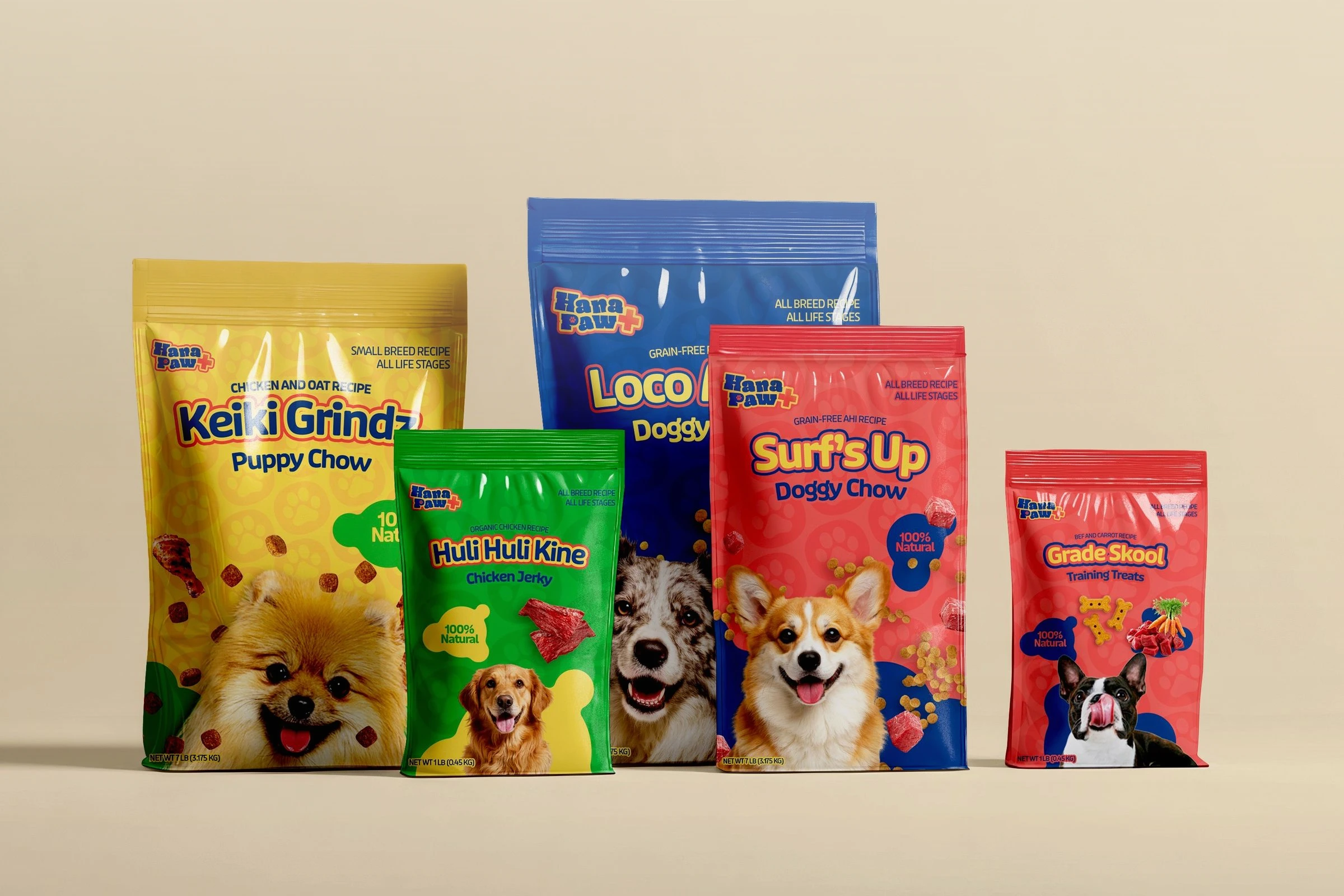
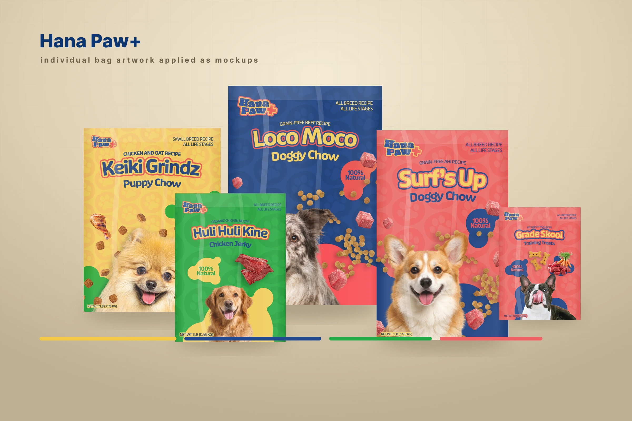
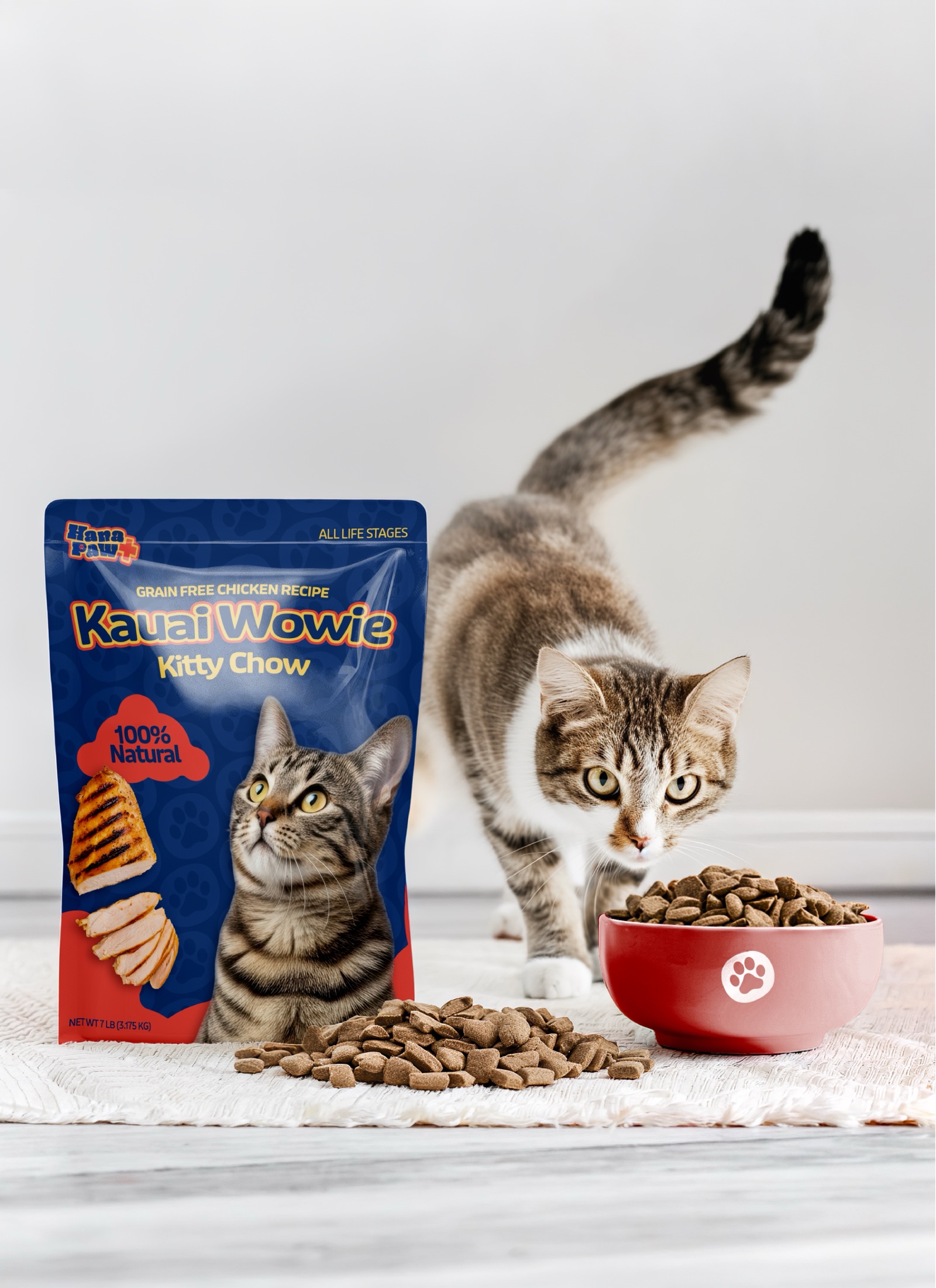
Hana Paw Pet Goods
A client pet-products idea I led through positioning, naming and trademark pitches, identity, packaging, factory development, and a broader retail family.