2026 / Packaging / Healthcare / Identity
Wai Shield Bed Pads
A local Hawaii incontinence-care packaging direction for Wai Shield, designed to feel clear, discreet, and easier to shop in-store.
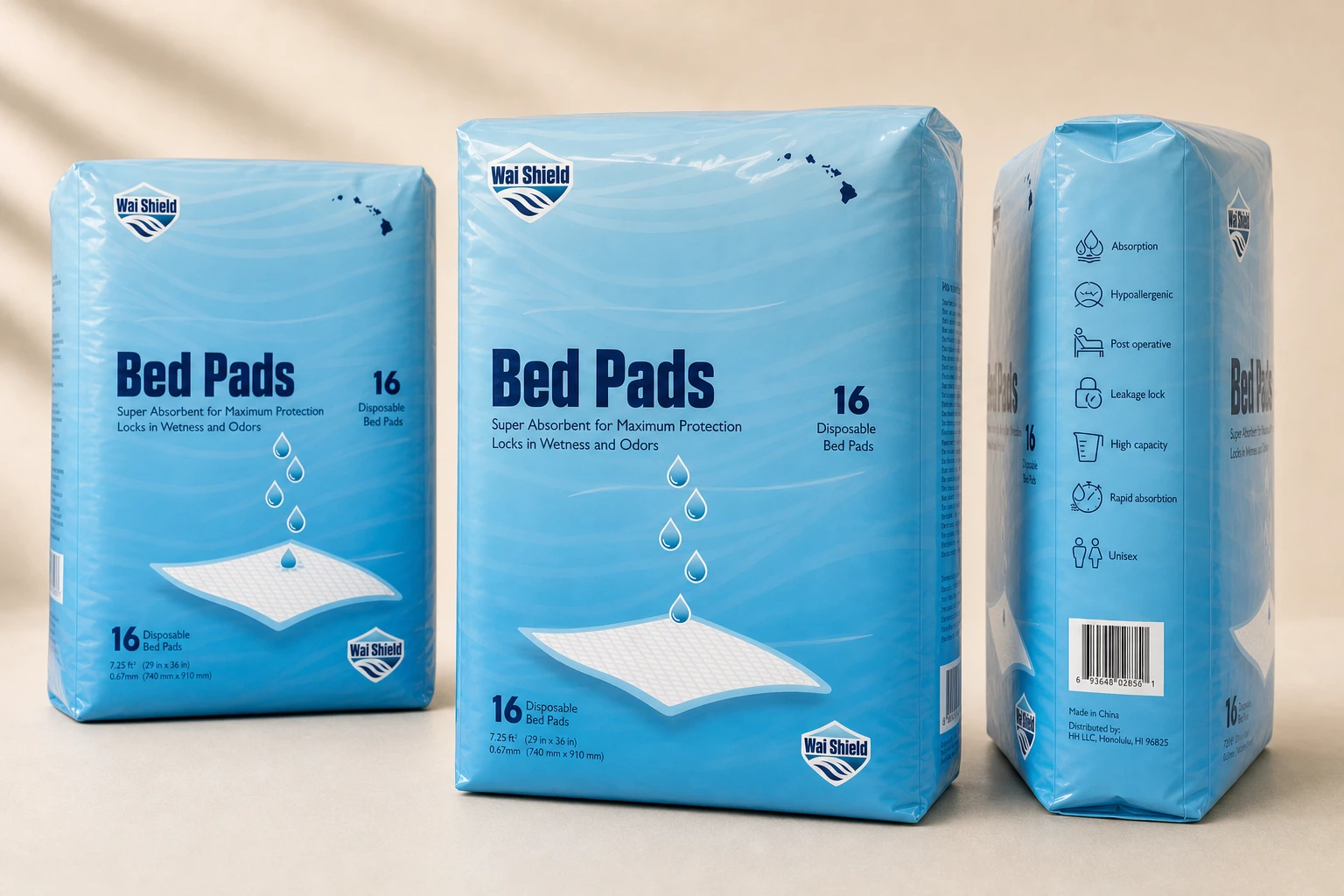
Brand direction, naming, identity, packaging, and production development
Wai Shield
Client brand development
Positioning, naming pitches, identity, packaging, and factory coordination
Packaging, Brand system, Retail graphics
Hawaii
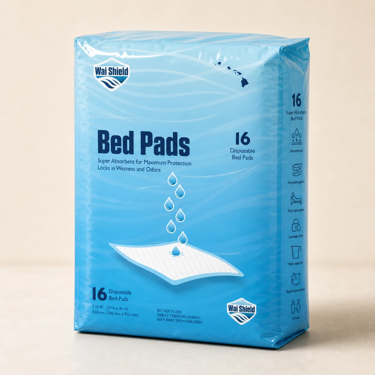
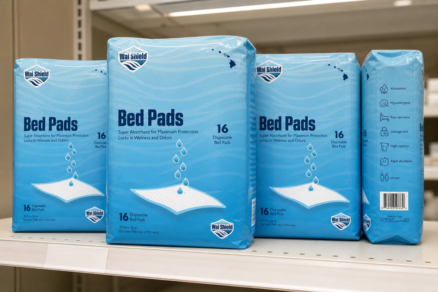
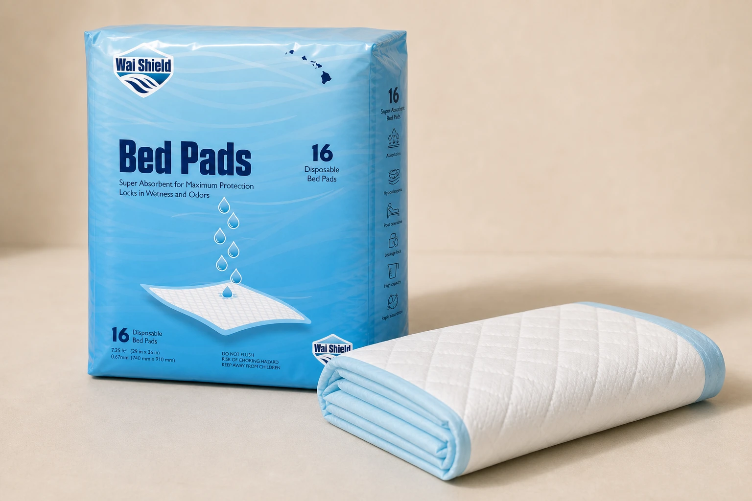
Discreet care packaging
The package needed to be direct about use while helping the product feel less awkward to buy.
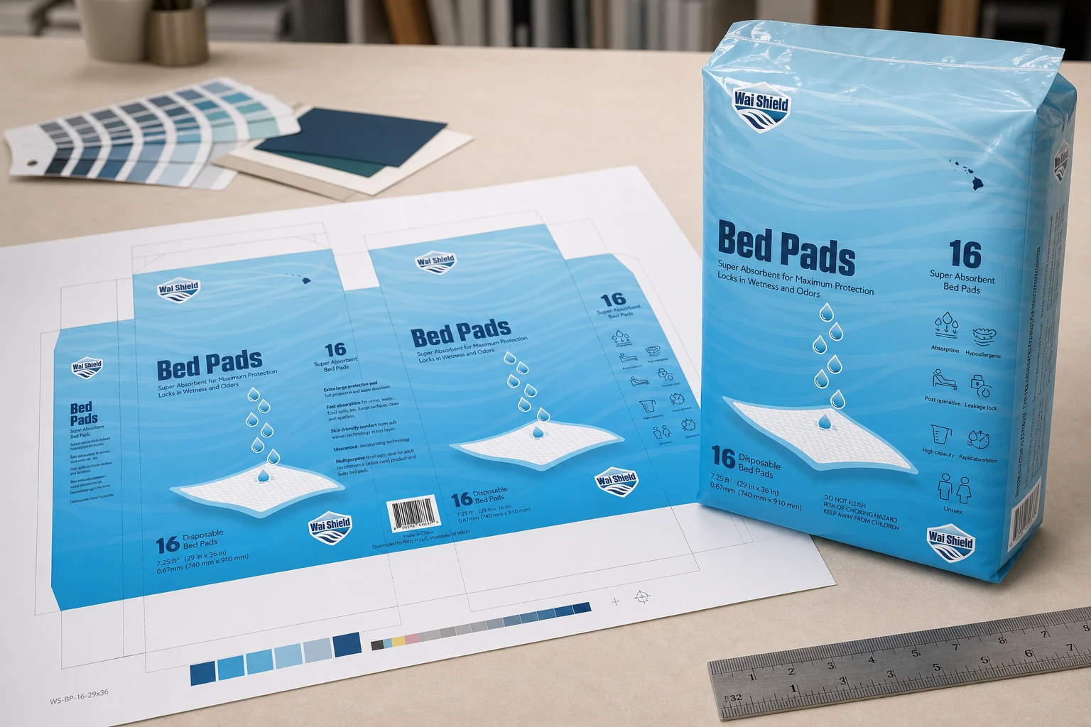
The direction moves away from generic, harsh care packaging by using water-inspired naming, clear product information, and calmer visual hierarchy for a local product now sold in Longs Drugs stores.
Brief
The client came to me with a broad idea for a locally produced bed-pad product. I helped shape the positioning, developed and pitched names for trademark review, created the identity and packaging direction, and worked directly with the client and factory to develop the physical product. Wai Shield is now sold in Longs Drugs stores.
Concept
Because these are incontinence-care products, I wanted the package to feel as discreet as possible while moving away from generic care packaging, including the bold black CVS Health packaging used for similar products.
The name Wai Shield is direct but local: wai means water, and the phrase water shield connects clearly to protection and product function.
System
The packaging uses clear typography to communicate what the product is and organize the accompanying information so customers do not have to feel awkward in the aisle or while carrying the product through the store.
The mockups focus on the hero package, shelf context, material detail, and design-table proof, keeping the product language calm and retail-ready.
Outcome
The final page presents Wai Shield as a local care packaging system that is practical, discreet, and easy to understand at shelf level.
Image archive
4 selected visual moments
Related work
Continue through the archive
Toriyama Early Works Exhibition
A self-initiated exhibition concept for Akira Toriyama's early work, using a strict black, white, and gold palette to build a coordinated visitor campaign.
Hana Paw Pet Goods
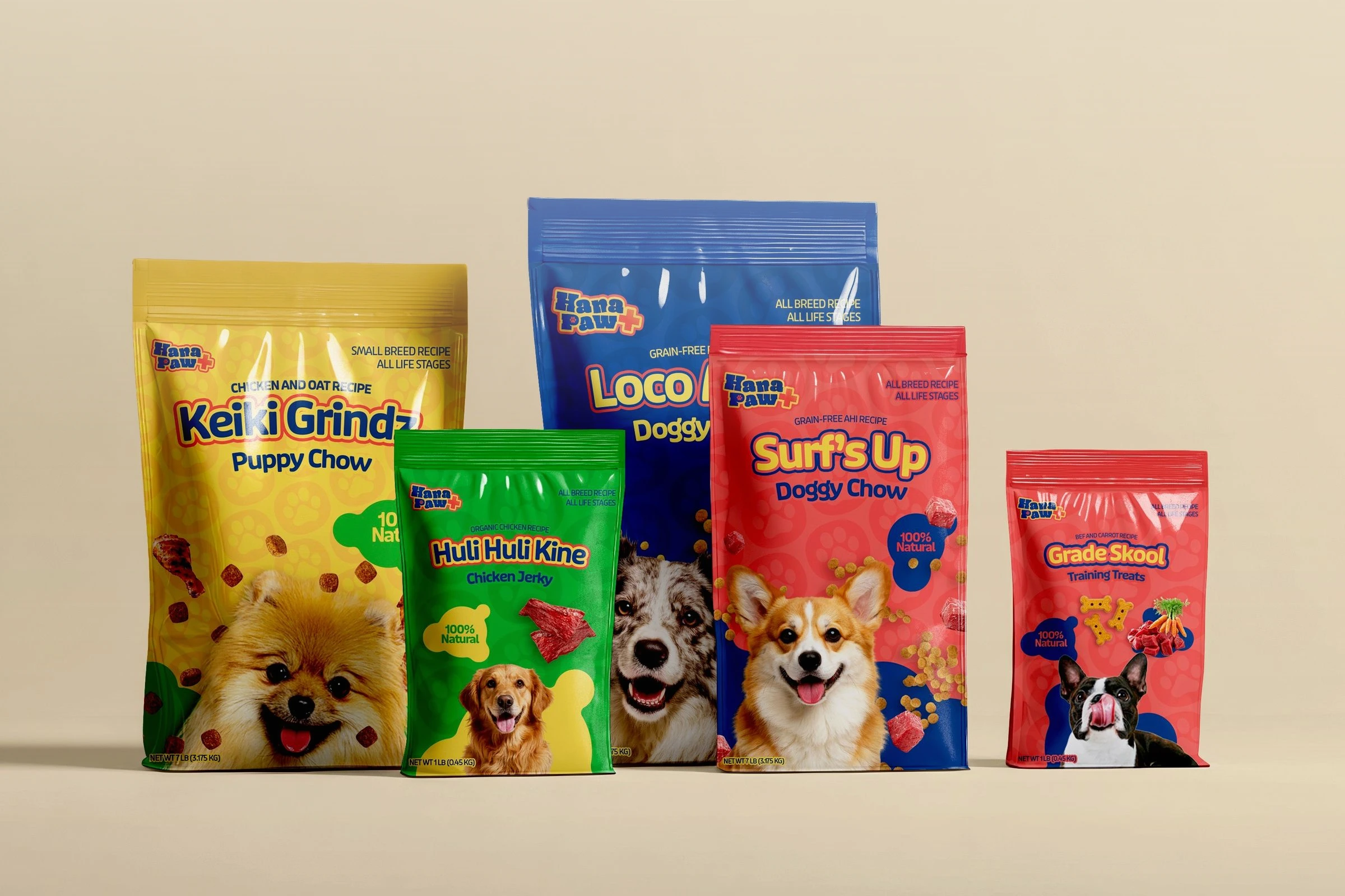
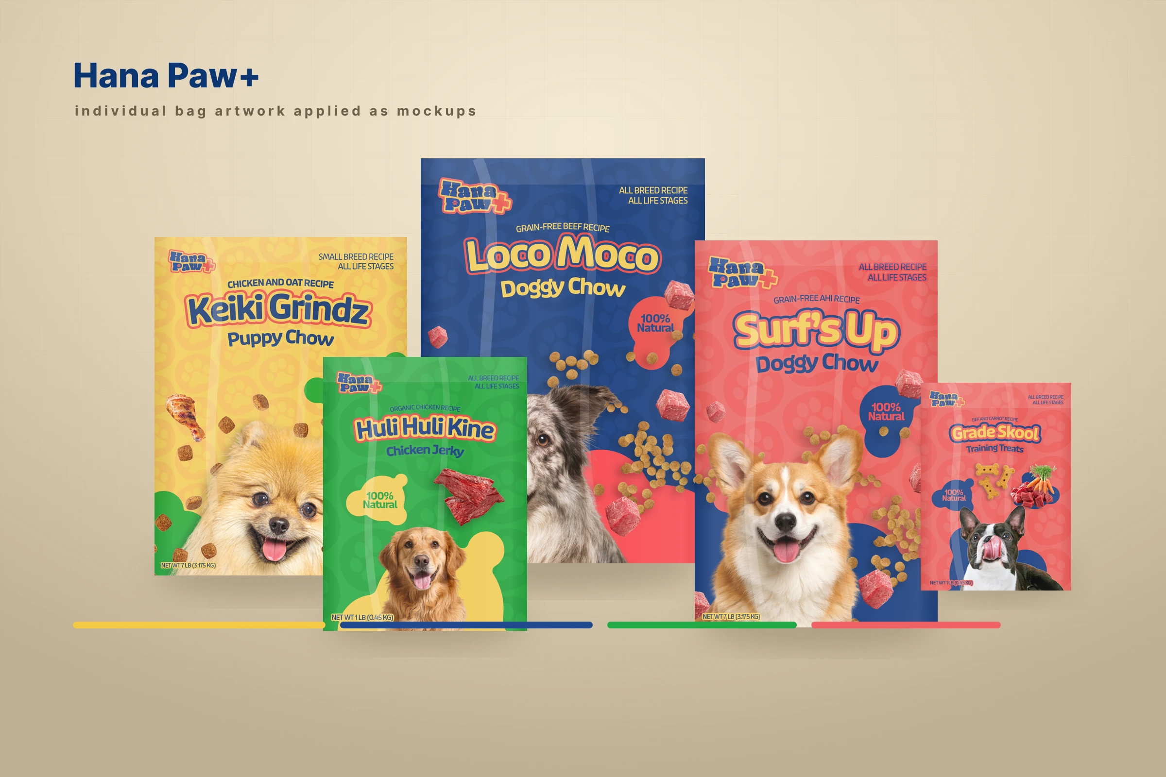
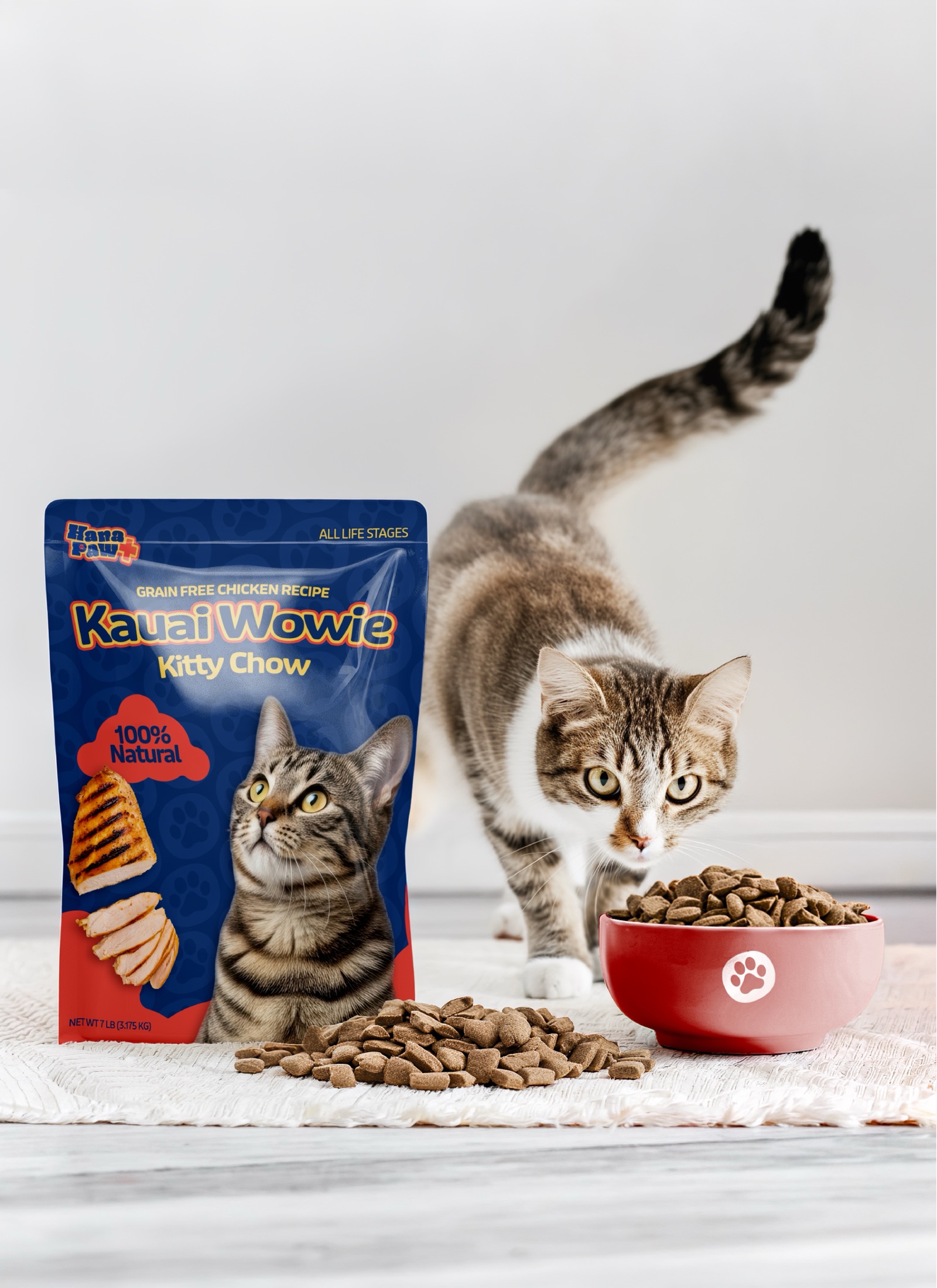
A client pet-products idea I led through positioning, naming and trademark pitches, identity, packaging, factory development, and a broader retail family.