2024 / Identity / Social Impact / Campaign
Reproductive Justice Fund of Hawaii
A 2024 identity pitch built around wayfinding, collective care, and the Reproductive Justice Fund of Hawaii's work helping people navigate barriers to abortion access.
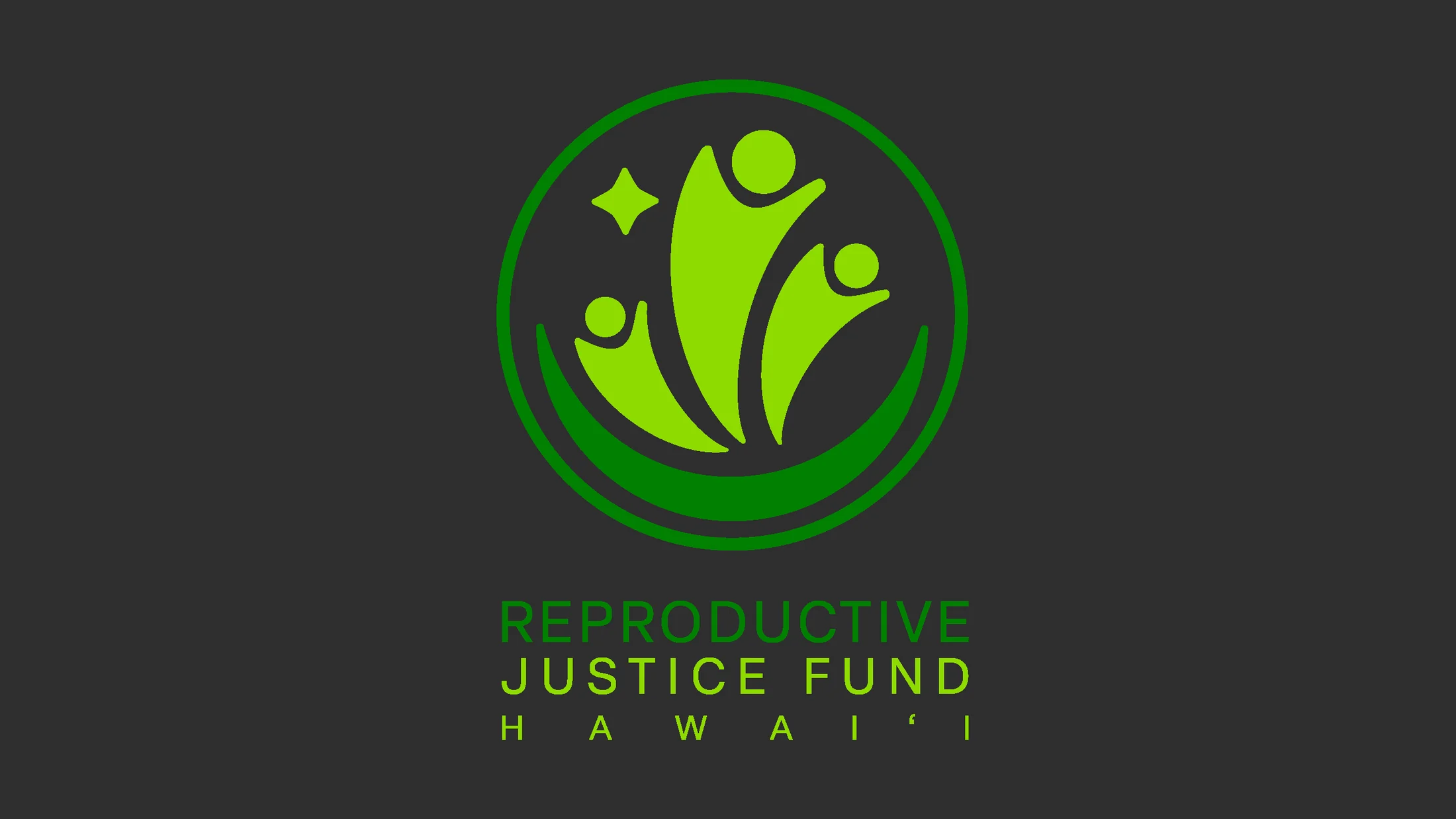
Identity design, art direction, and pitch development
Reproductive Justice Fund of Hawaii
Identity system, Pitch deck, Digital application, Merchandise
Hawaii
Hoʻomālamalama
A guiding identity for moving through darkness together.
The pitch names the concept Hoʻomālamalama—to shine and give off light in darkness—and connects it to Polynesian wayfinding. Moon, star, people, and circle become live ideas on the page rather than labels trapped inside a presentation image.
Context
The Reproductive Justice Fund of Hawaii began as an abortion fund in 2016. Hawaii did not have a state law preventing abortion access, but it also did not have an existing fund to support patients. The organization initially helped cover clinical services for patients without insurance through the University of Hawaii OB-GYN faculty practice, and its support later expanded to incidental and travel expenses.
The pitch needed to acknowledge the practical barriers that remain across the islands: limited abortion-care providers outside Oahu and restrictions on using federal insurance for abortion care.
Concept: Hoʻomālamalama
I developed this identity as part of a pitch for the fund. The concept, Hoʻomālamalama, means to shine and give off light, especially in darkness. It was inspired by Polynesian wayfinding and by the idea of a community traversing hardship together.
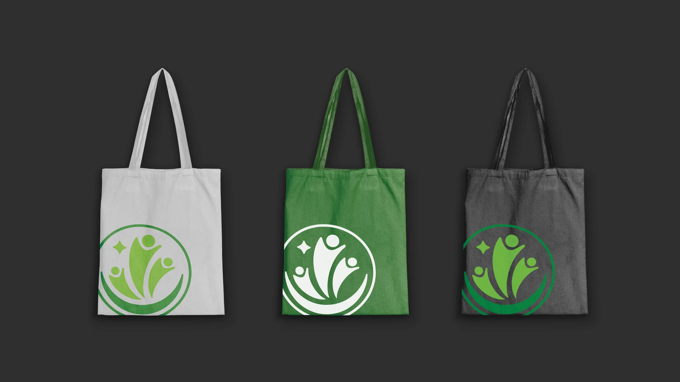
The mark combines four ideas:
- Empowerment: the moon, historically connected to people who have been othered, also helped wayfinding communities navigate at night.
- Community: multiple figures rise together while keeping their individual forms.
- Autonomy: a guiding star represents each person’s right to navigate their own path.
- Support: the surrounding circle reflects the practical care the fund gives people who need aid.
System
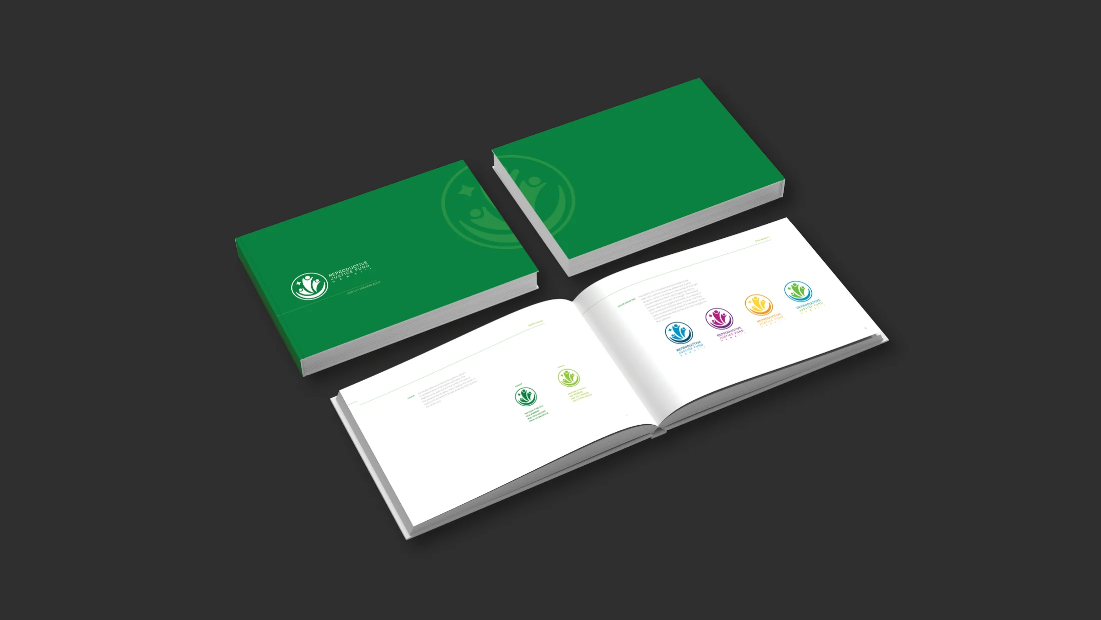
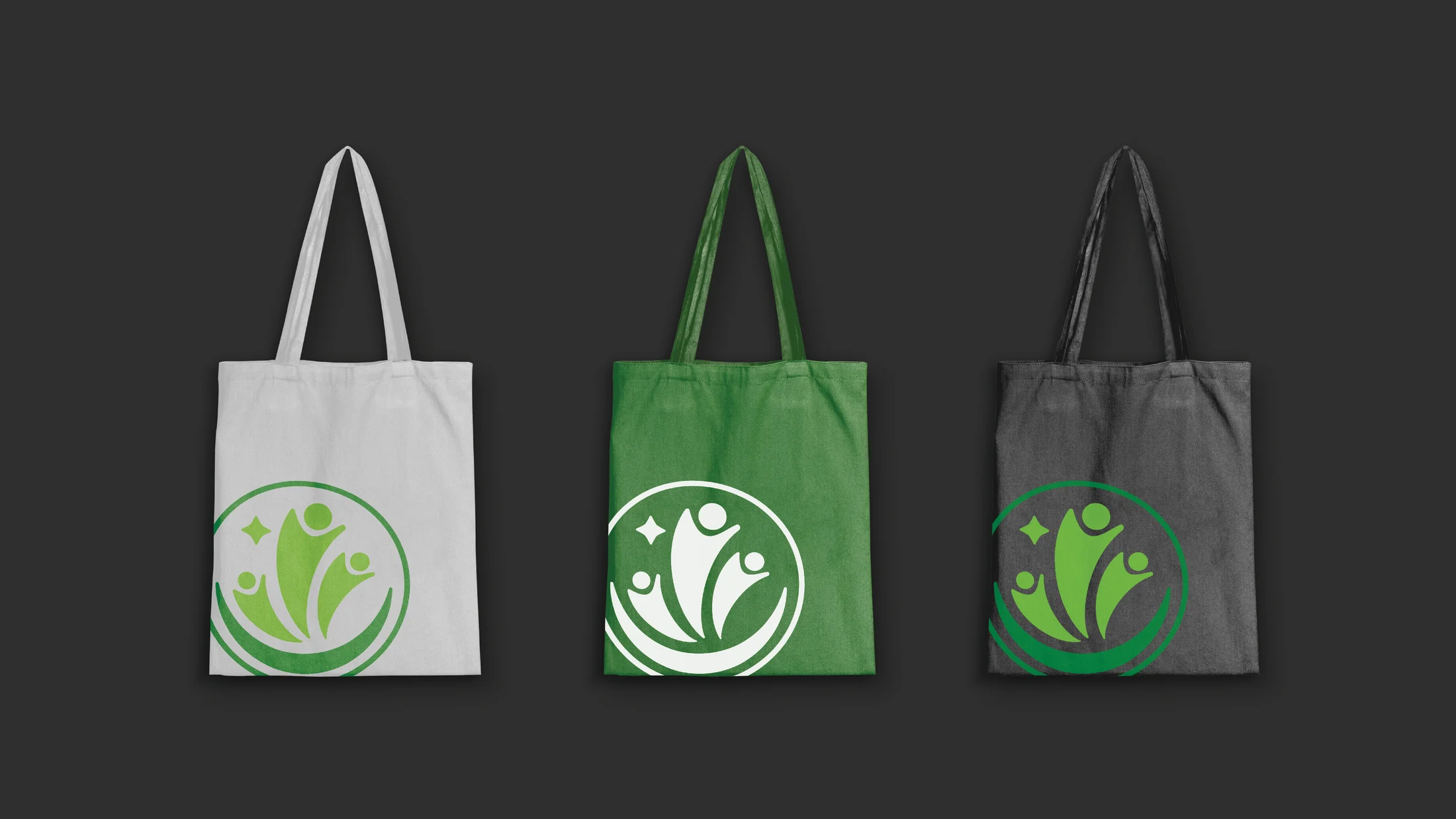
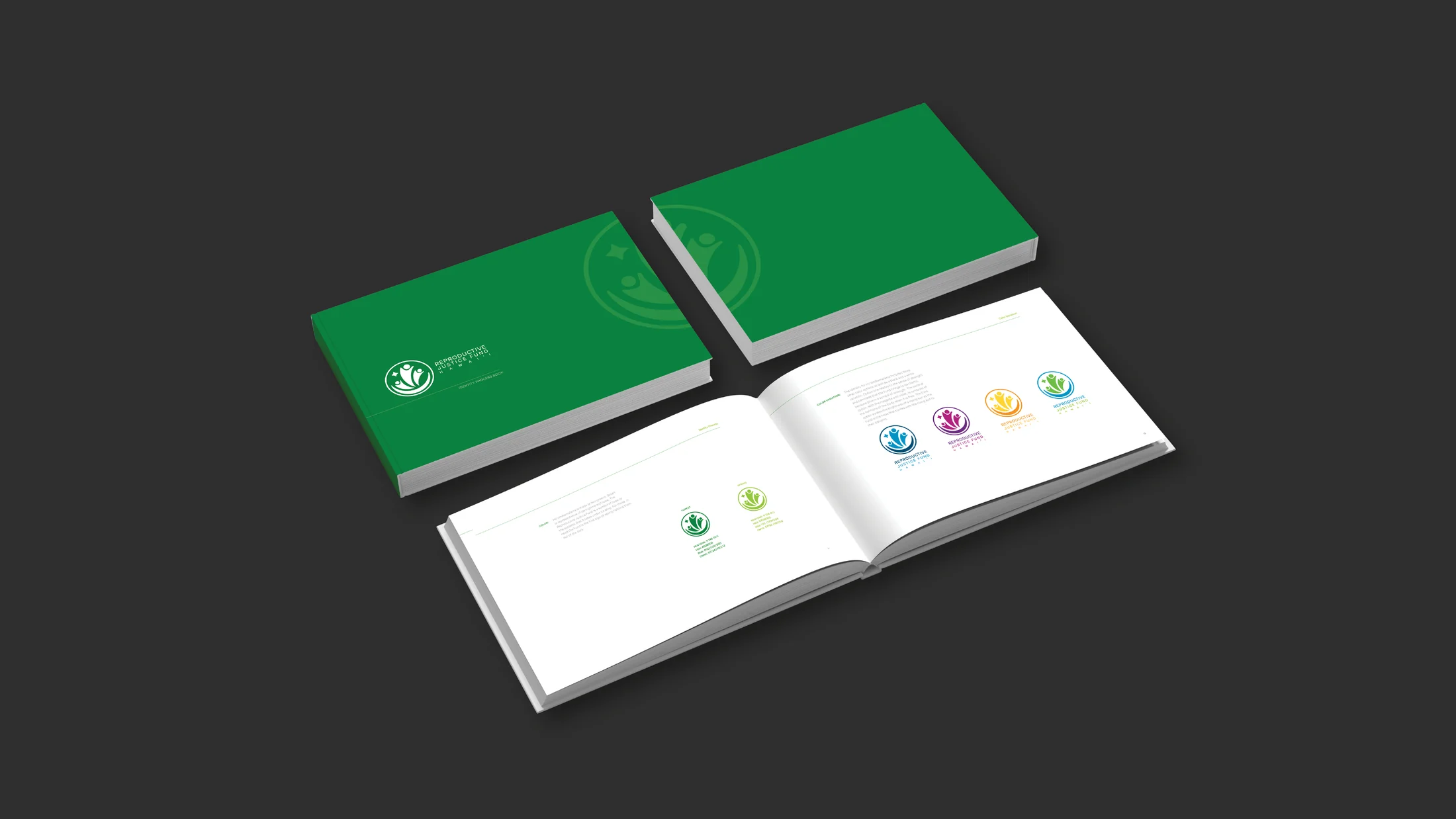
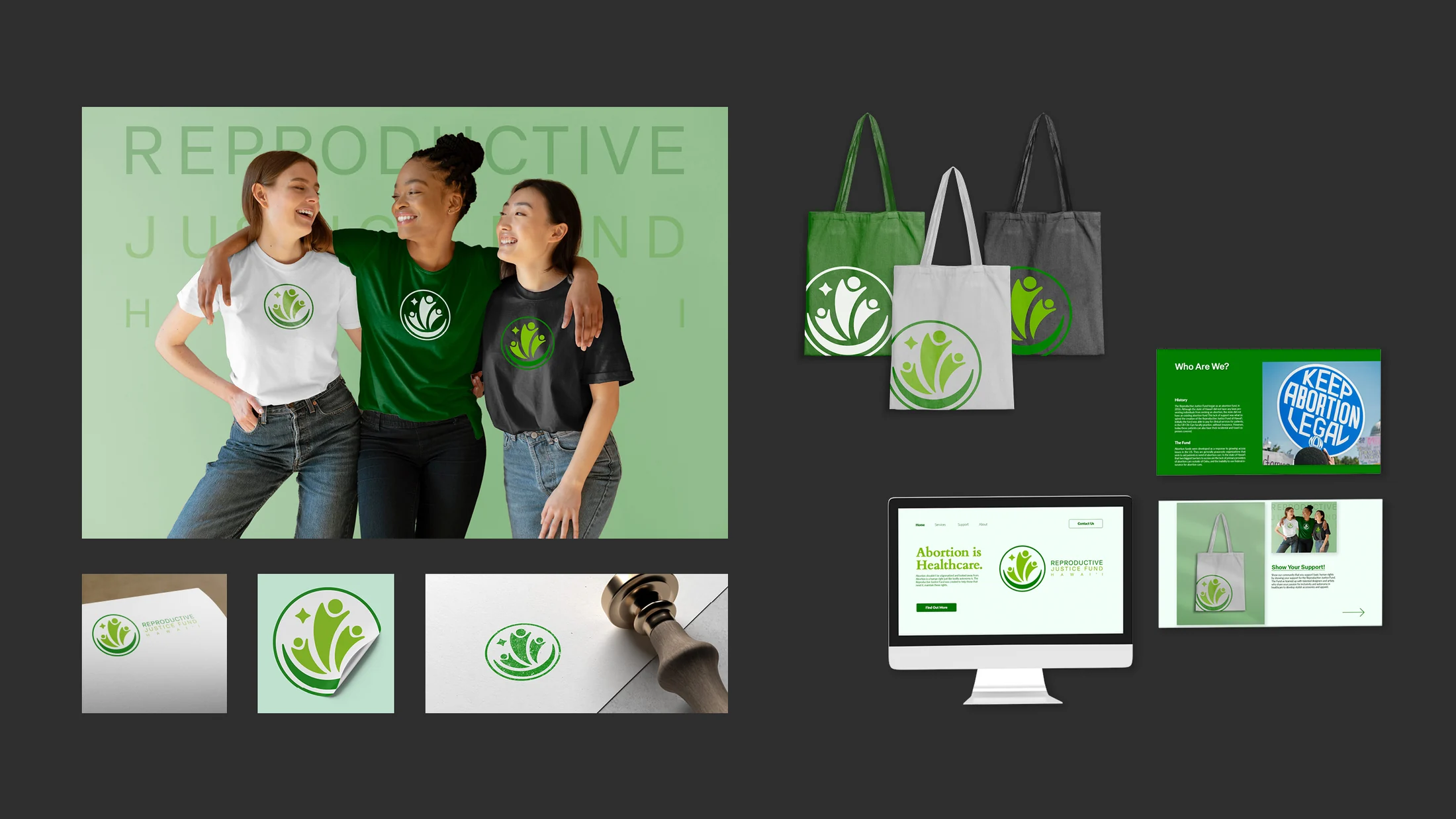
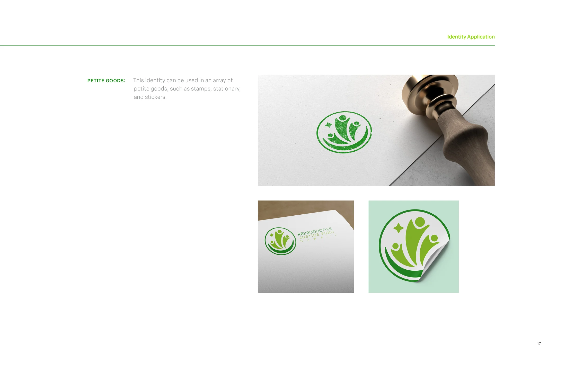
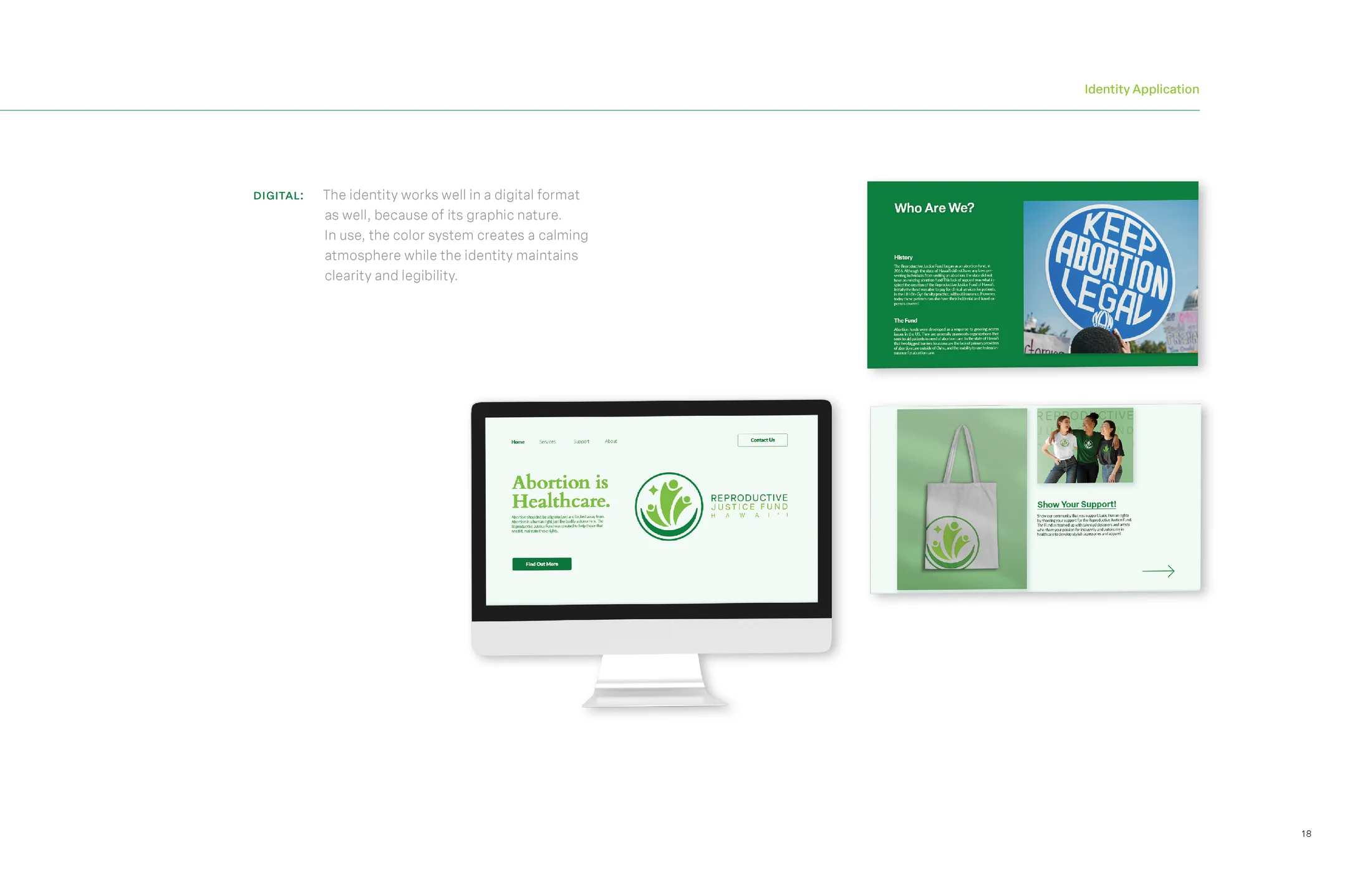
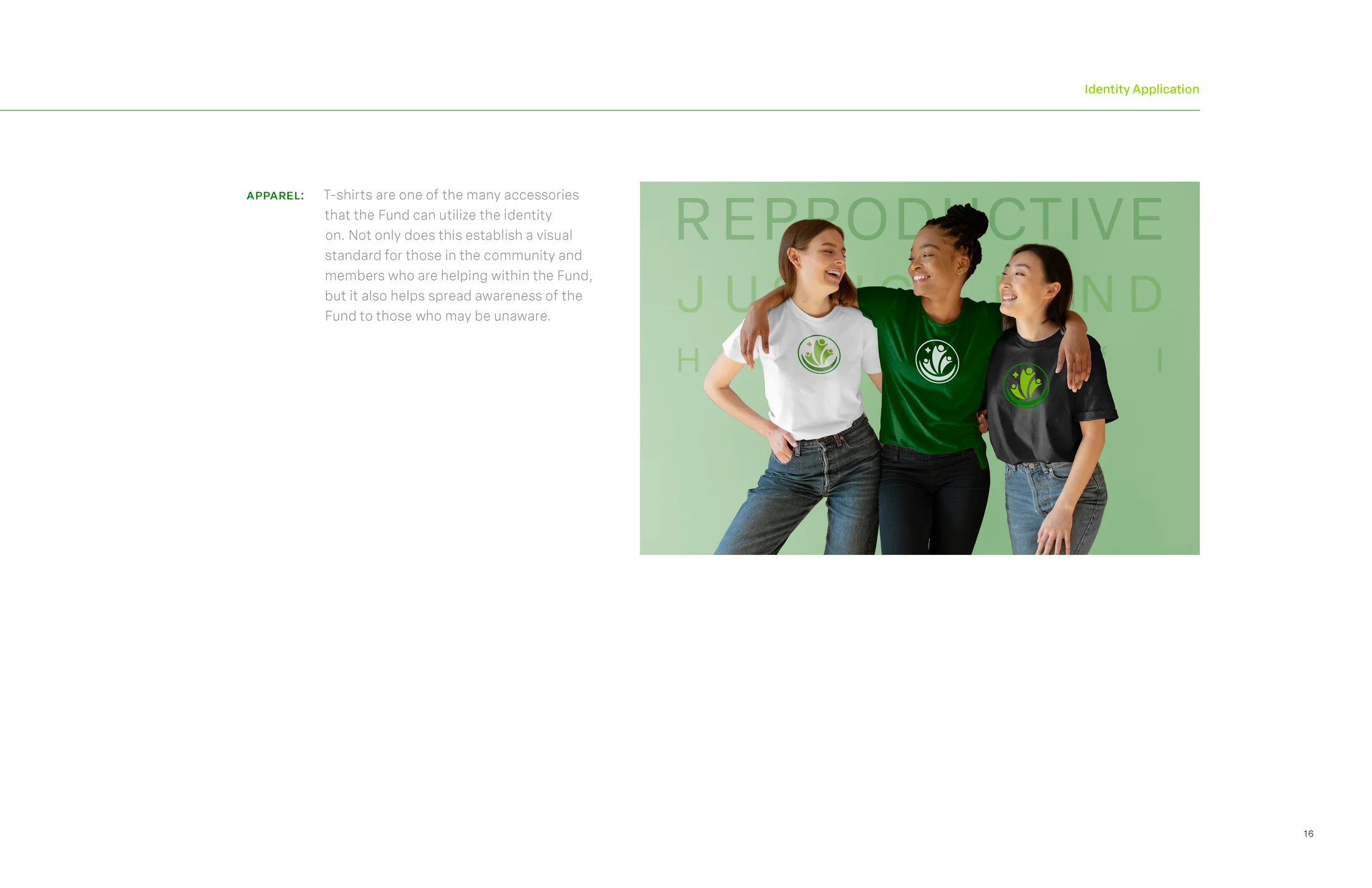
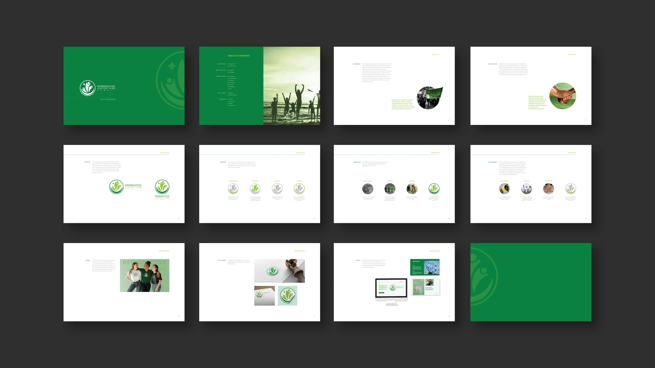
Green creates a calm, grounded visual field while the circular mark stays clear at small and large scales. The identity was tested across an identity book, stationery, stamps, stickers, apparel, tote bags, posters, and a website concept.
The digital direction keeps the most important language direct: abortion is healthcare; information should be legible; and people looking for help should be able to find a next step without moving through an intimidating interface.
Outcome
The result is a flexible pitch system for an organization built on bodily autonomy and community care. Rather than depending on one campaign image, the identity can move between quiet one-to-one support, public education, fundraising, and visible solidarity.
Image archive
10 selected visual moments
Related work
Continue through the archive

Toriyama Early Works Exhibition
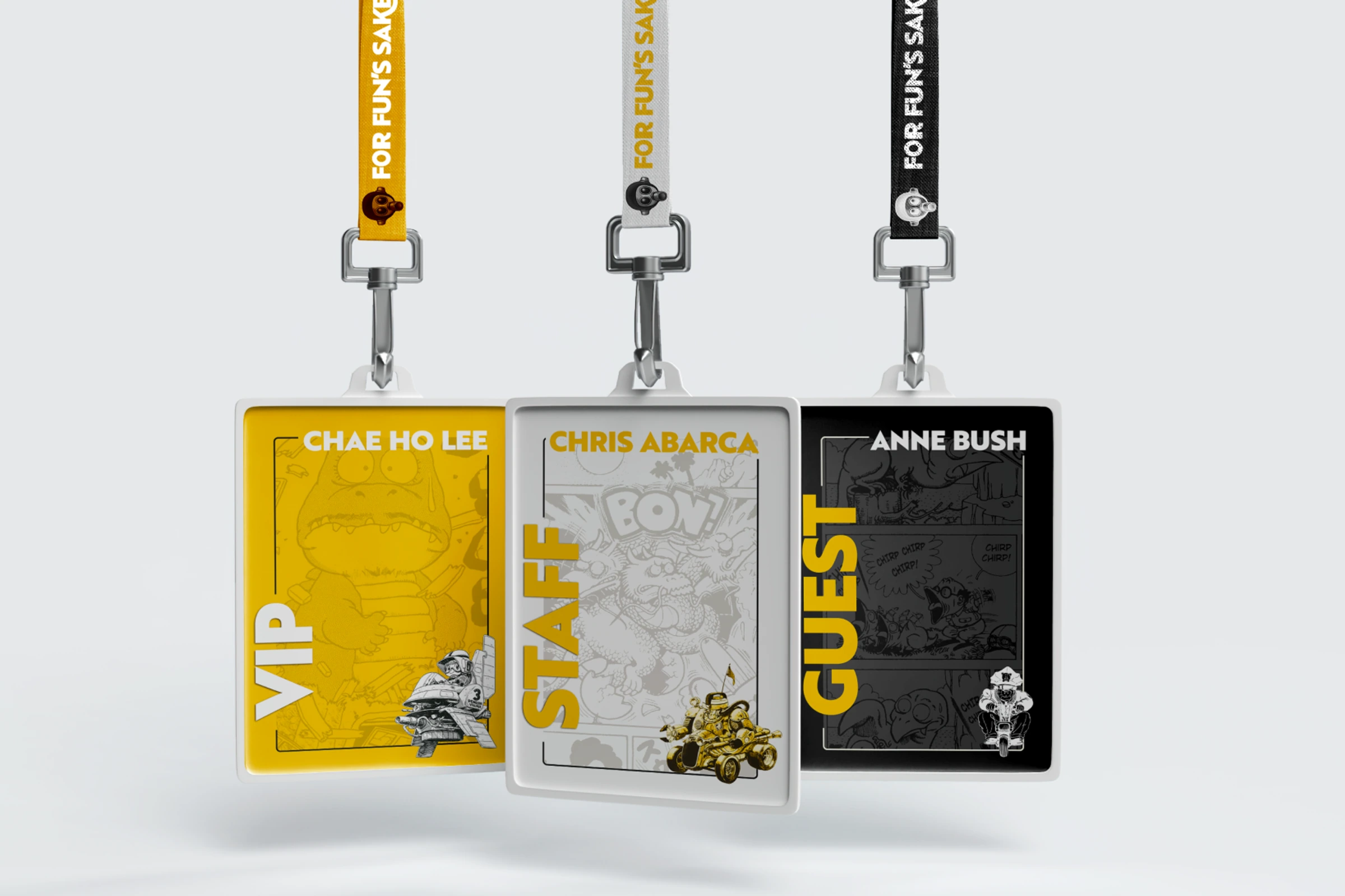
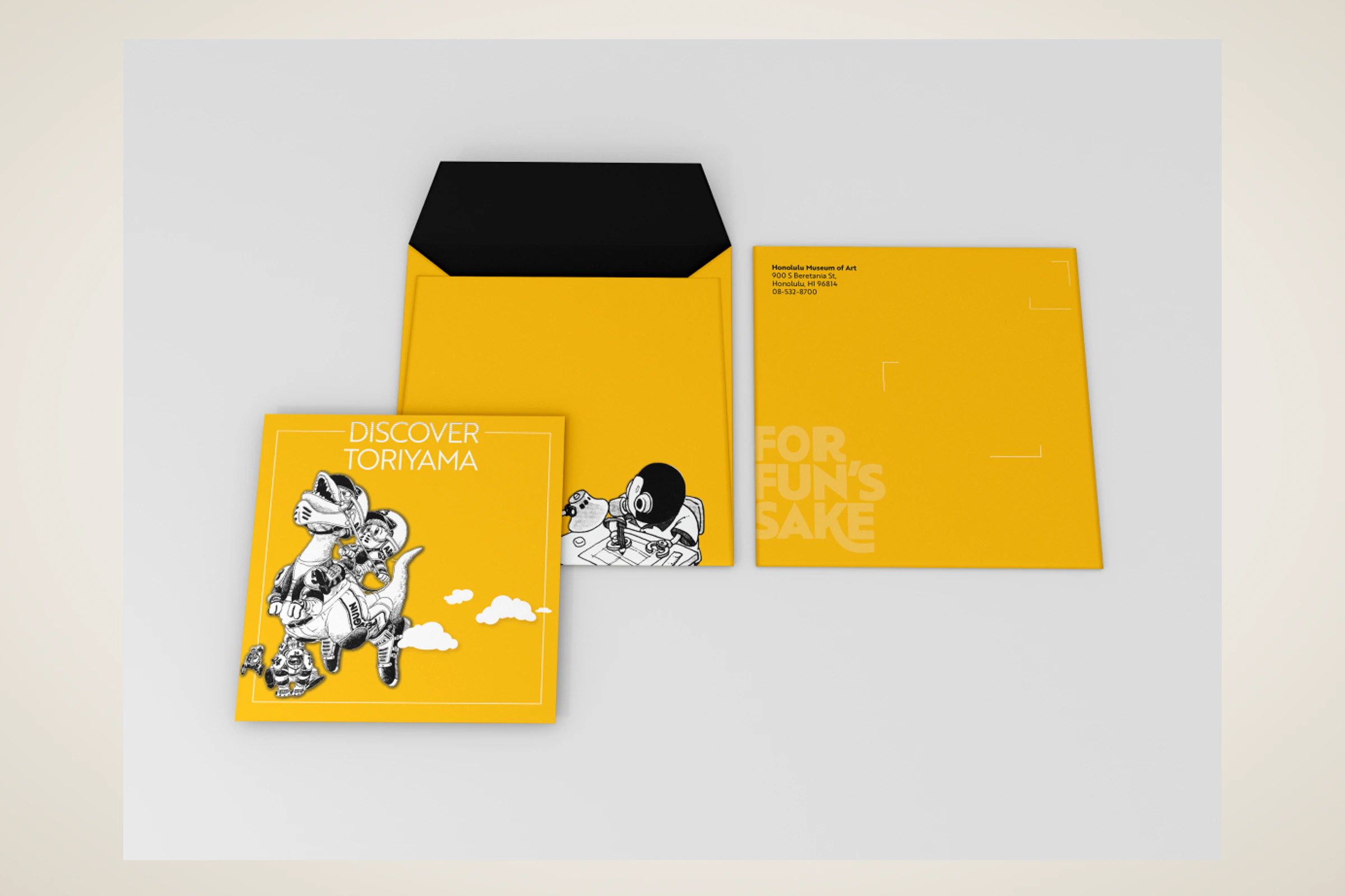
A self-initiated exhibition concept for Akira Toriyama's early work, using a strict black, white, and gold palette to build a coordinated visitor campaign.

Hana Paw Pet Goods
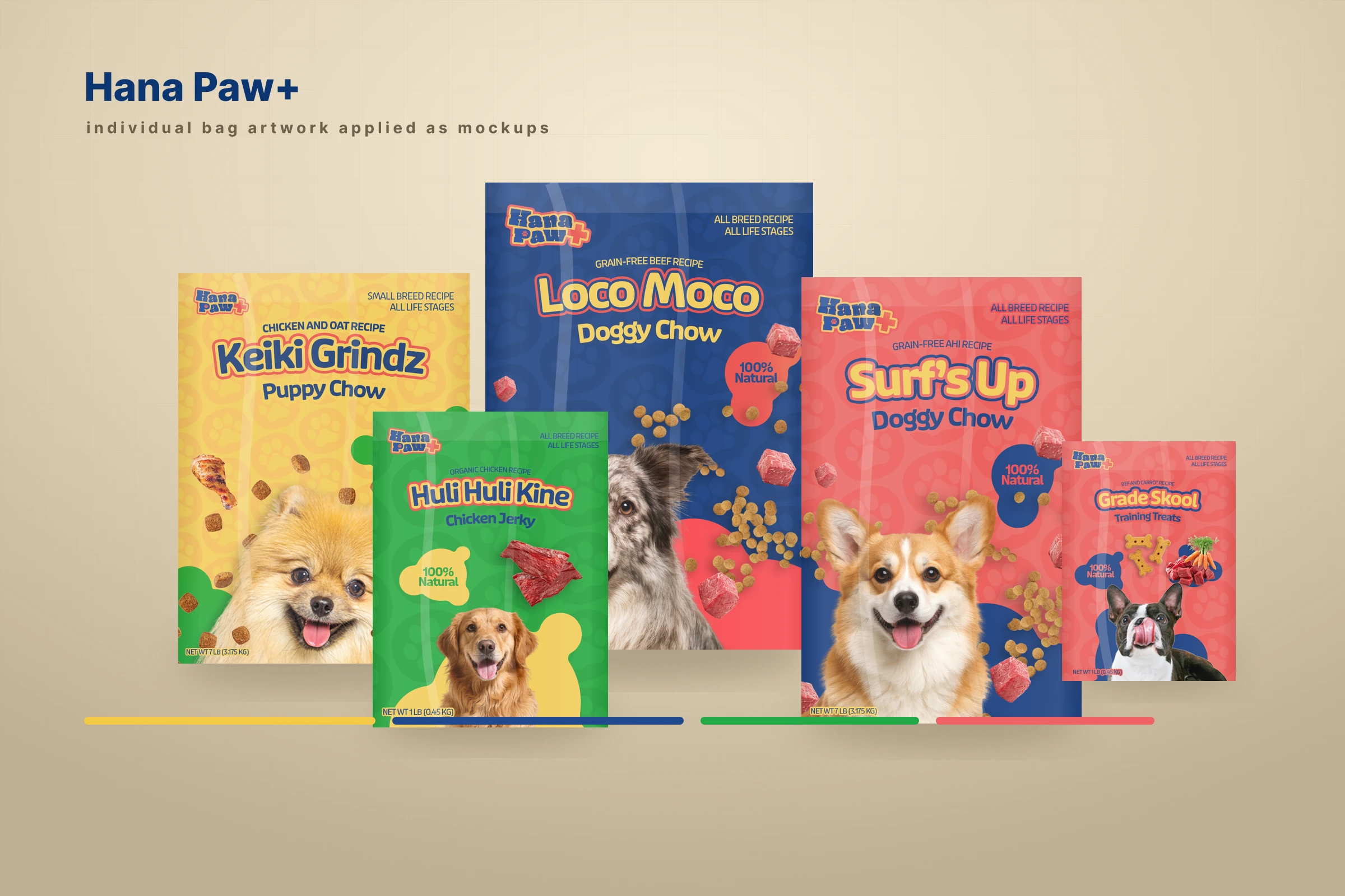
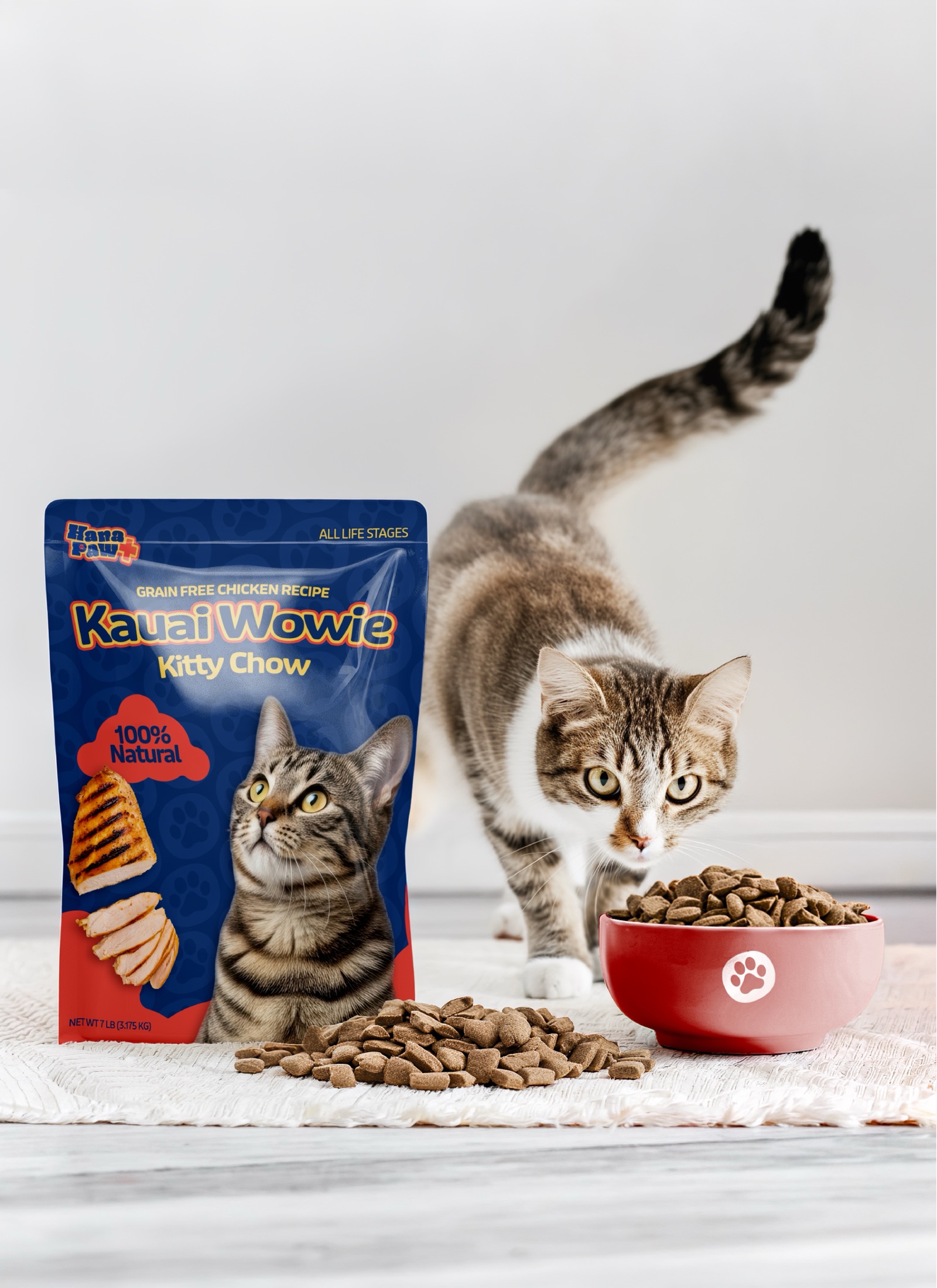
A client pet-products idea I led through positioning, naming and trademark pitches, identity, packaging, factory development, and a broader retail family.