2023 / Editorial / Case Study / Architecture
Shigeru Ban Architecture Study
A Paper Palaces editorial study inspired by Shigeru Ban's modular paper structures, built as a poster, booklet, and tearable card system.
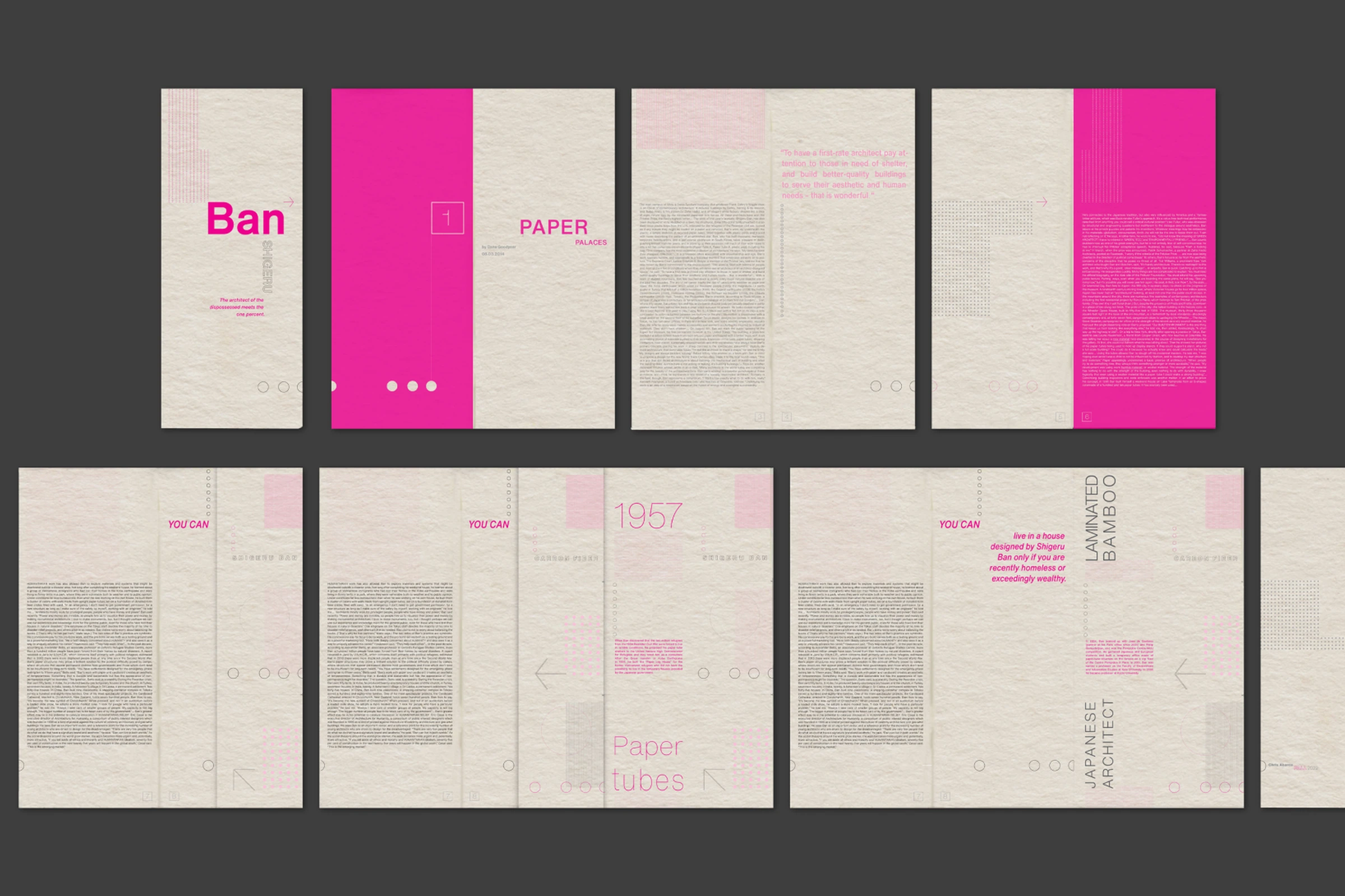
Art direction, identity, and editorial design
Self-initiated case study
Editorial layout, Poster system, Booklet, Research design
Concept
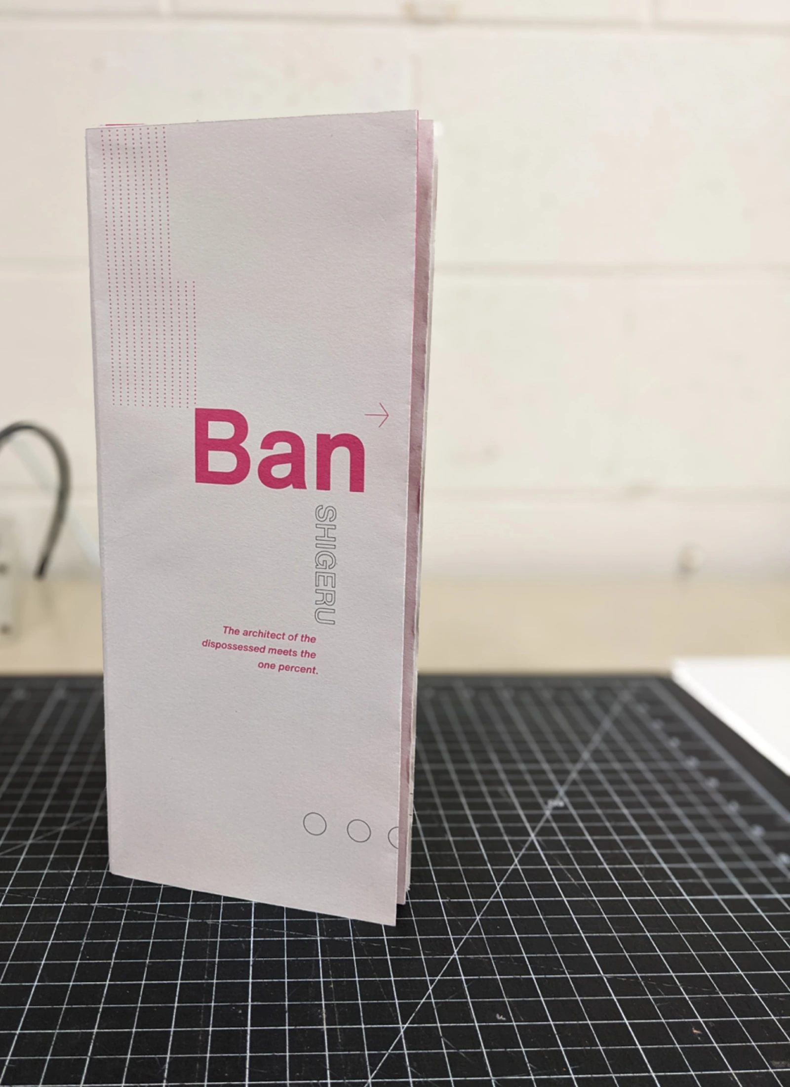
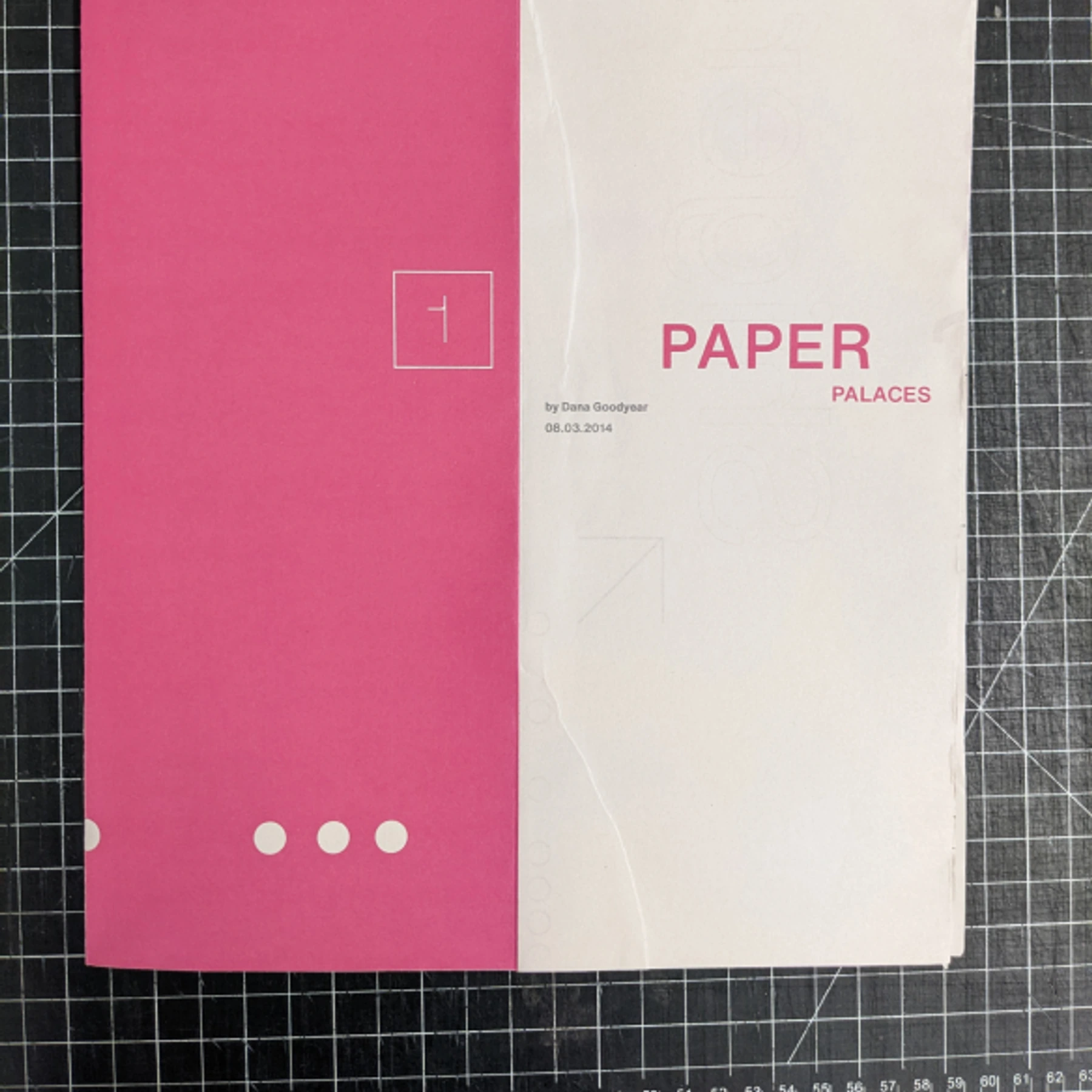
Paper Palaces
The design treats paper as the subject, structure, and production method.
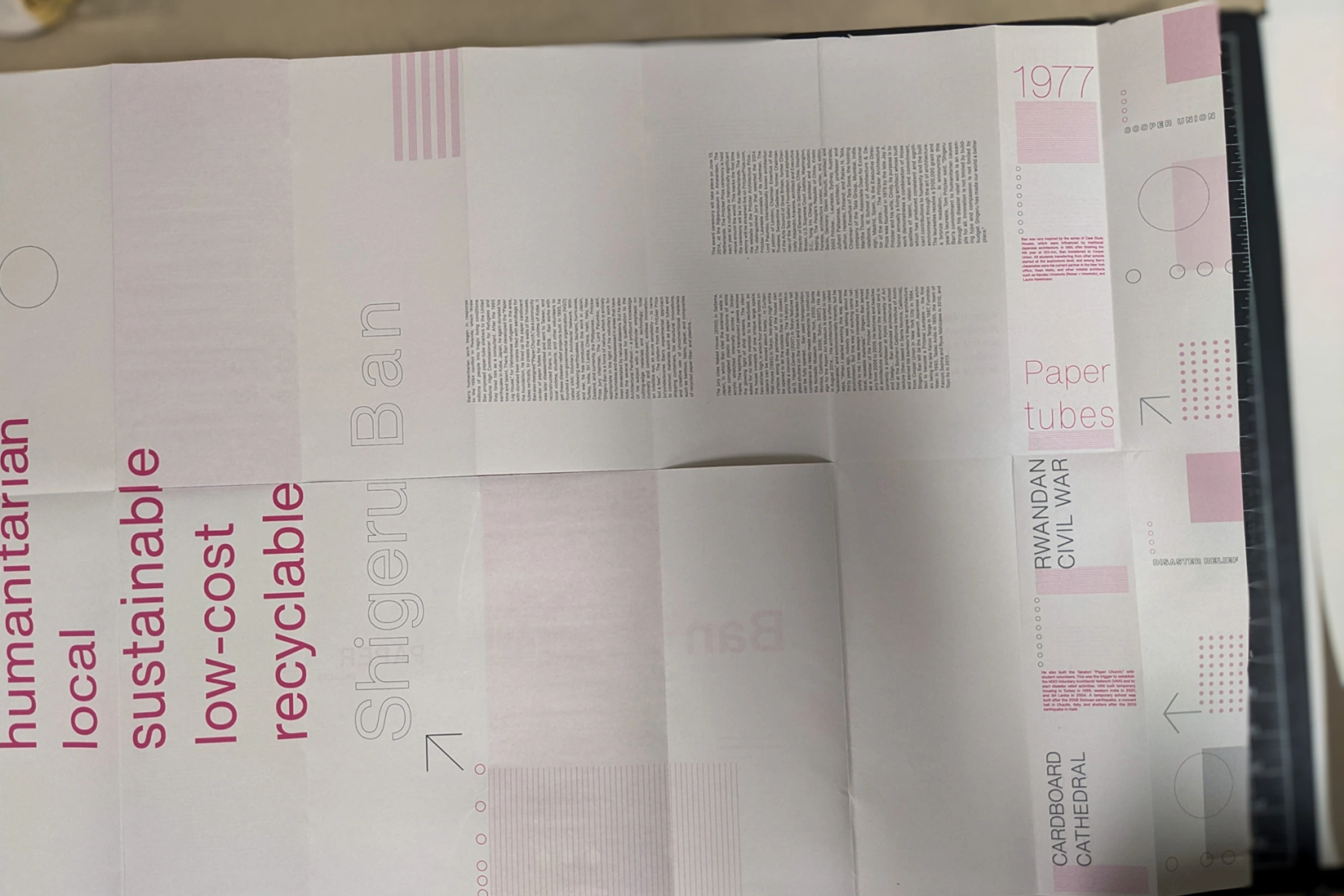
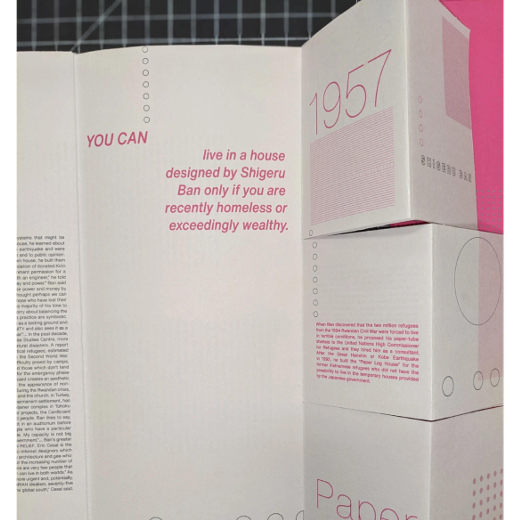
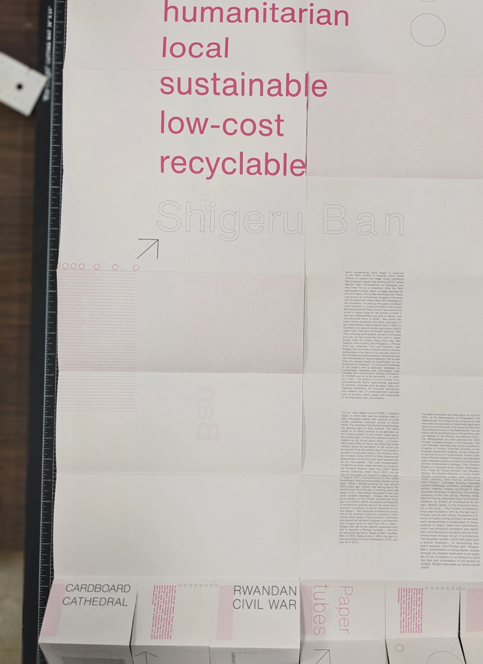
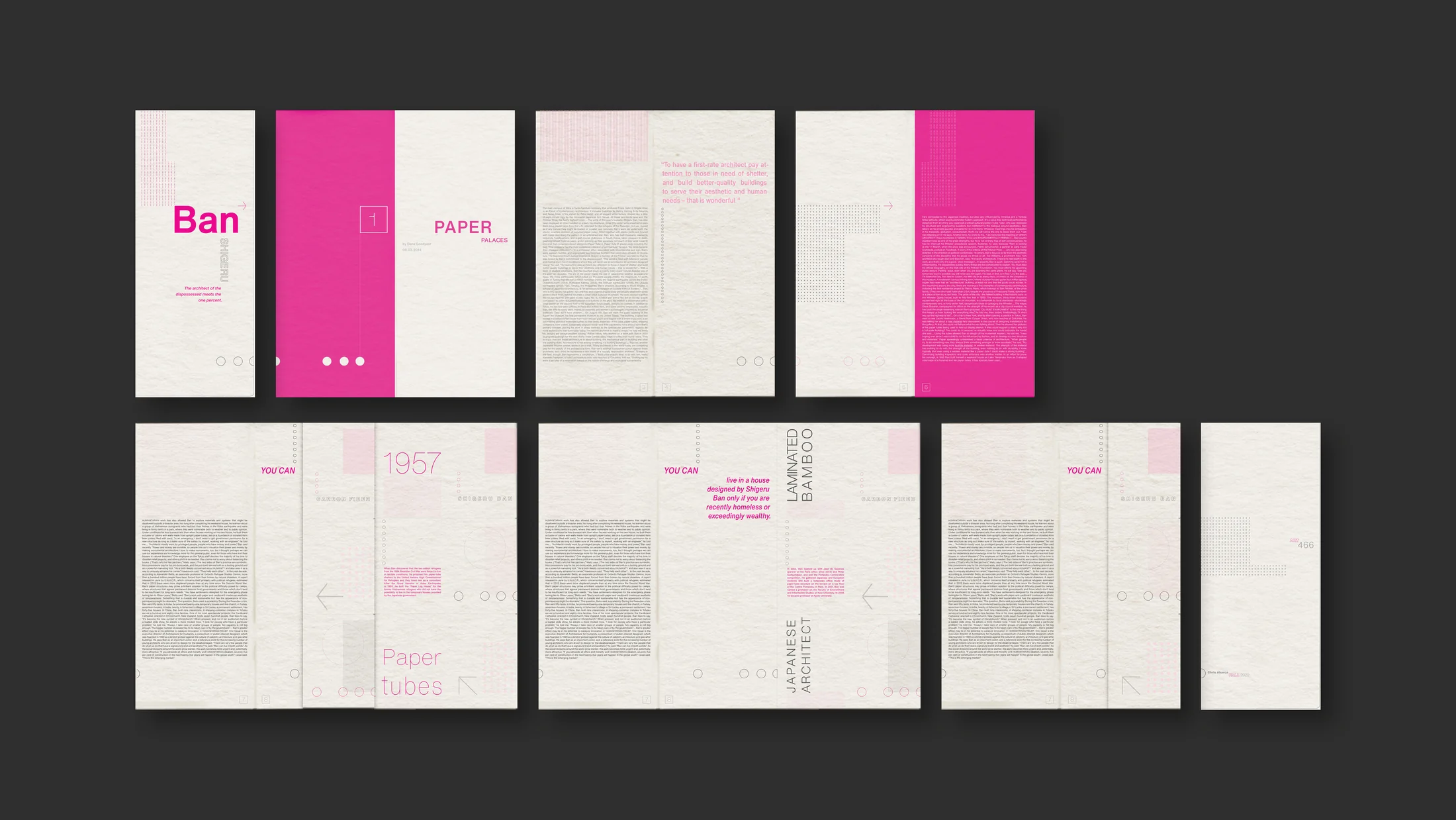
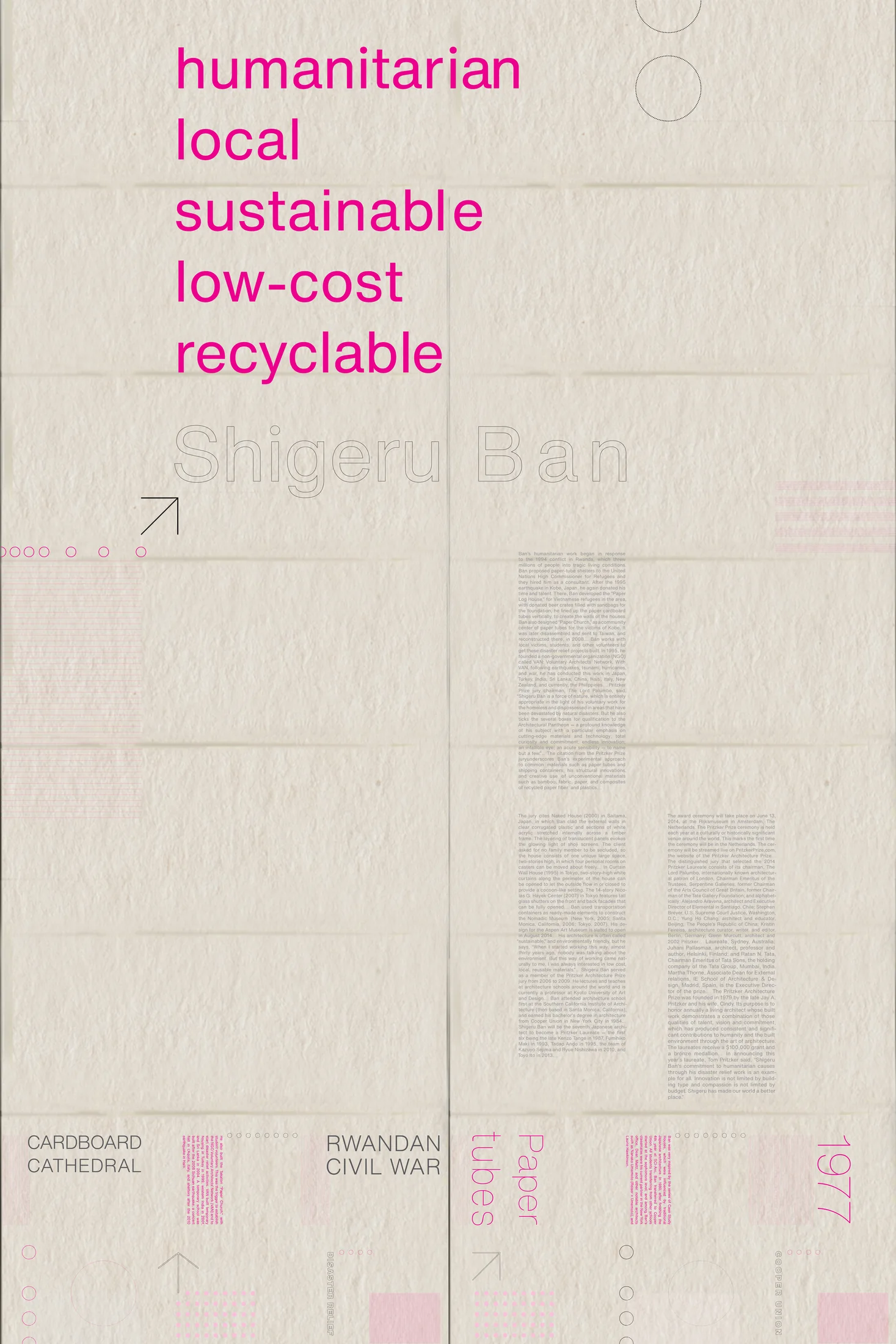
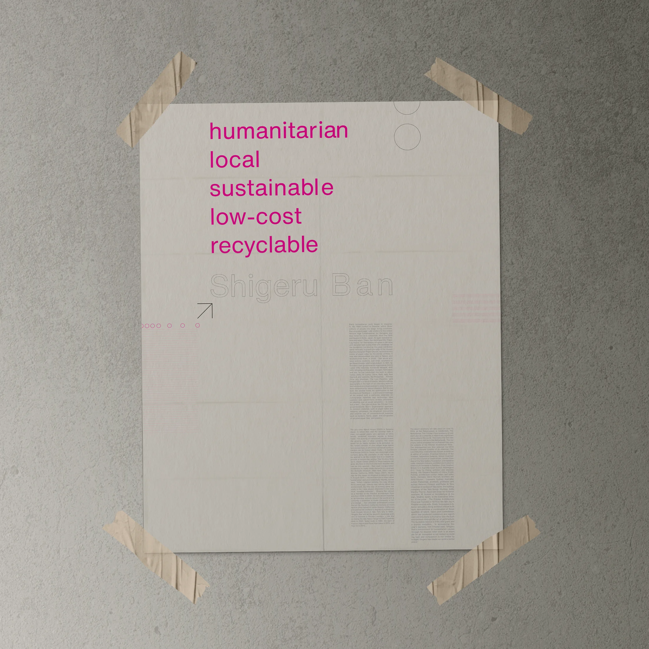
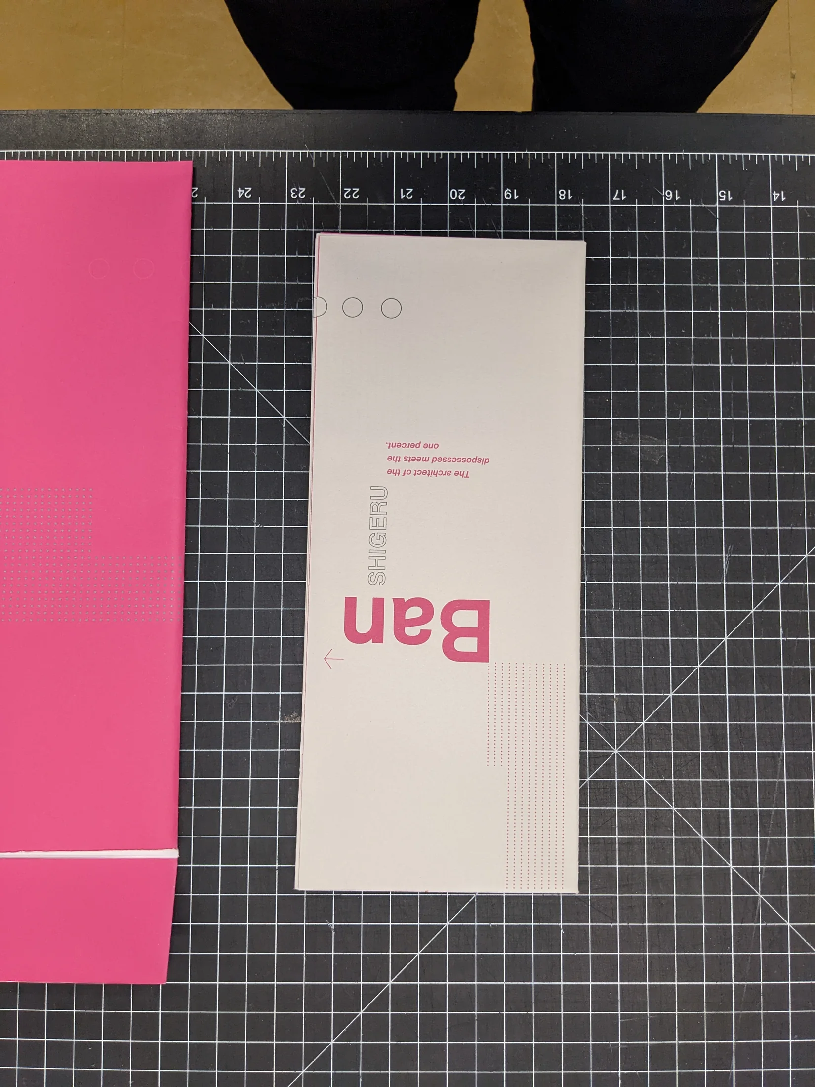
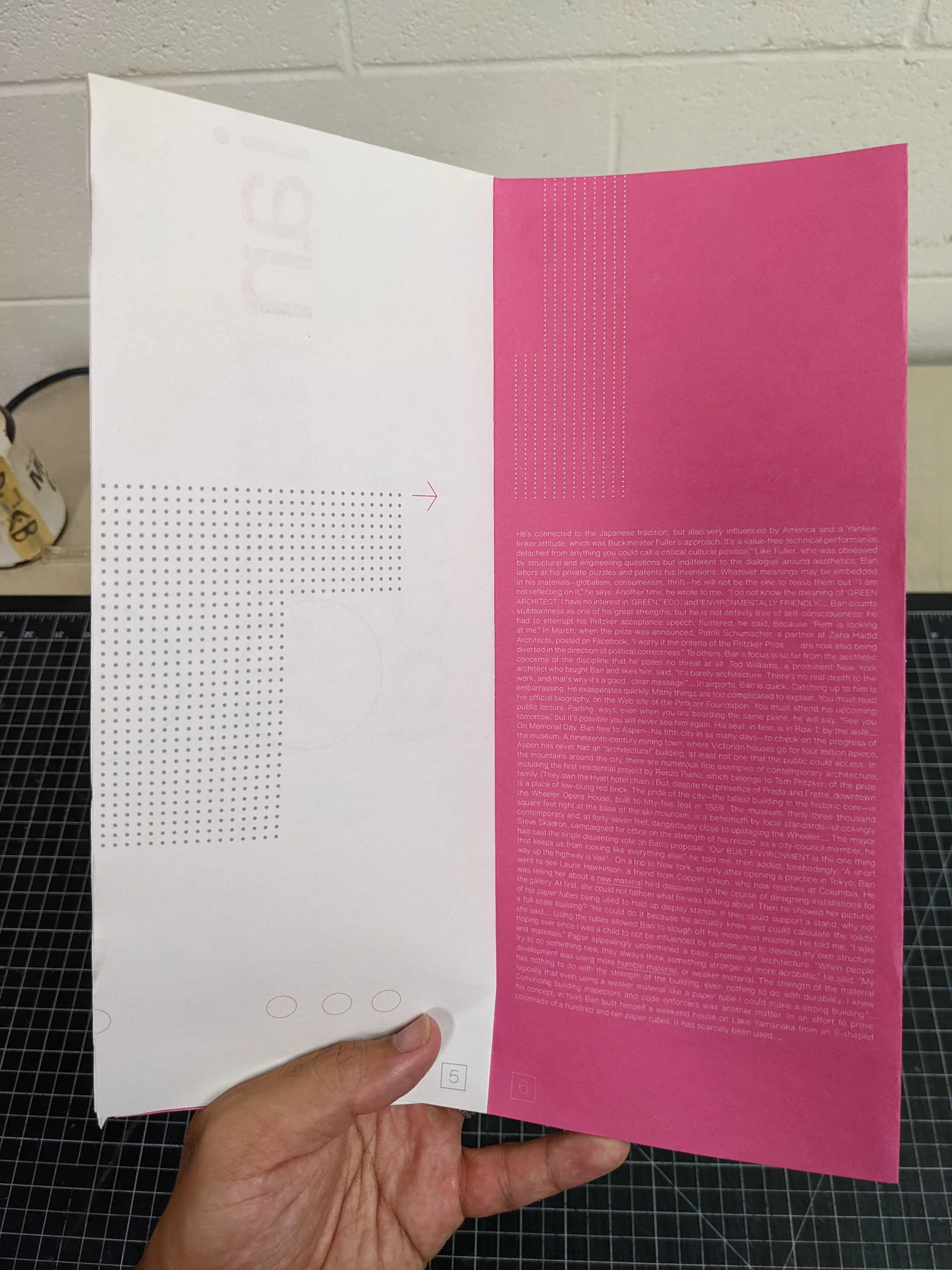
The object works as a 24-by-36-inch poster, folded booklet, and tearable card system, using newsprint, limited ink, and accessible type so it can be edited, printed, recycled, and reproduced easily.
Brief
This case study was inspired by Shigeru Ban’s paper structures, especially his modular builds using paper rolls. The sustainability of that work touched me because even temporary emergency structures can stay standing as long as they are maintained, and the material is affordable and easy to replace.
Concept
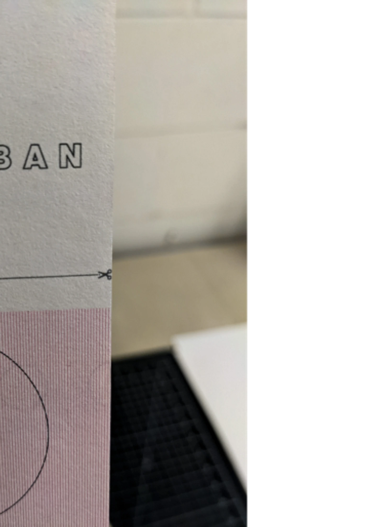
With that inspiration, I wanted to create a project about Ban’s Paper Palaces that also embodied the principles behind them. The final object became modular and multi-purpose: a poster that folds into a booklet, with tearable tabs or cards that can be removed without destroying the integrity of the larger design.
The material would be newsprint because it is affordable, accessible worldwide, and easy to recycle. The poster size is 24 by 36 inches because it is a common newsprint sheet size and can be printed in bulk from a 24-inch or 36-inch roll.
System
The booklet is printed on the opposite side of the poster, so the same sheet can shift between reading formats. Tearable cards live on the last page and are designed to work with the booklet and poster before and after removal.
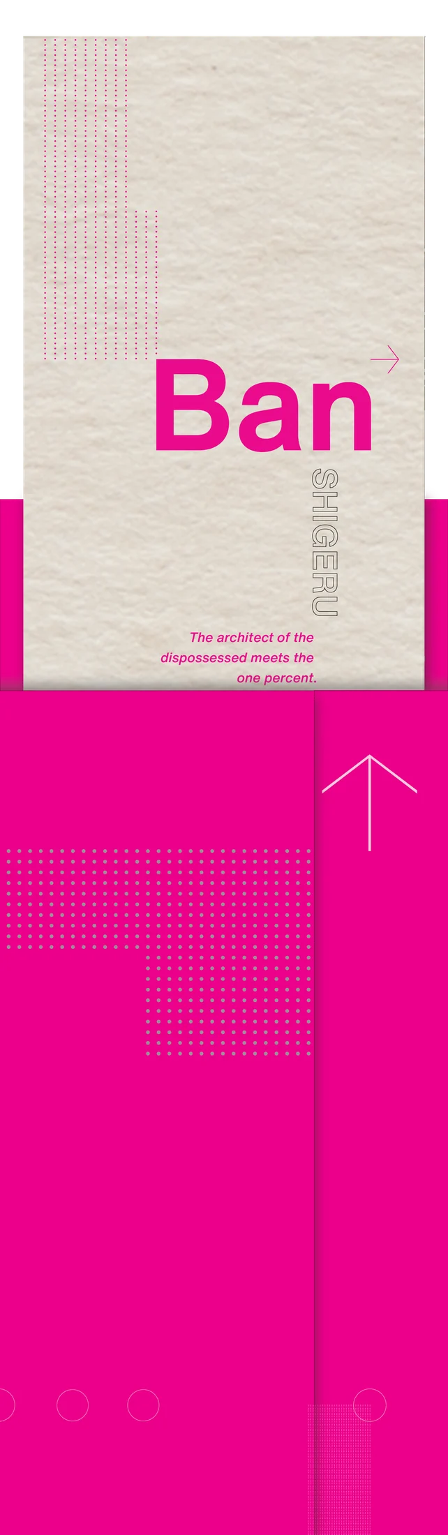
I limited the ink for two reasons: less ink makes the material easier to recycle, and the thinness of newsprint makes heavy coverage more likely to ghost through from the opposite side. The system uses pure black and pure magenta, relying on shape, gestalt, and typography to create interest without heavy color saturation.
I also chose Helvetica rather than a more specialized typeface so the project could be opened, edited, and produced on many machines without requiring custom font access.
Outcome
The result is an editorial object about architecture that behaves architecturally itself: economical, modular, accessible, recyclable, and driven by material decisions.
Image archive
13 selected visual moments
Related work
Continue through the archive
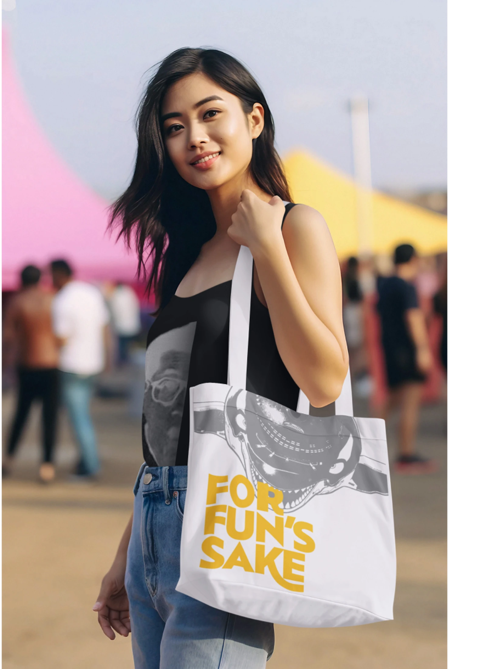
Toriyama Early Works Exhibition
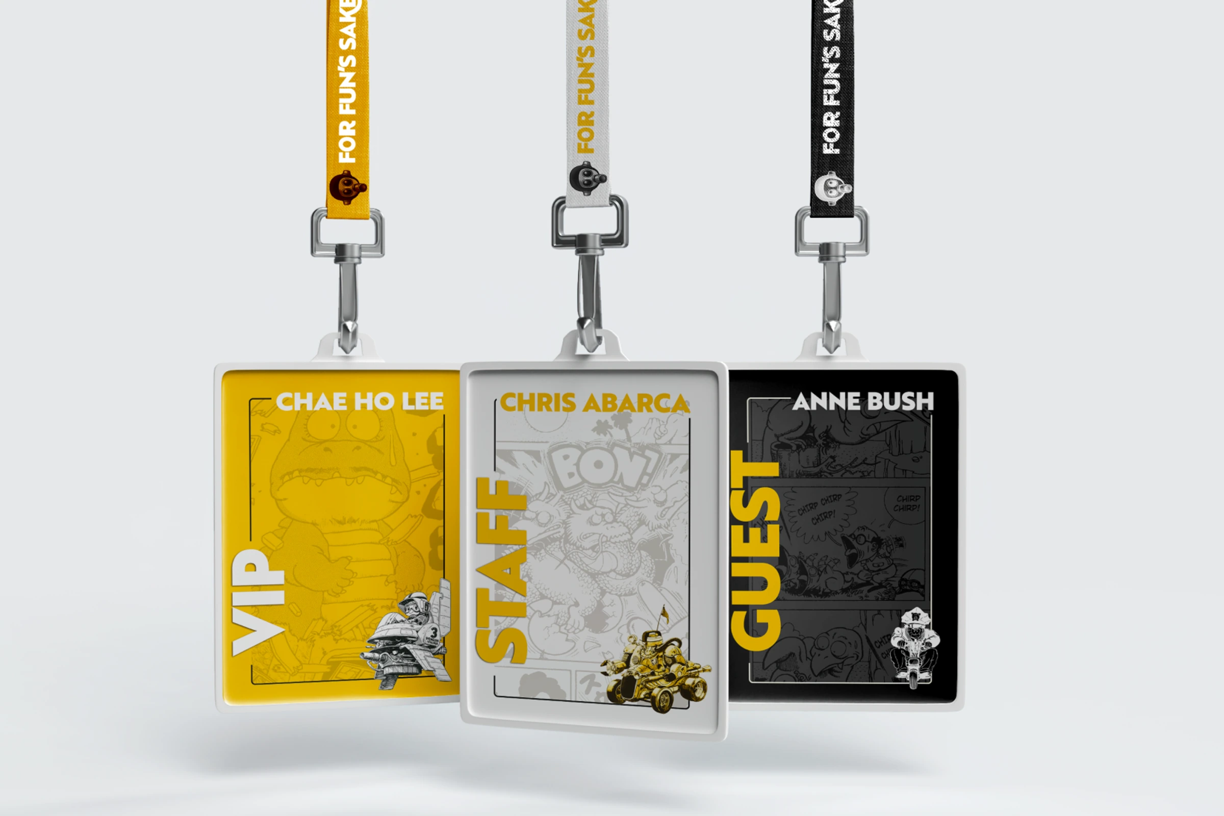
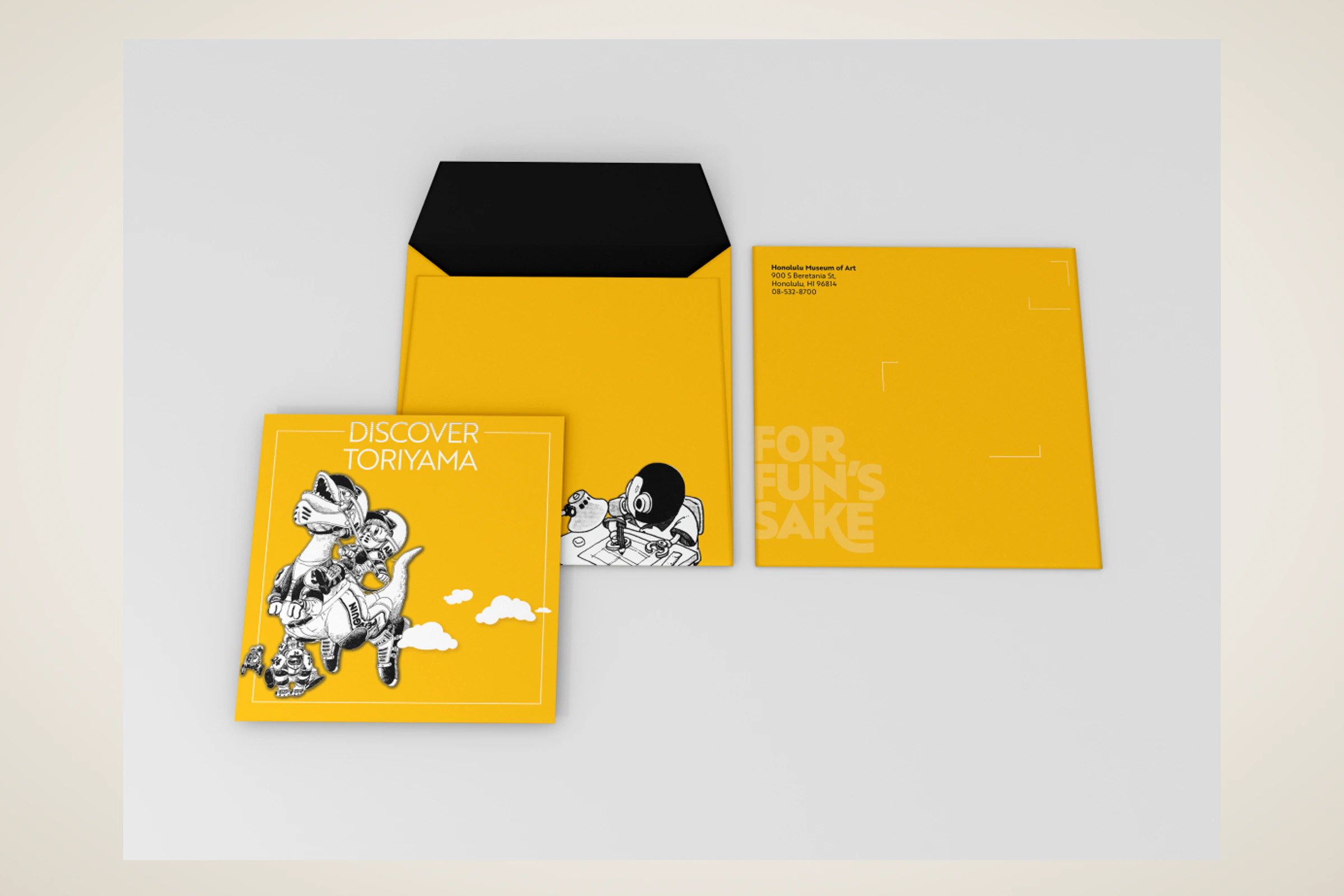
A self-initiated exhibition concept for Akira Toriyama's early work, using a strict black, white, and gold palette to build a coordinated visitor campaign.
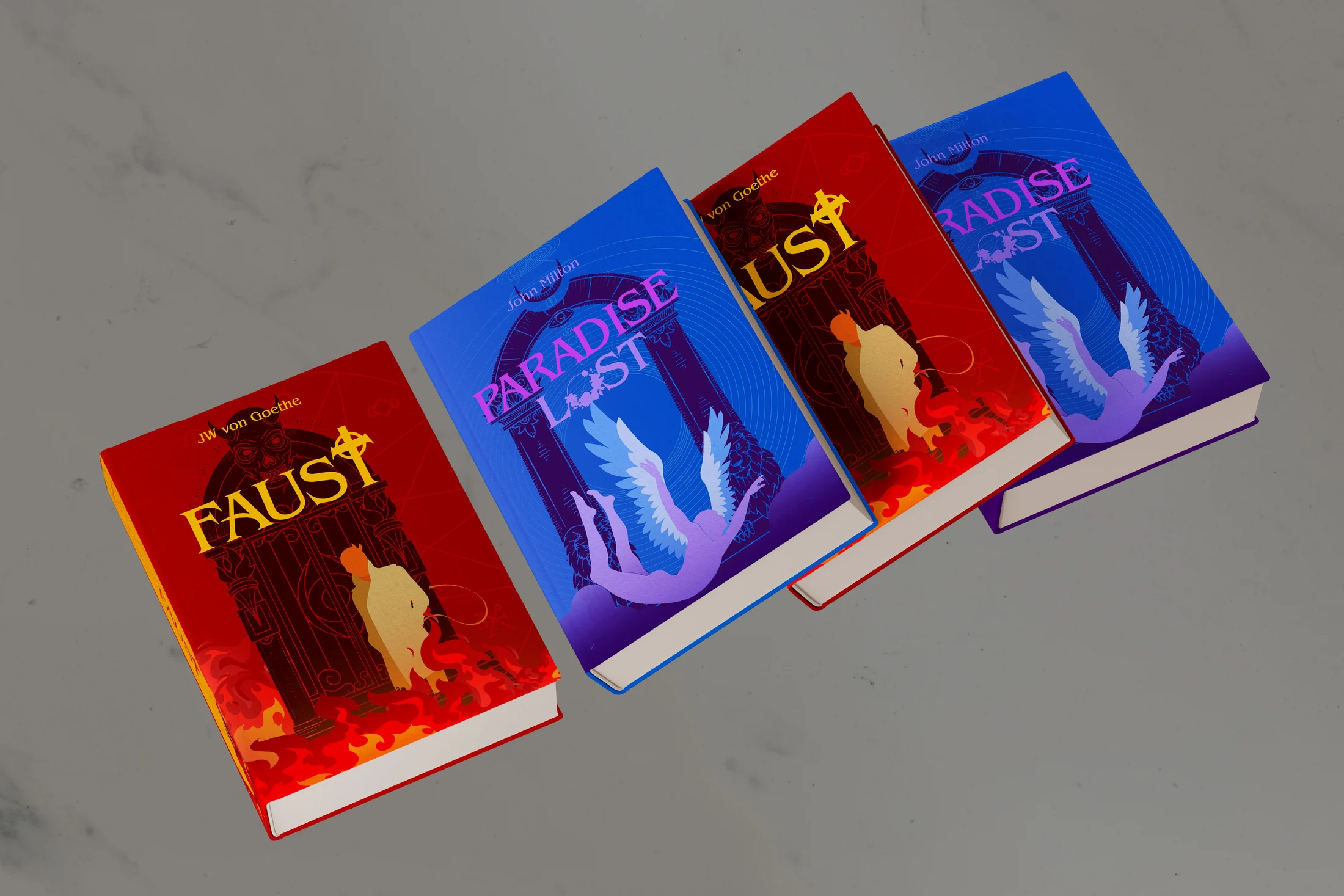
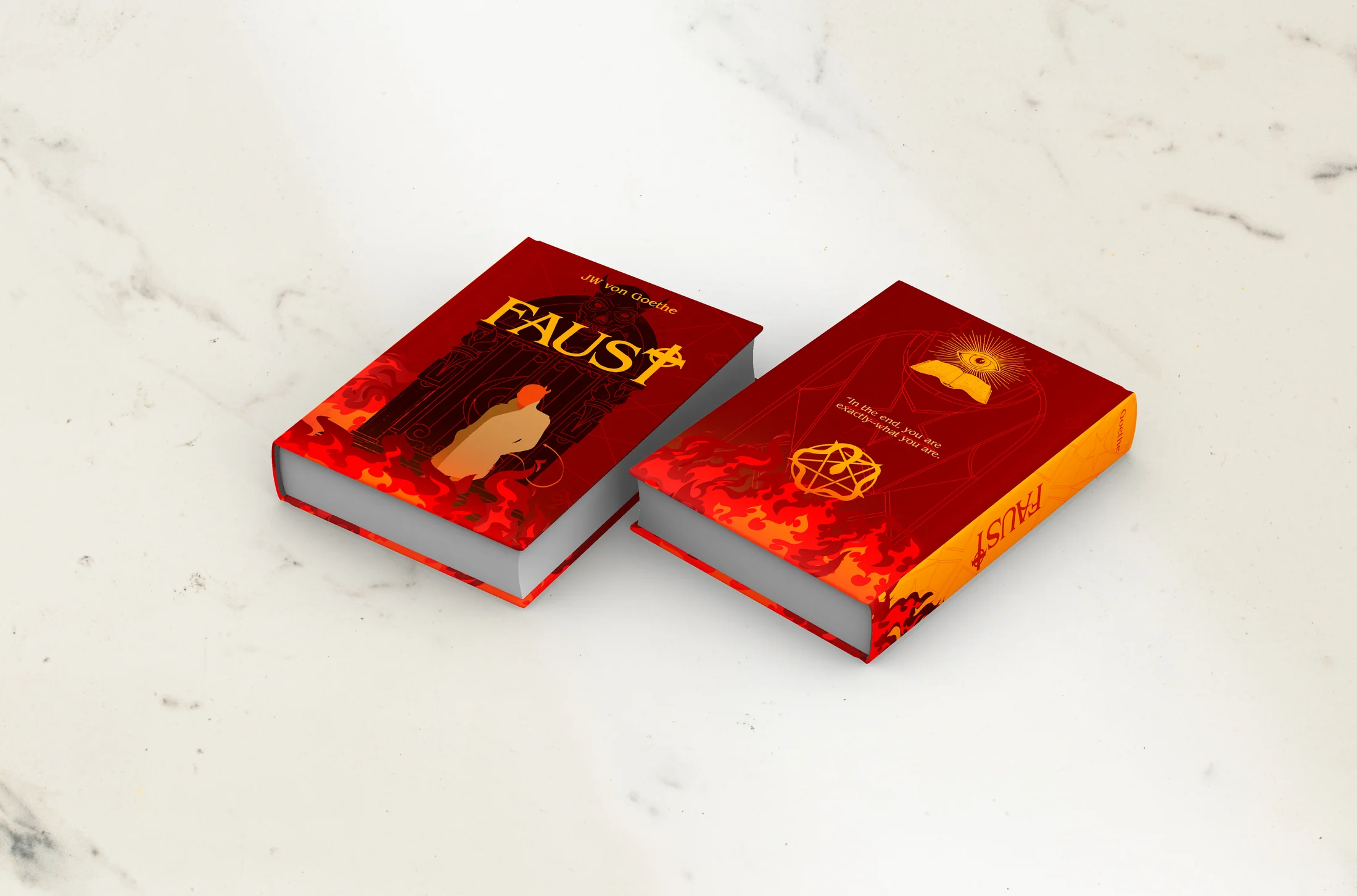
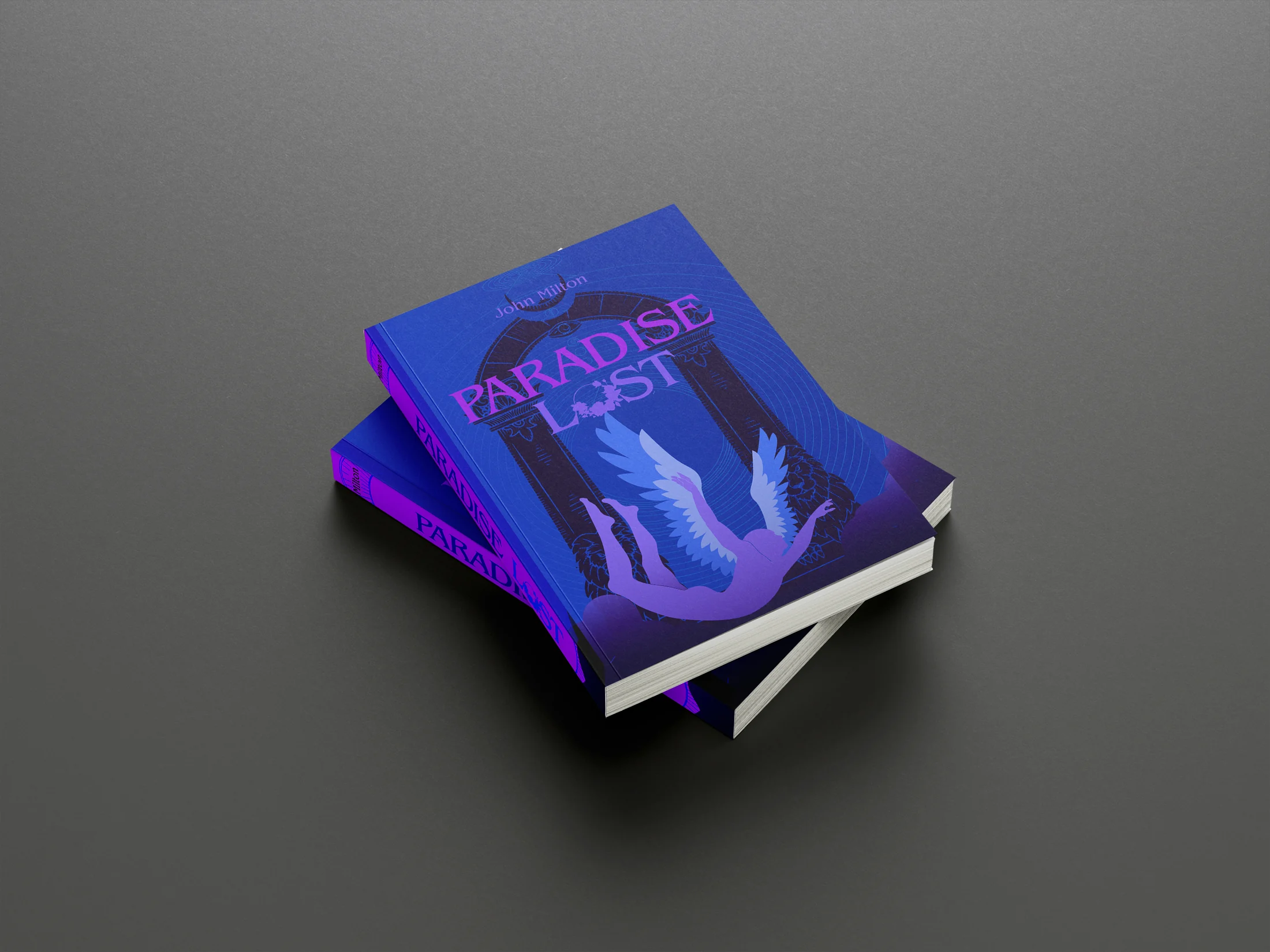
Archived Projects
An archive of book-cover redesigns, editorial pieces, information studies, type experiments, advertisements, and exhibition work made between 2019 and 2024.