2024-2026 / Brand System / Web / Brand
Longs Drugs Brand Revival
A completed, fully live CVS Health brand revival for Longs Drugs, rebuilding the voice and system around the existing wordmark.
End-to-end creative direction, strategy, brand system, voice, web, and production
Longs Drugs
Completed live CVS Health project
Strategy, guidelines, web, retail, packaging, campaigns, launch, and measurement
Brand system, Website, Retail graphics
Hawaii
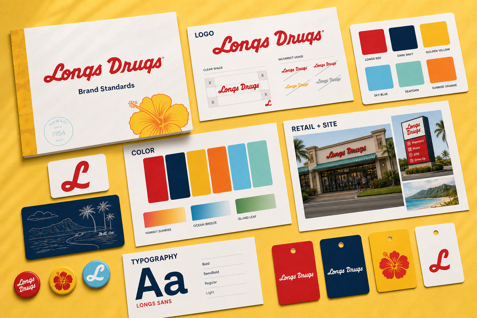
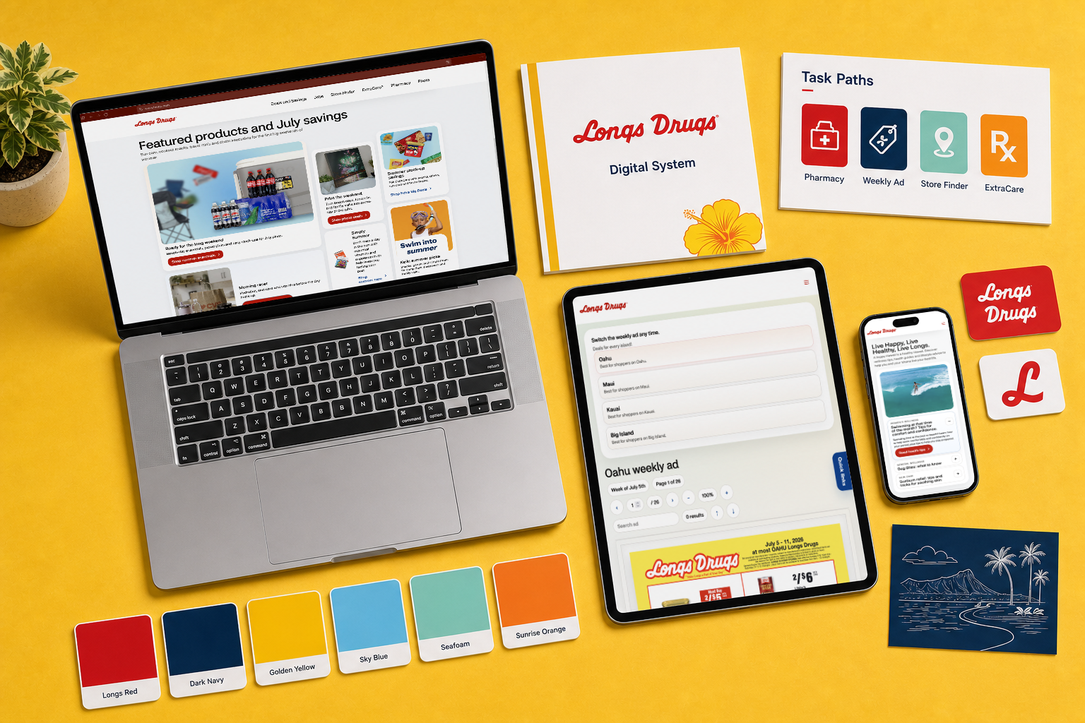
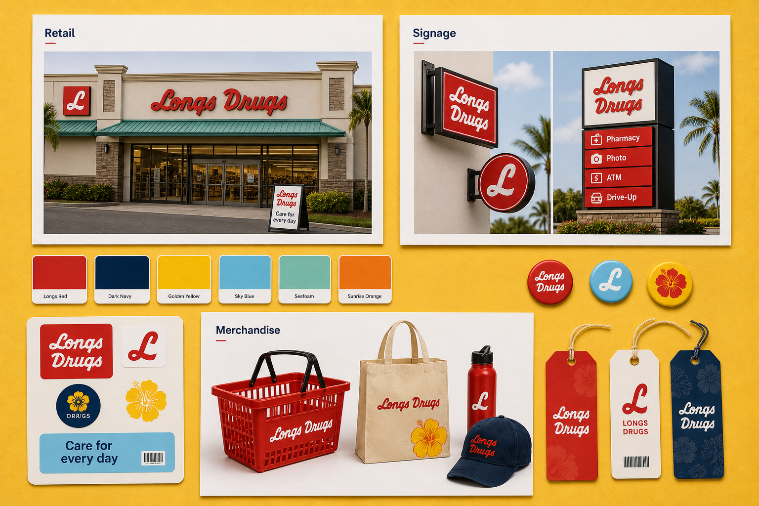
Guidelines-led revival
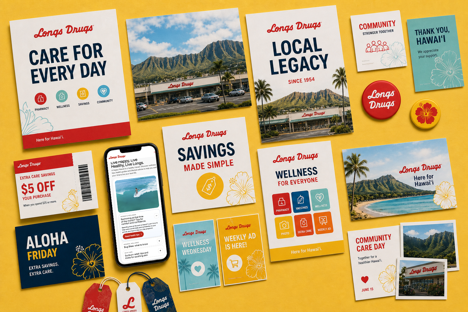
The revival keeps the recognizable Longs signal while giving the brand more room to grow.
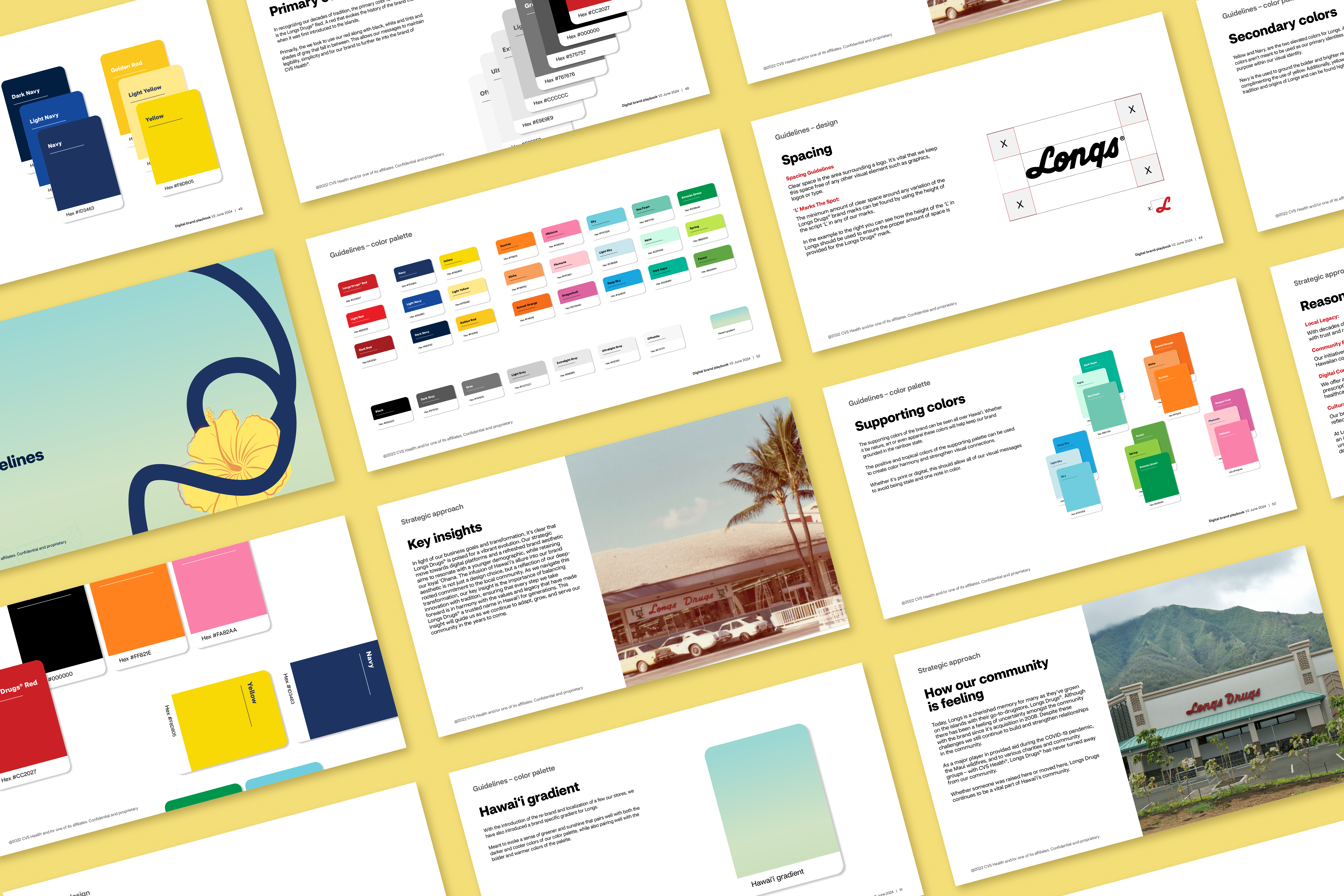
Red remains the primary anchor, while yellow honors the printed circular history and navy adds flexibility, trust, and a bridge to CVS Health. A wider supporting palette gives campaigns, seasons, and community moments more energy without disconnecting from the core brand.
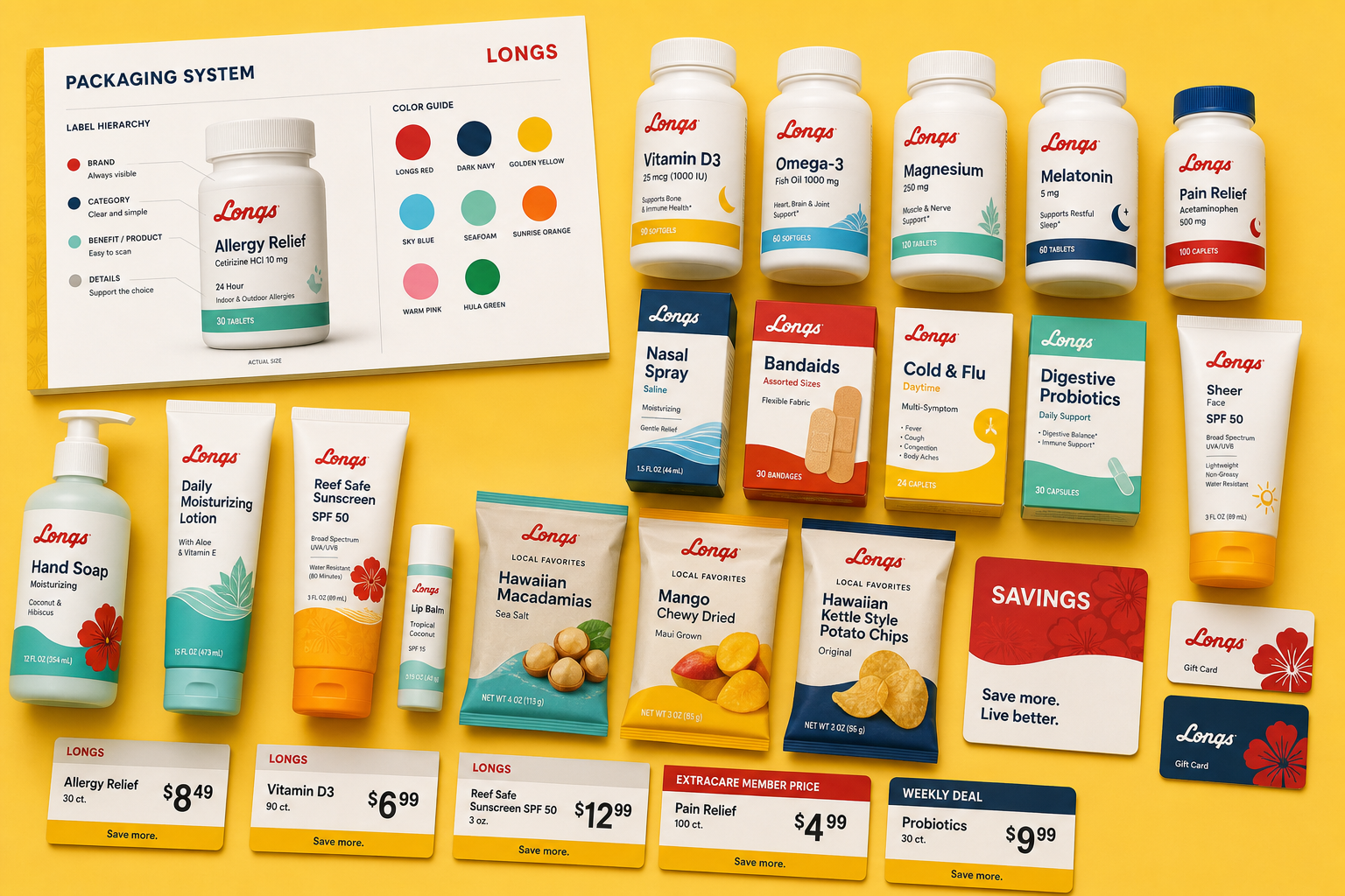
Brief
CVS Health asked me to modernize the Longs Drugs brand and set it up for a multi-layered transition across store products, social media, website experiences, and physical and digital banners. I led the work end-to-end, from the initial brief and strategic direction through creative development, stakeholder alignment, production, launch, and measurement. This is a completed, fully live project developed with CVS Health, not a speculative case study.
Concept
I did not redesign the Longs Drugs wordmark. I treated it as established brand equity and rebuilt the system and voice around it. That meant prioritizing Longs Drugs red and preserving the iconic yellow associated with the printed circular, while using both in a way that would not feel too harsh in modern digital and retail environments.
The final palette starts with one primary color, red, and two secondary colors: a rich yellow that stays true to Longs history and a navy blue that adds flexibility with CVS Health while evoking trust and stability. From there, I expanded the tertiary palette so campaigns, seasons, and events could feel lively without looking disconnected from the core brand.
System
The system rebuilt everything surrounding the existing wordmark: brand voice, guidelines, typography, color logic, website direction, social presence, store products, banners, packaging development, and retail graphics. I carried the work through concept development, presentations, approvals, vendor and production coordination, reusable standards, launch, and ongoing optimization. The result is live and functioning across the Longs Drugs experience.
A portfolio version of the guidelines page developed from the Longs prototype, adapted to sit beside this brand revival project.
Outcome
The outcome has been measurable across digital work, operations, and retail. After launch, individual quarterly website traffic, tracked-event, and click-through measures increased by as much as 120%. A later major update produced another 300% quarter-over-quarter increase across those measures.
Bringing website and social work in-house freed approximately $140,000 annually for other campaigns and business initiatives. A digital retail campaign also moved store sales and foot traffic from a 3% monthly decline to approximately 2% monthly growth.
The broader result is a quickly maturing website, a growing social presence, and a more recognizable physical presence across the islands of Hawaii. The official public guidelines destination is also linked here for reference: longs.com/brand-guidelines.html.
Image archive
5 selected visual moments
Related work